Fresh From the Field — Health Care revolution by Culture & Theory
This Fresh from the Field, features Culture & Theory‘s brave Brand Strategy and Visual Identity Systems for Tend, who aspires to be the countries largest healthcare provider by 2030. The work is dynamic visually rich and puts ‘life’ at the centre of health.

The brief / project Kaupapa:
Tend came to us with a brave, singular vision: to revolutionise healthcare in New Zealand and become the country’s largest healthcare provider by 2030. It was an outstanding challenger vision that led to us partnering on a project spanning strategy and positioning, naming, design, and identity, and ultimately becoming ongoing guardians for the brand.

Cecilia and James Robinson, Tend’s founders, were driven by the fundamental belief that Kiwis deserve a whole lot better than what the industry currently offers up and were determined to bring a modern approach to challenge the bricks-and-mortar, one-size-fits-all approach.
Tend is a revolutionary healthcare app that enables Kiwis to see their doctor right from their phone, with ongoing comms between customers and their healthcare teams that doesn’t just stop when you leave ‘the clinic’.
The design response:
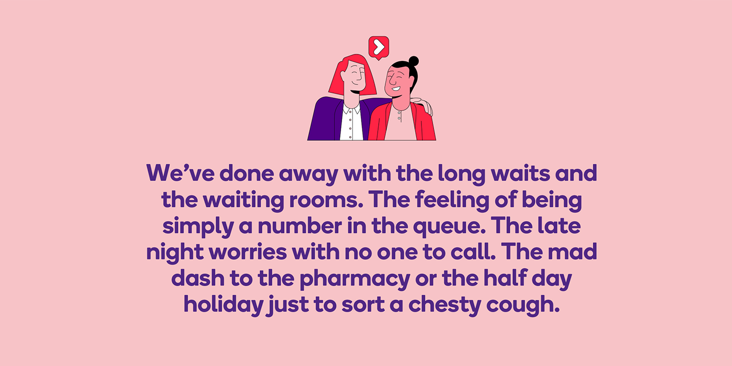
Traditionally, ‘healthcare’ has been the preserve of soft, sanitised, generic language or uses clinical speak that means little to anyone but the experts. Tend wanted to make health, and healthcare, newly
relevant and much more engaging. Our positioning centred on healthcare that finally puts the control back in the hands of the customer, no longer beholden to a system that sometimes feels impossible to navigate, instead empowering Kiwis to live happier, healthier lives. So, we created a fresh, confident, and down-to-earth voice, straight-talking and real, making complex or embarrassing things easier and more comfortable – a voice far more in tune with how Kiwis relate to each other today.

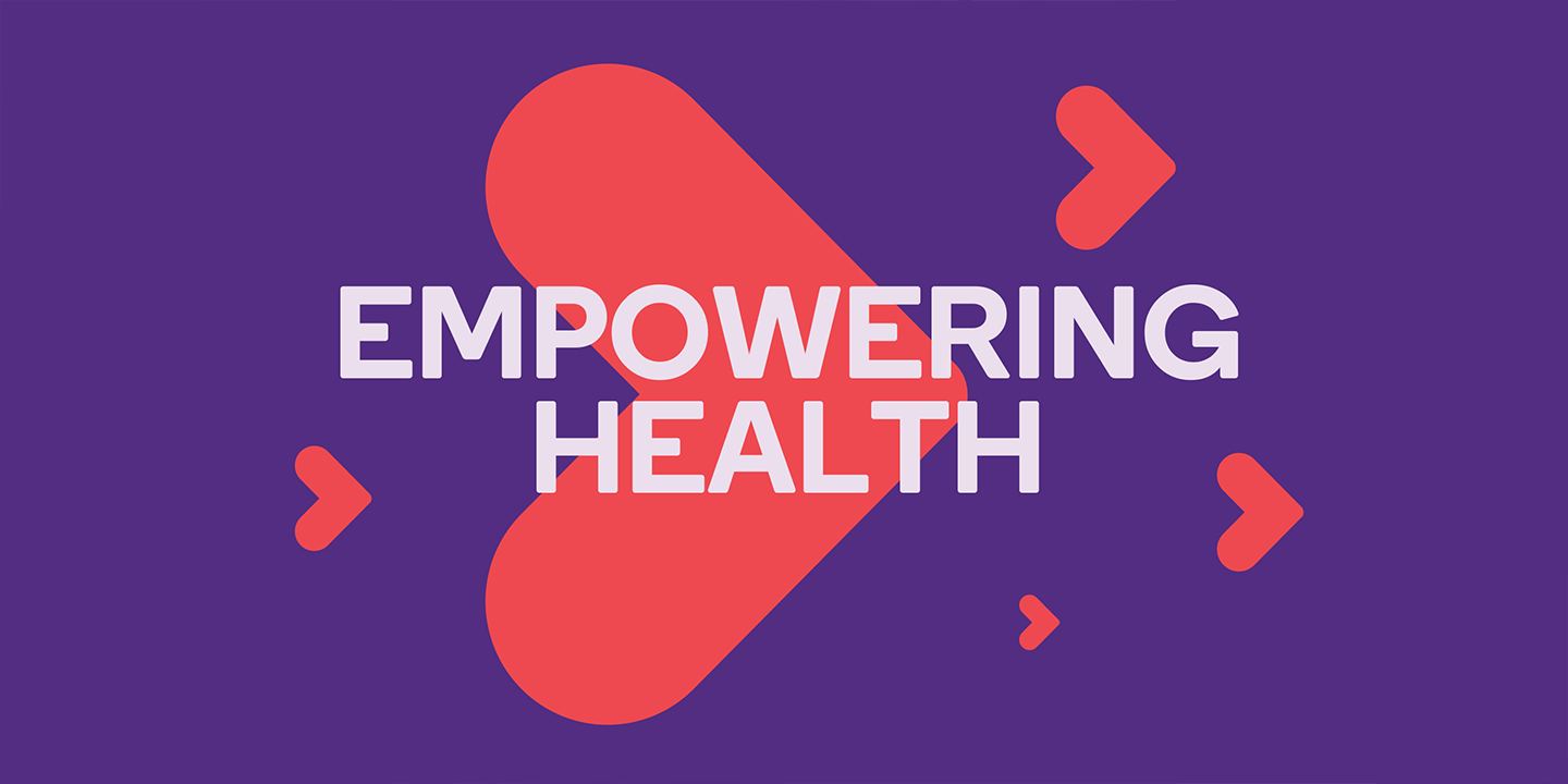
Built on the key brand benefit ‘Empowering Health’ we created a visual identity system that brought to life our creative idea: ‘life at the centre’. Our wordmark is inspired by the humanist san serif ‘Boing’, setting an approachable tone right from the get-go. Our icon represents the notion of life, love and good health at the centre. Its versatility becomes a tool for multiple uses and rich storytelling.
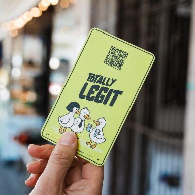
We partnered with illustrator Joe Carrington and YoungShand to bring to life all the different scenarios each of us experience when needing to check in on our health. Quirky, beautifully seamless illustrations and animations that explain what Tend is and how use the app.
The collaborators (creative team):
Photography: Victoria Baldwin – https://www.victoriabaldwin.com/
Illustration: Joe Carrington – https://www.instagram.com/mosesillustration/?hl=en
Film & Animation: YoungShand – https://youngshand.com/