Fresh from the Field – Pause Breathe Smile for Southern Cross by Voice
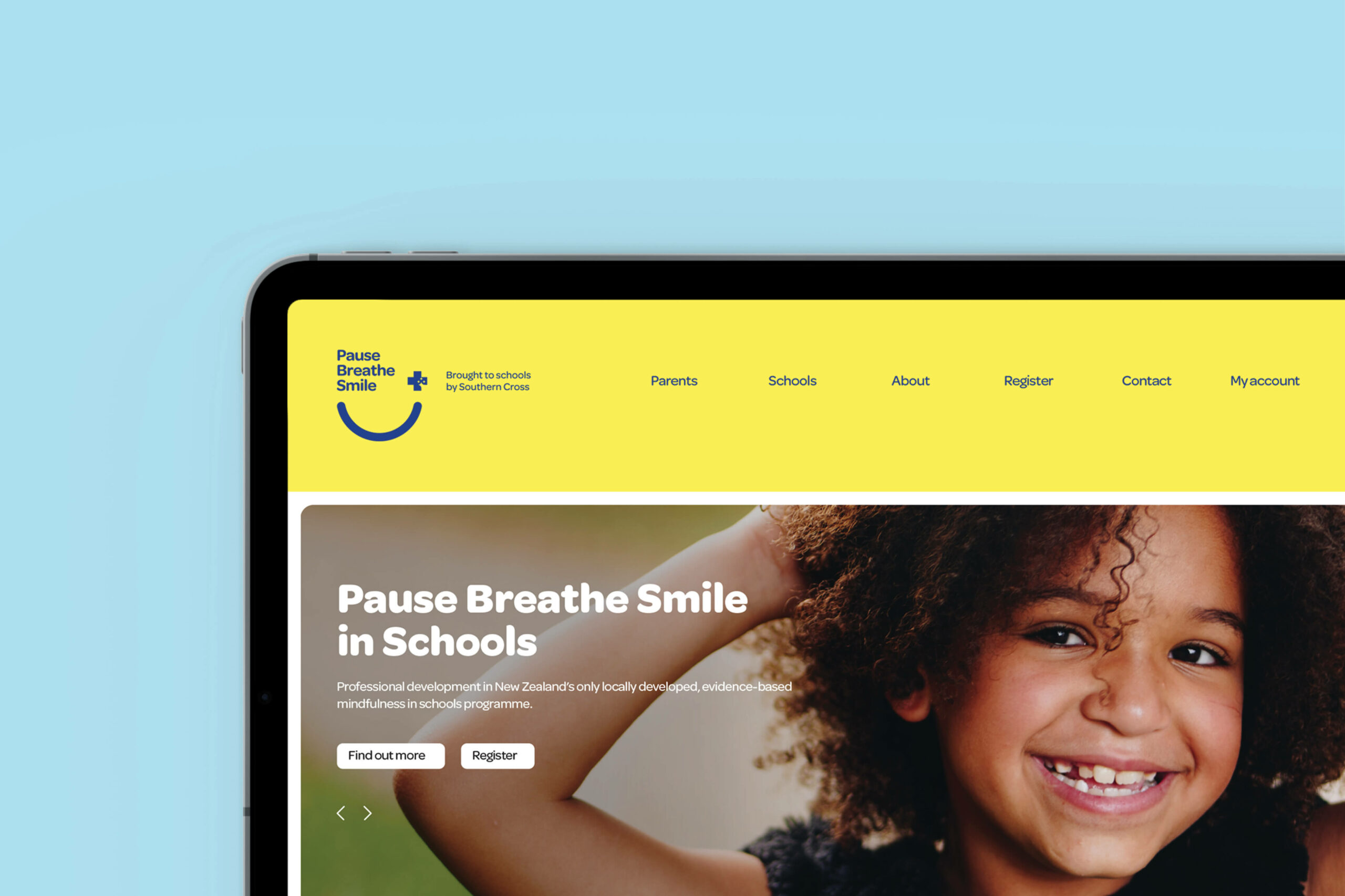
Pause, Breathe, Smile is an evidence-based mindfulness program developed for New Zealand schools. Voice Brand Agency developed a playful and positive aesthetic approach for this important initiative.
If you have new or recent work that you would like to share in Fresh from the Field email nicole@designassembly.org.nz for details.

The brief:
As part of its commitment to the health and wellness of New Zealanders, Southern Cross entered into a partnership with Pause Breathe Smile, a programme to help young Kiwis to develop as strong, resilient, healthy individuals. Pause Breathe Smile is one of a few structured programmes that seeks to increase mindfulness in education and consists of eight lessons that focus on specific areas.

The programme had an existing identity and had already been introduced to 2,000 teachers across 350 schools, with more than 60,000 children benefiting from exposure to the programme so far. The goal is to expand Pause Breathe Smile over the next three years by removing the cost barrier that has prevented more schools from accessing the programme.
Our brief was to refresh the Pause Breath Smile brand and create a visual link to Southern Cross as part of the partnership in order to increase awareness and raise Southern Cross’ profile and reputation as a health and wellness leader in New Zealand. The Pause Breathe Smile branding needed to be refreshed to better appeal to its audience whilst also being able to exist on its own.

The response:
We knew that our idea had to be simple and memorable – and most importantly, positive. The simplicity of the smile communicates the benefits of the programme. Our idea also needed to link the Pause Breathe Smile programme with Southern Cross in a way that was natural and that satisfied all stakeholders. As a well-established and trusted brand, locking up the Southern Cross logo with Pause Breath Smile’s needed to be treated with care. It was also important to include a descriptor to acknowledge the involvement of Southern Cross.
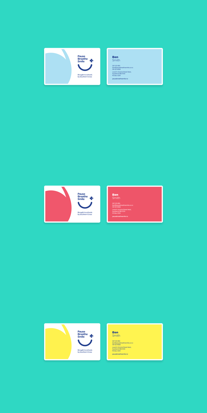
Our design solution is playful, flexible and positive. Capturing a youthful attitude with the subtle nod to an emoji with its smile and wink form wrapping around the Pause Breathe Smile wording. The link to the Southern Cross brand is suggested with the use of the Southern Cross font along with the well-recognised cross device.

We also developed three mindfulness bubble devices which link to the idea of moment-by-moment awareness of thoughts, feelings and emotions. Along with a vibrant colour palette that further states the positive nature of the programme. Given the varied audiences for the materials it was important the look and feel was able to adapt easily and create interest across their marketing and programme collateral. We also developed a wide range of collateral across internal and marketing communications, as well as brand guidelines.
An ATL campaign across TV, radio and digital has also been developed by Havas New Zealand. Quote from Joanne Mahon, Chief Communications & Brand Officer at Southern Cross “Voice lives and breathes our wider strategy to increase our profile as a health and wellbeing leader. Voice worked smartly and collaboratively at every step; their strategic approach matched with outstanding creative has helped us cut through what was a complex and layered sponsorship programme to deliver a lovely, fresh result that breathes fun and creativity into our brand.”

The team:
Executive Creative Director: Jonathan Sagar
Design Director: Richie Hartness
Designers: Jayson Ulrich and Matt James
Client Director: Fiona Lopez


