Fresh From The Field — Kapsi by MakeBardo
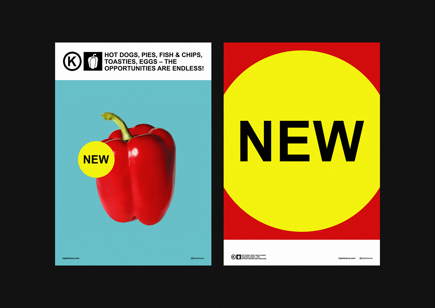
MakeBardo‘s work pushes boundaries, Bren & Luis are masterful at innovating in the categories they design for. Kapsi is nostalgic while also feeling contemporary it is intentionally weird and most importantly distinctive. This Fresh From The Field explores the identity, packaging and campaign graphics which were recently recognised as finalists in the best awards.
If you have new or recent work that you would like to share in Fresh from the Field email nicole@designassembly.org.nz for details.

The Brief:
The client’s brief was “It is time to get back to the basics”. This statement responds to the brand’s philosophy: Kapsi is a roasted capsicum sauce, and its simplicity is what makes it unique. Simple, functional and hero

The Design Response:
Although the brand value lies in its simplicity, a roasted capsicum sauce is not a common mass product as a tomato sauce; in fact, it is strange. The design challenge is between those two points. We need to develop a simple concept to reflect the core value of the brand but with a unique design approach that shows this different side of the product without confusing it with a tomato sauce. The strategy was to achieve a perfect mix between simplicity and singularity.

The solution was brave and minimal. The overall identity stands out for its simplicity. The brand reveals all of its bold character with an Arial typography and bright colours, accepting that less is better when the world is saturated with information.
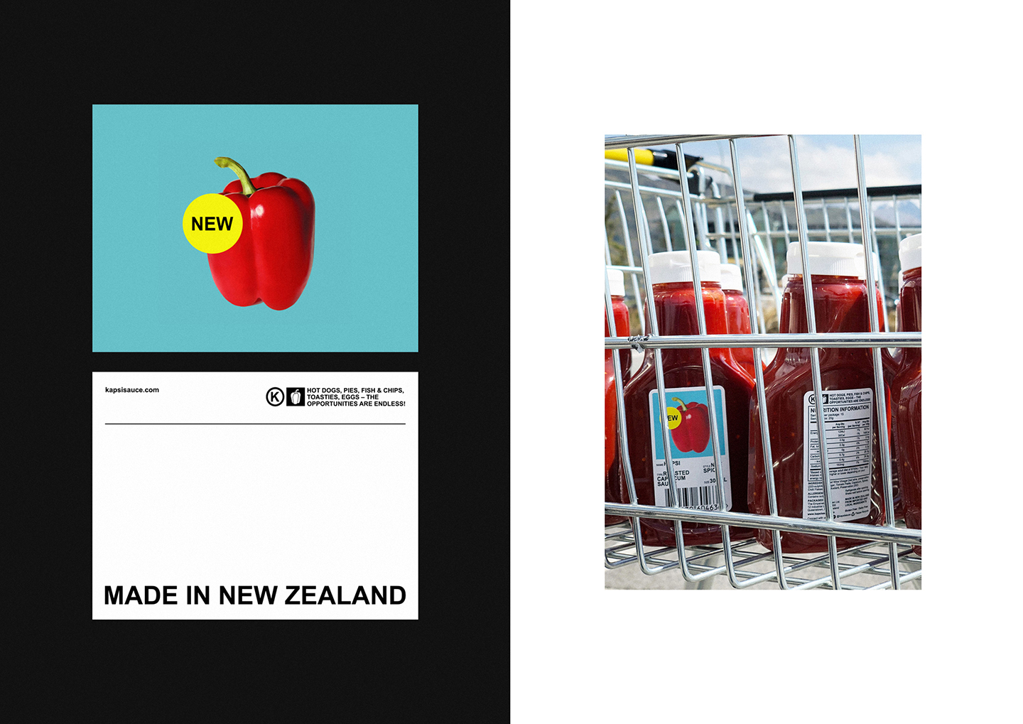
The originality of the packaging design is that the label does not follow the shape of the container. As a strategy, we choose a standard bottle to help Kapsi fit within the sauces category, but at the same time, we’ve decided that the label should not follow the shape of the container to stand out from the rest breaking all the design senses. The “New” statement at the front of the packaging reinforces that Kapsi is something new and different within the world of sauces. This decision is the final touch to respond to our client’s demand and show with the packaging design that “what you see is what you get”.
The result is weird and fabulous, the perfect balance to be memorable.
The Collaborators:
Creative team: Bren Imboden & Luis Viale
Instagram: @makebardo
Website: www.makebardo.com
Client: Kapsi
Instagram: @kapsisauce
Website: www.kapsisauce.com