Fresh from the Field — Michael McManus Architects by Grafik
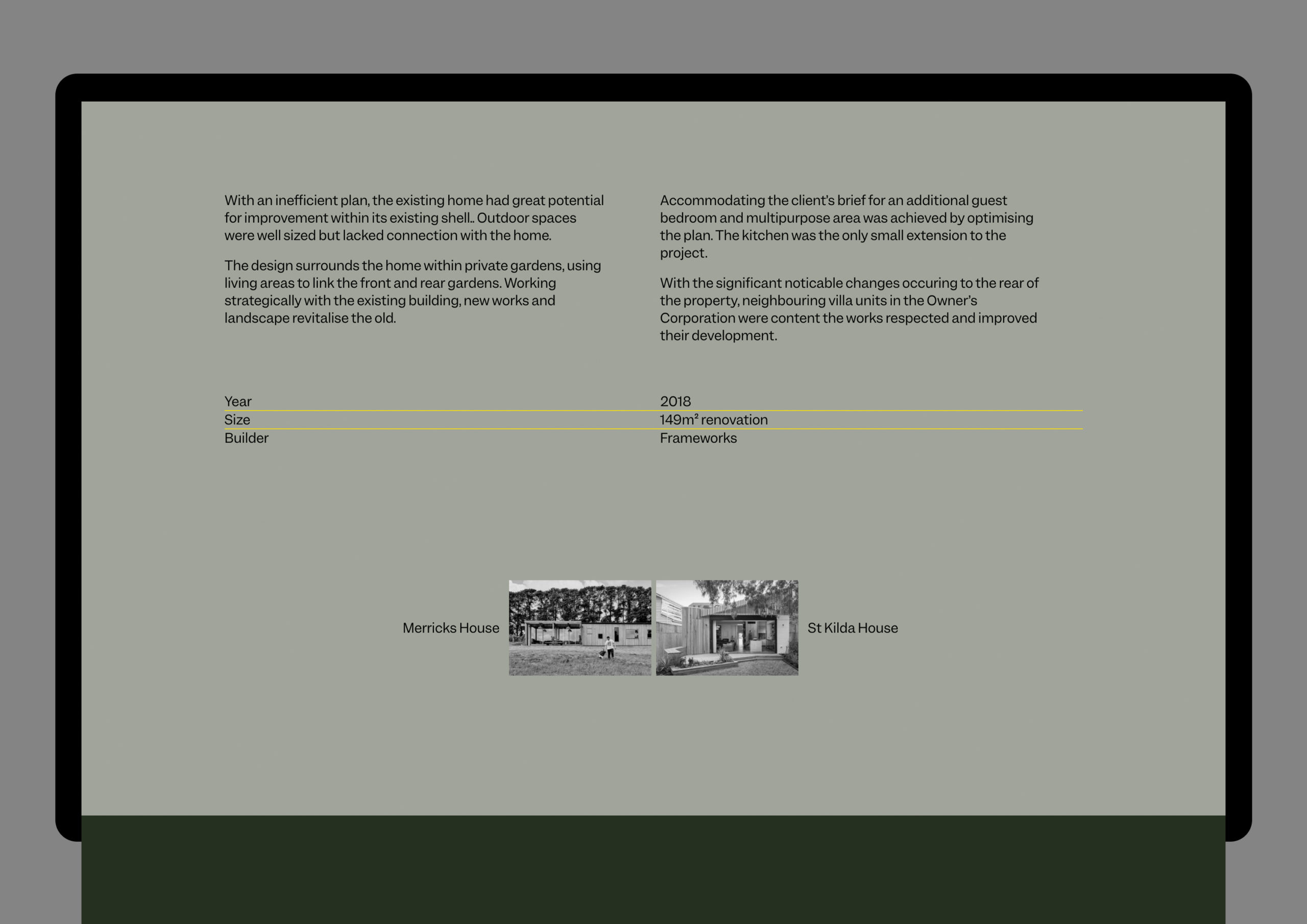
This Fresh From The Field features a bold and intelligent architectural identity and website by Nick de Jardine, Creative Director / Web Developer at Grafik.
If you have new or recent work that you would like to share in Fresh from the Field email nicole@designassembly.org.nz for details.
The Brief:
Michael McManus Architects is a boutique practice based in North Melbourne. Undertaking projects across Victoria, they seek to strike a balance between price point and environmental credentials.
New Zealand based Grafik was commissioned to produce a new identity and website for the practice.
The Response:
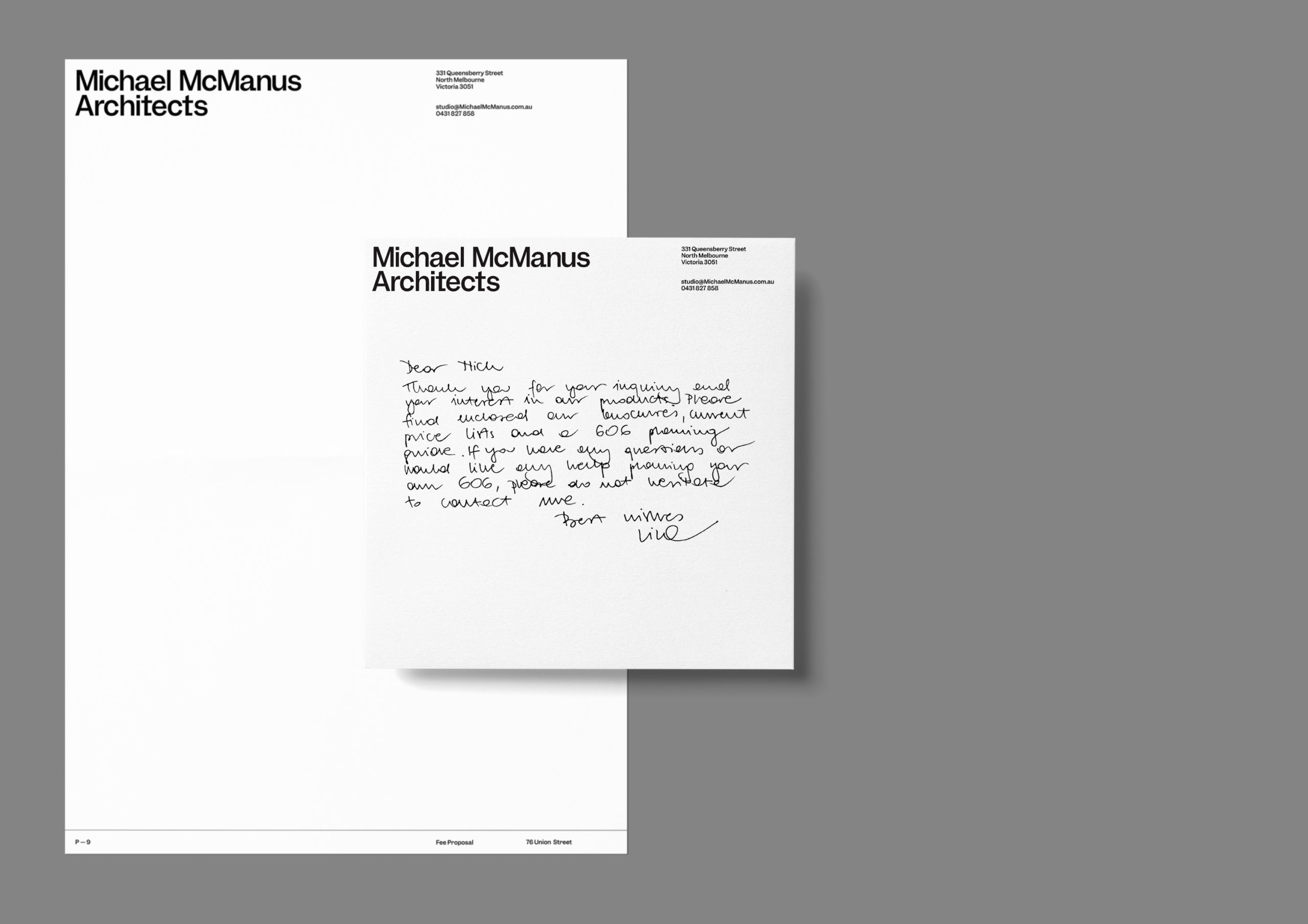
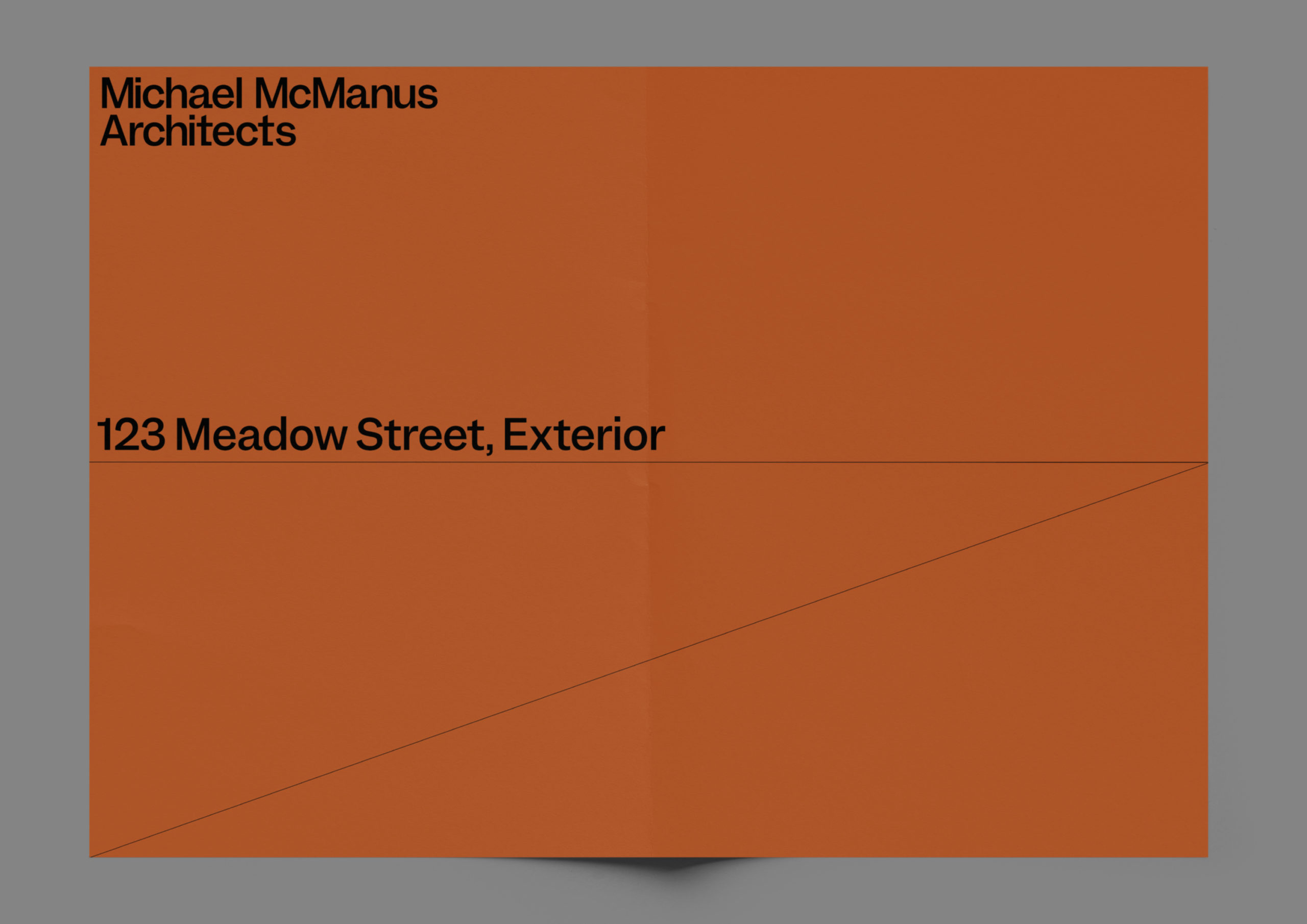
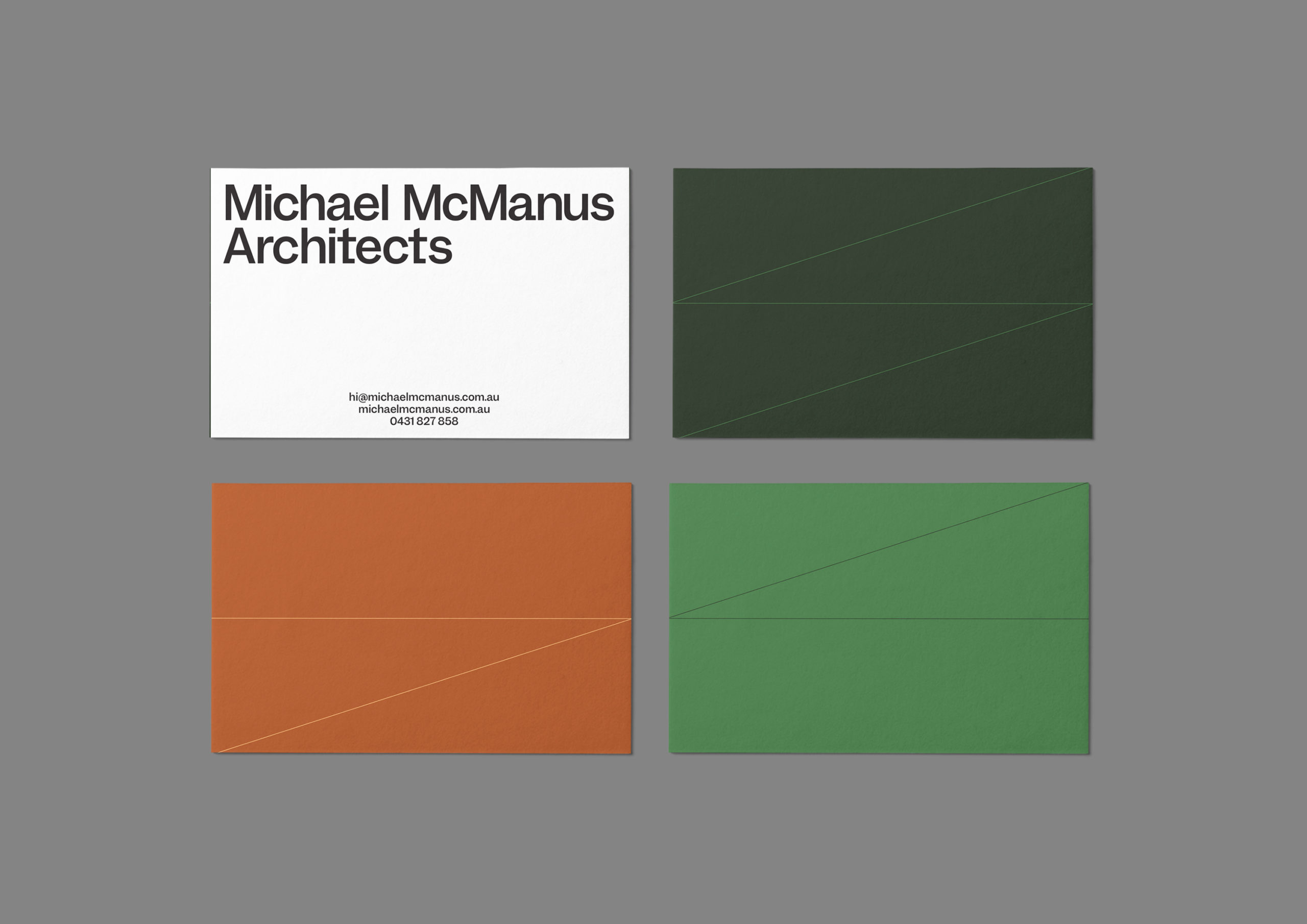
The logotype uses an enlarged tail on the letter ‘a’ to give the sense of careful detail that the studio is known for.
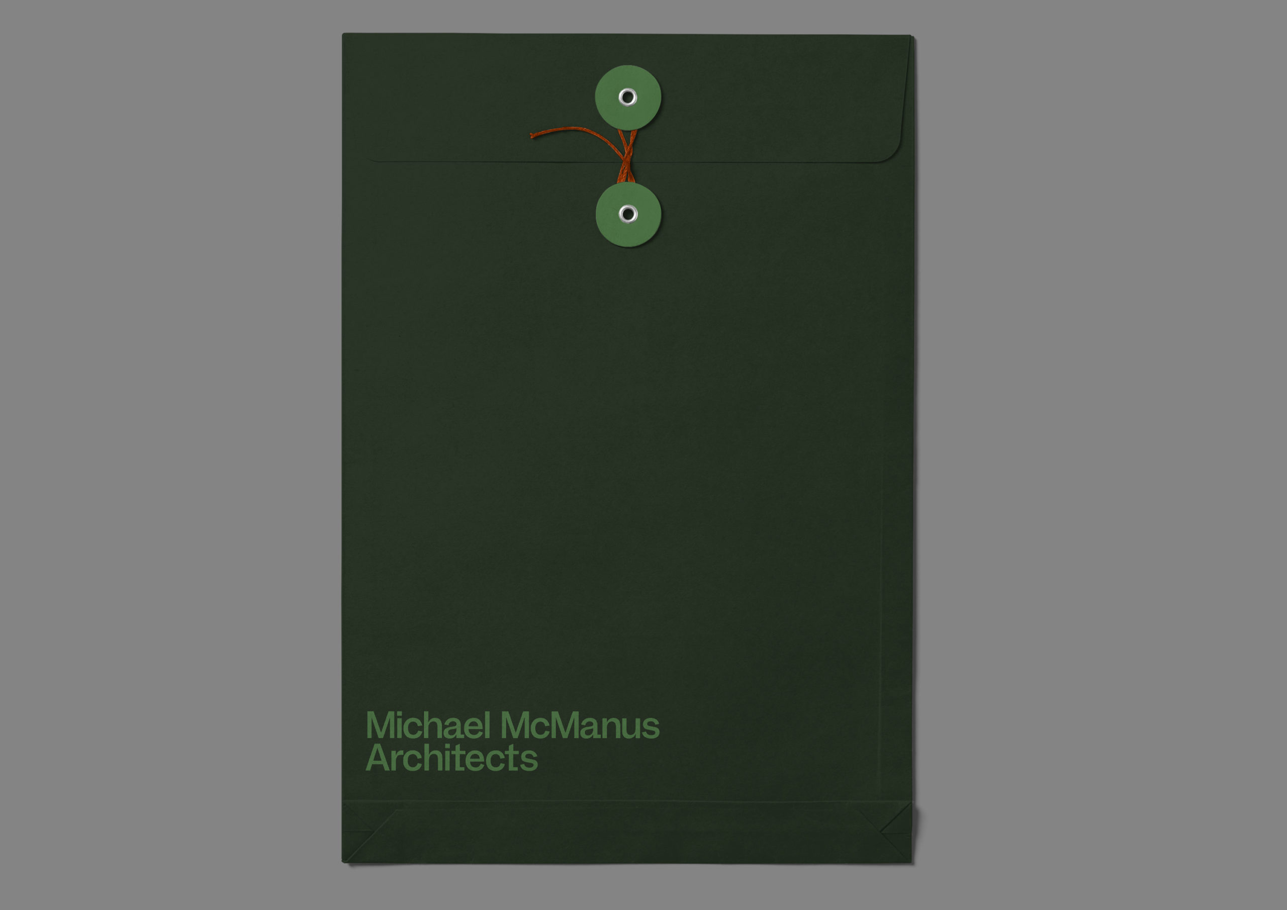
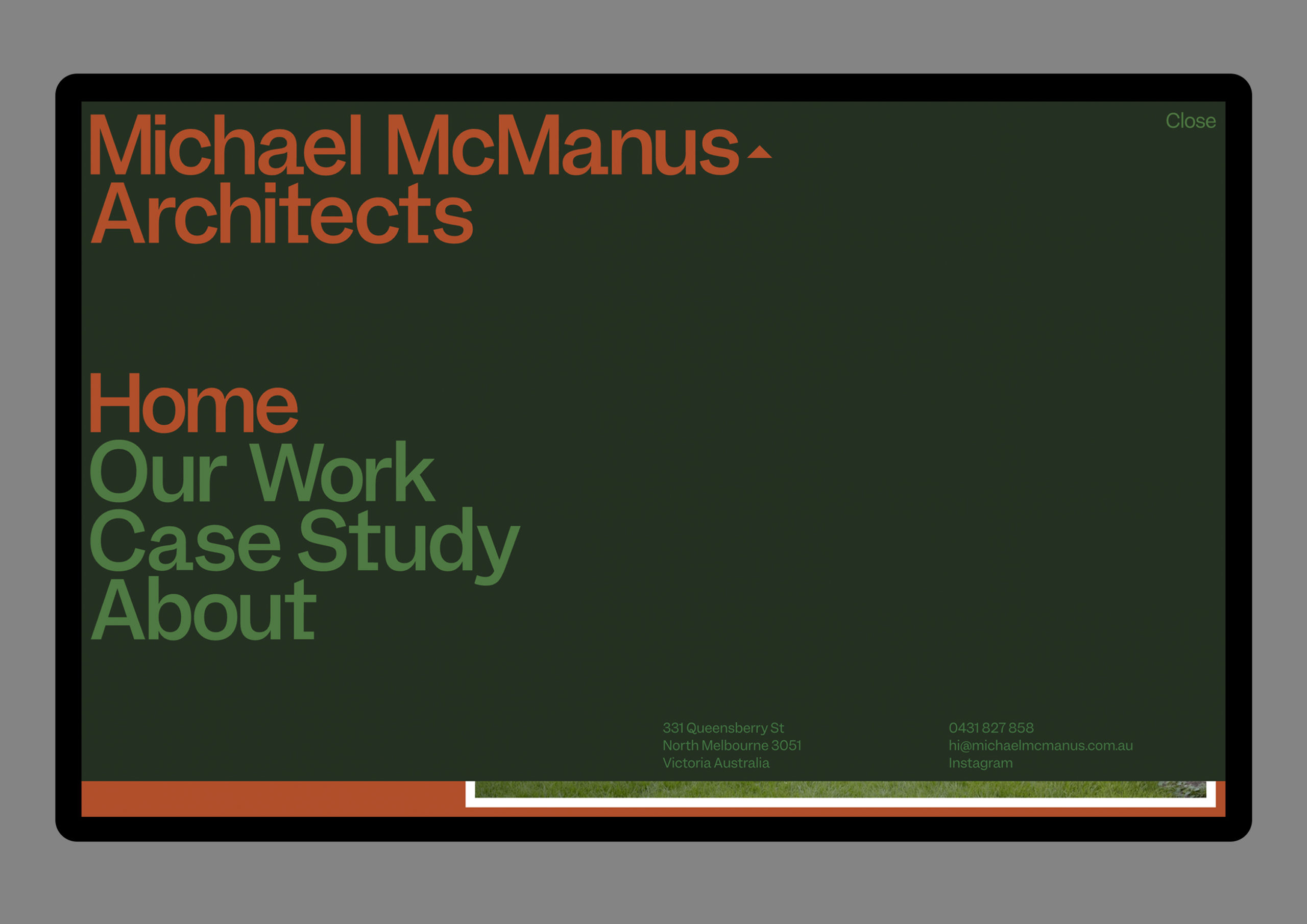
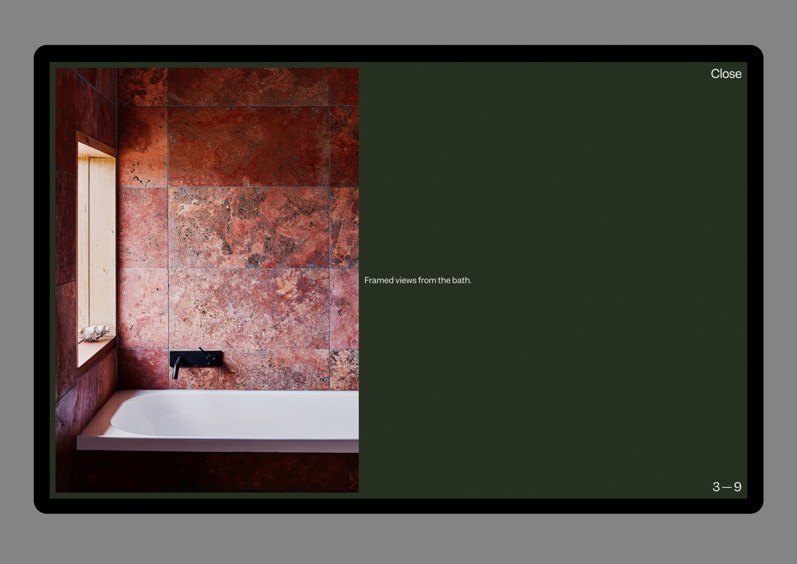
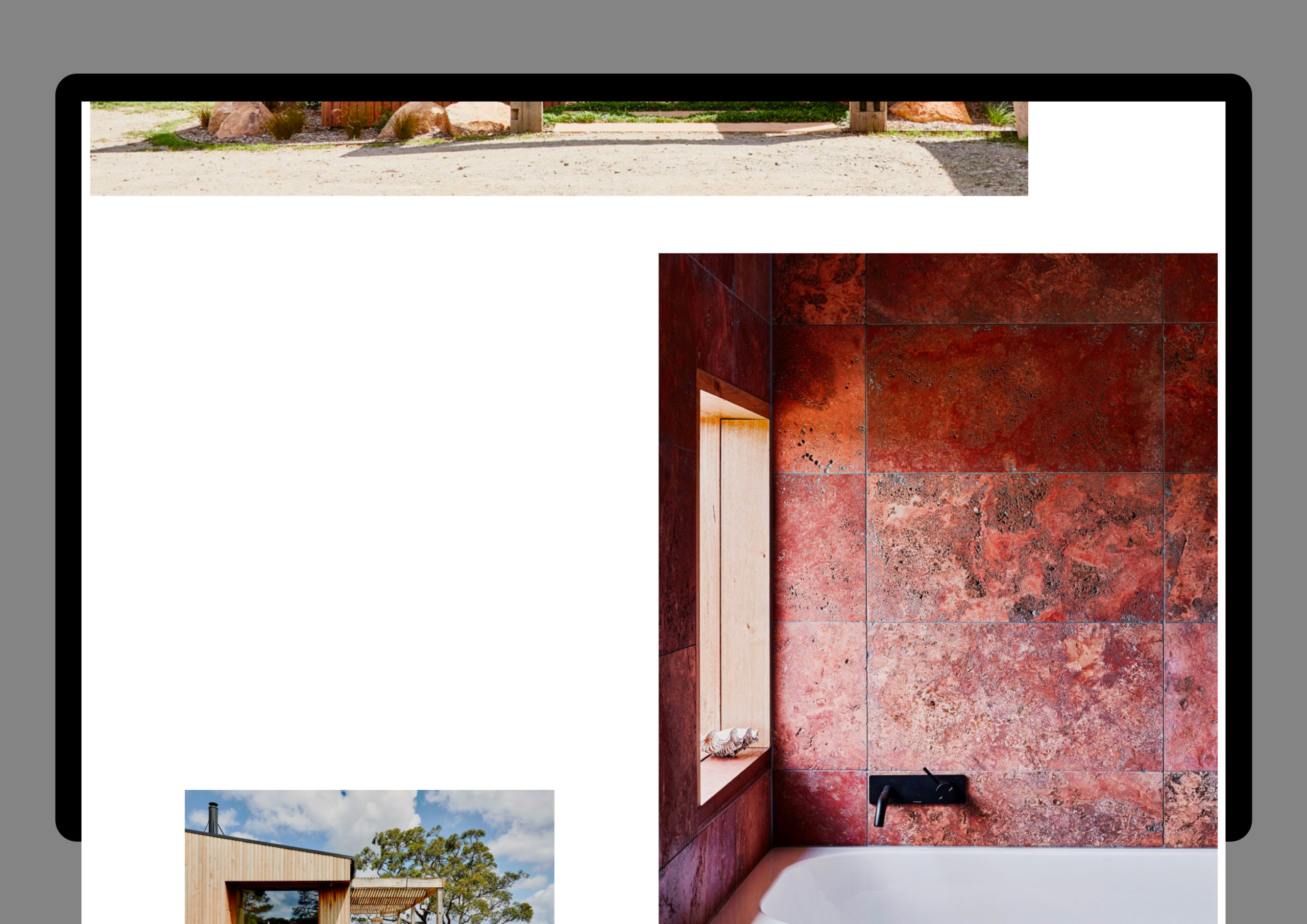
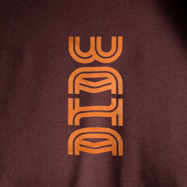
Architectural lines form the backbone of the visual system, with the linework subtly colliding with colour blocking and typography to build the characters’ MM’ (Michael McManus) and A’ (Architects). The bold typography is joined by a vibrant set of colours and clean interior photography to intrinsically represent the high-end nature of the work. This is designed to give the brand a highly-impactful presence across business cards, specification sheets and online.
The new approach combines a conversational balance of typography, layout and colour that challenges the grid-focused, black and white aesthetic common with many architectural practices and instead employes an engaging and vibrant direction that feels refreshing for the industry.
