Fresh from the Field — NoIssue by Pixelpush
In this Fresh From the Field, Pixelpush tells us how they helped their longterm client Noissue evolve their brand narrative with a fun, new cross-discipline explainer video full of intrigue to convert viewers to customers!
If you have new or recent work that you would like to share in Fresh from the Field email nicole@designassembly.org.nz for details.
The Brief:
Noissue is a custom packaging company that focuses on helping customers create their own sustainable & customisable packaging.
Pixelpush first made them a brand/explainer video in Dec 2017 to promote “Tissue, No Issue”, and that had helped to define the distinctive tone and voice of the brand and effectively turn curious viewers into actual customers.

Fast forward to 2019/20 (and various smaller/ social content projects later).
Noissue is now a well-established online custom packaging company with a sizable customer base and online following, offering various customisable AND sustainable packaging solutions to customers all around the world.
An up-to-date brand video was needed to reflect the shinier picture with new product offerings and a wider positioning while maintaining that same impression/feeling of the brand that customers have grown accustomed to.
The Response:
NoIssue with their intuitive online platform is a business that needs little explanation, so it made sense that the purpose of this video was less about informing and more about inviting.
Pixelpush were tasked to “intrigue”, evoke a sense of inspiration and momentum, and ultimately help encourage viewers to take the leap.
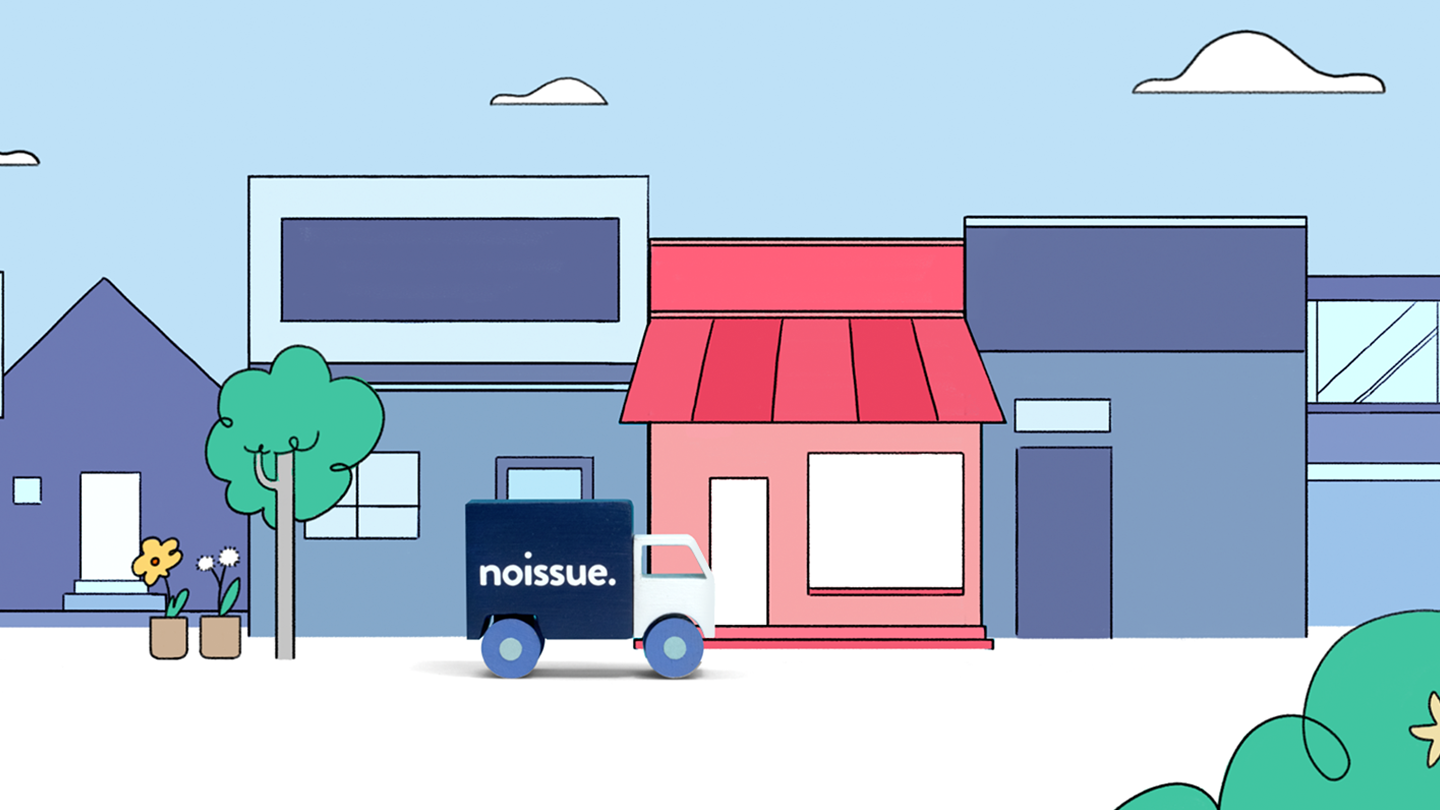
Knowing that the company’s offerings are continuously expanding, Pixelpush wanted to shift the messaging to a bigger picture:
Noissue wasn’t just about tissue papers anymore, they aren’t just a packaging company either. Pixelpush wanted to show how customers are able to elevate their brand through Noissue.

Idea & Script.
Working closely with the client, a script was crafted around the concept of having shared values that are relevant to customers, makers as well as merchants (everyone really). Featuring wrapping demonstrations with actual products from some of NoIssue’s existing customers from around the world, Pixelpush aimed to wrap the why, what and how in a charming showcase.
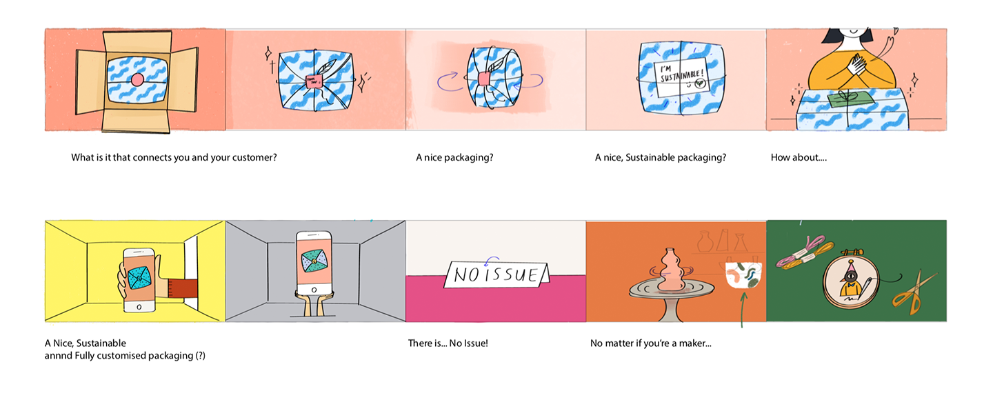
Design & Storyboard.
Expanding from the previous visual identity Pixelpush created for the brand, props and scenes were coordinated and designed to work with a broader but curated colour palette suggesting a sense of the endless possibilities yet maintaining the consistency in look and feel.
A more ‘graphical’ approach mixing hand-drawn, digitally created graphics combined with filmed assets enabled Pixelpush to keep the visual treatment vibrant and lively.
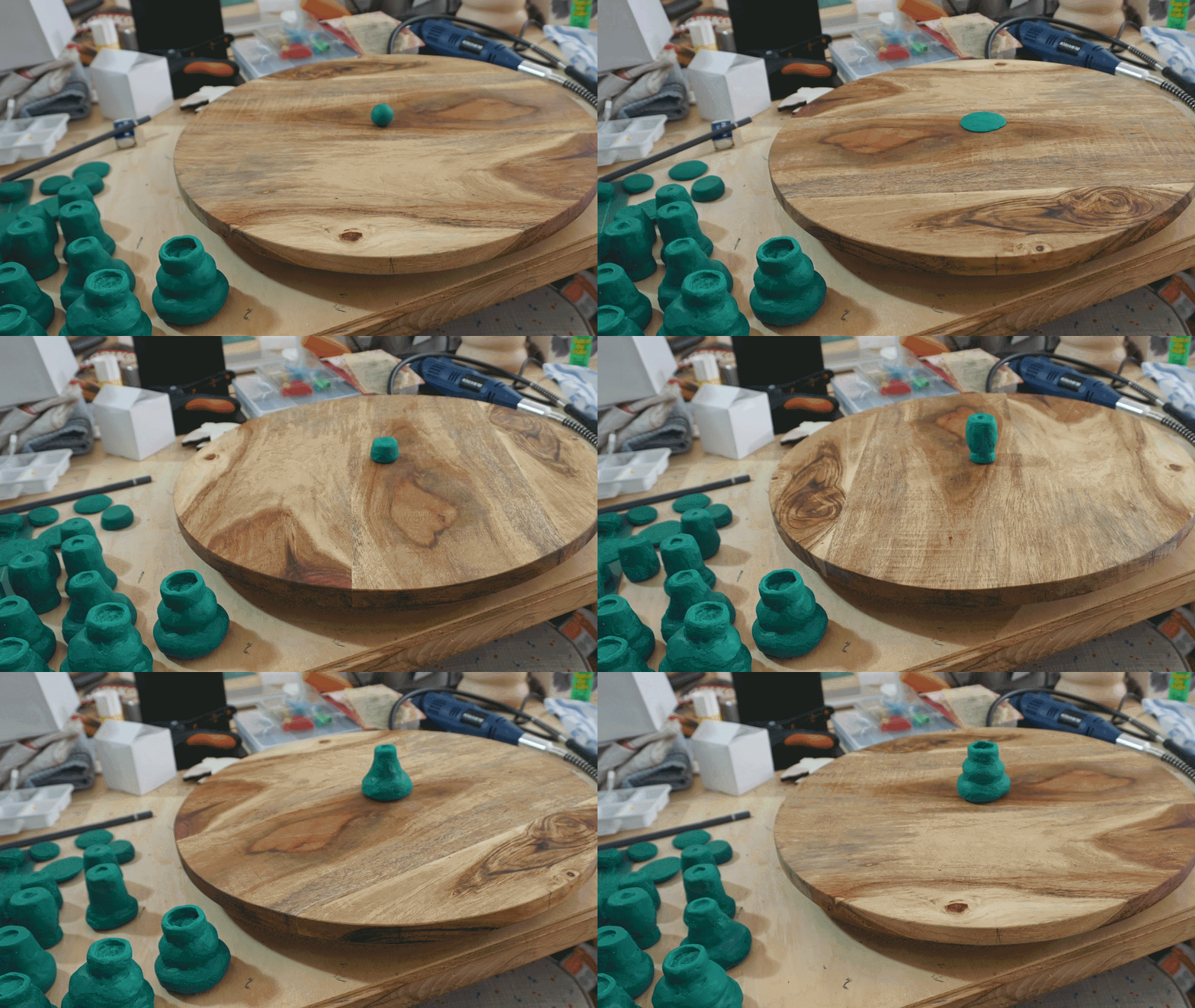
Making, Animating & Post-production.
To assemble the scenes, props, shapes and plates were handcrafted according to the styleframe.
For the featured products, many existing customers gladly agreed to have their products for us to use in the video, In some instances, we ‘reverse-engineered’ the steps to showcase the process in stop-motion.
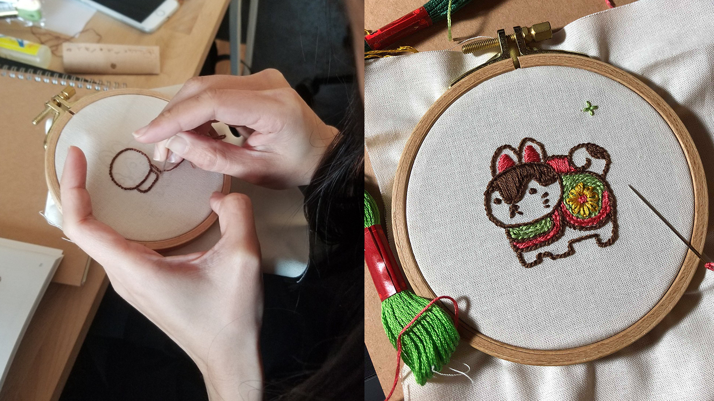
Animating and capturing stop-motion footage is always exciting and rewarding.
It requires Pixelpush to think on our feet, which often means solving problems with quick, makeshift rigs…. and heaps of blue tack.


To complete the picture, captured images were cleaned up and finished with digitally-animated elements and scenes, audio production;
A final, thick coat of Finesse and “tadaa…”


Watch the video here.
Collaborators:
Client // Noissue (Josh Bowden, Ben Conard)
Director // Siew Wee H’ng
Producer // Han Law
Art Direction // Siew Wee H’ng
Design // Huey Min Pon, Siew Wee H’ng
Animation, Prop & Post production // Siew Wee H’ng, Huey Min Pon, Han Law, Naomi Tjandra
Sound Design // Jhen Ken Thoo
Pixelpush is a multi-disciplinary motion design studio focused on creating charming content. Check out more of our work at pixelpush.co.nz
