Field Guide — Typographic Anatomy
There is plenty of Jargon (and way too many rules!) in typography which can be overwhelming when just starting out in design. You don’t need to be a specialist to typeset text, InDesign and Opentype features are making the selection and arrangement of type easier than ever. This page contains some foundational information for designers working with and talking about type, with the aim of making the practice and craft of typography more accessible. (If you geek out about type – or if youre just a little Typo-curious learn more about what is going on in the world of type over at TypographHer.com

Legibility and readability are closely related but not the same. The degree to which a typeface is legible is controlled by the face’s designer. While readability is controlled by the designer of the layout. Legibility primarily describes how easily distinguished the letterforms are individually and when collected together how efficiently word-shape recognition is achieved. The x-height is one of the most relevant value for increasing the reading comfort. Open apertures and generous counterspaces improves legibility and letterform recognition.
The typeface is what you see, the font is what you use. A typeface is a design – It is the shape, style, and overall appearance of a collection of characters. Not to be confused with font. A font physically is a set of metal sorts or digitally is the software you install on your machine.
In layout space creates relationships between content. These unifications and divisions convey meaning, engage the reader and make pieces of information easily understood and digestible.
Alignment is the arrangement or form of type and content. Used in typographic terms alignment of text is left and right ragged, centred and also justified. The Measure is the width of a block of justified text or the length of each line of characters in a ragged paragraph. The measure of a line should never be more than 8-12 words (or the line length becomes too long and text becomes hard to read).
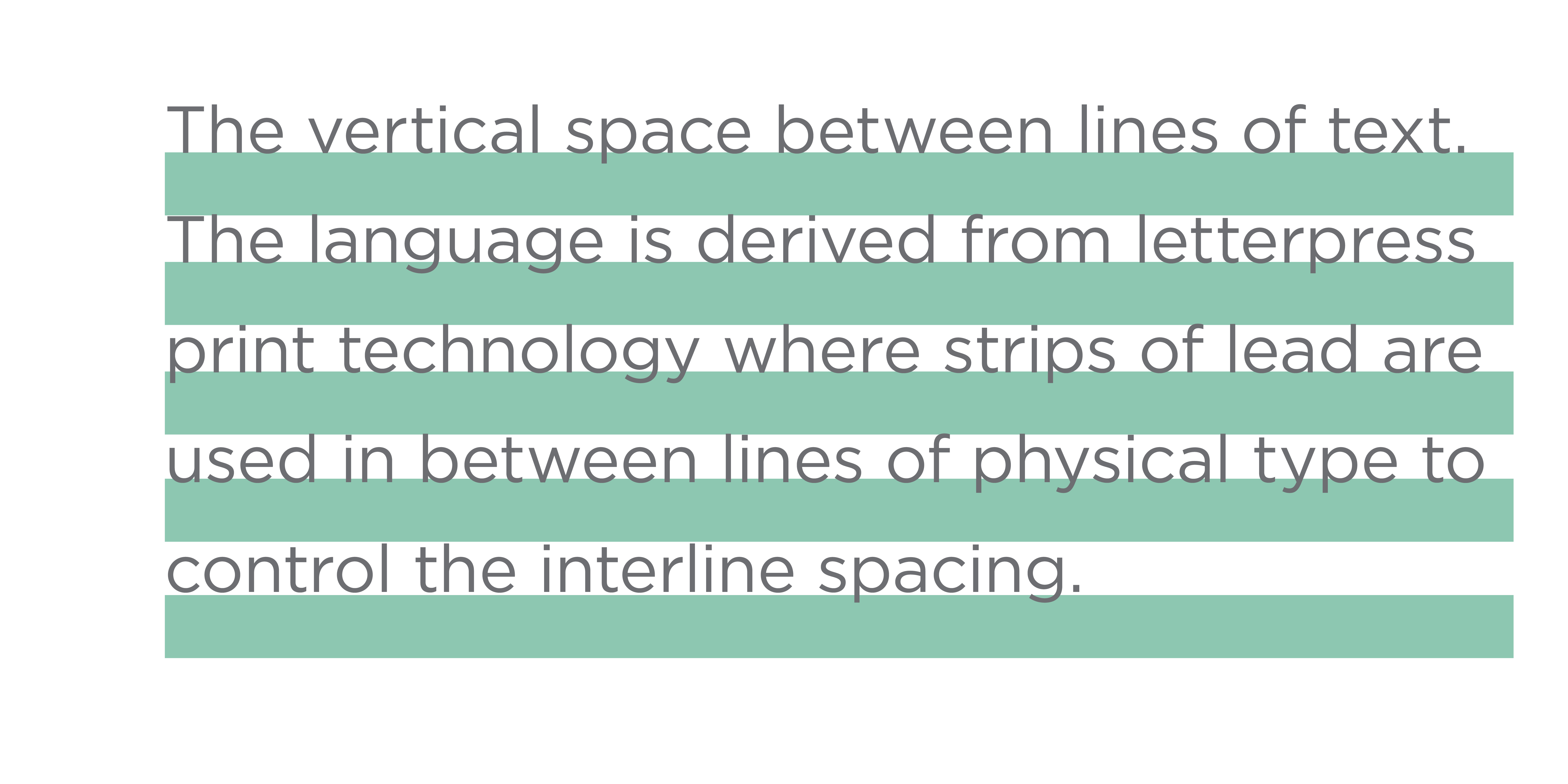
The vertical space between lines of text. The language is derived from letterpress print technology where strips of lead are used in between lines of physical type to control the interline spacing.
In Western society our eyes are trained to sweep along a parallel line of type in subtle jumps, darting back and forth as our eyes search for word recognition.

With too much leading our eye gets lost in the channel. Too little lead and our eyes don’t have enough room to scan for the word recognition.
Widows (usually refer to a single line) and orphans (usually refer to a single word), but sometimes these terms are used interchangeably… widows and orphans are fragments, they are lines or words separated from the text to which they belong. You can use hyphenation, justification settings, or sometimes a forced line break, to fix these up to rejoin the lonely word or line with the remaining text.
Tracking is letter-spacing and adjusts space uniformly throughout a paragraph or line of text. Kerning also adjusts space, but it specifies the relationship between a pair of characters.
When spacing is too tight (and words or letters set too closely together), text is indecipherable; when spacing is too open text can become awkward to read.

In justified paragraphs the word spaces are inconsistent to achieve the solid edges to each line, these can create rivers (organic vertical gaps in typesetting), which appear to run through a paragraph of text, due to a coincidental alignment of spaces. Rivers make it tricky for the readers eye to follow the channel created by the leading.
Visual rhythm is created by the repetition of elements. Rhythm creates a sense of movement, and can establish patterns, texture and paths of navigation to guide the reader. Rhythm has significant impact on reader experience. Space defines the rhythm of a text. Justified text relies on hyphenation to ensure an even colour. Typographic colour describes the relative lightness or darkness of a block of text. Letterspace, wordspace and the leading create rhythm and inform colour.


