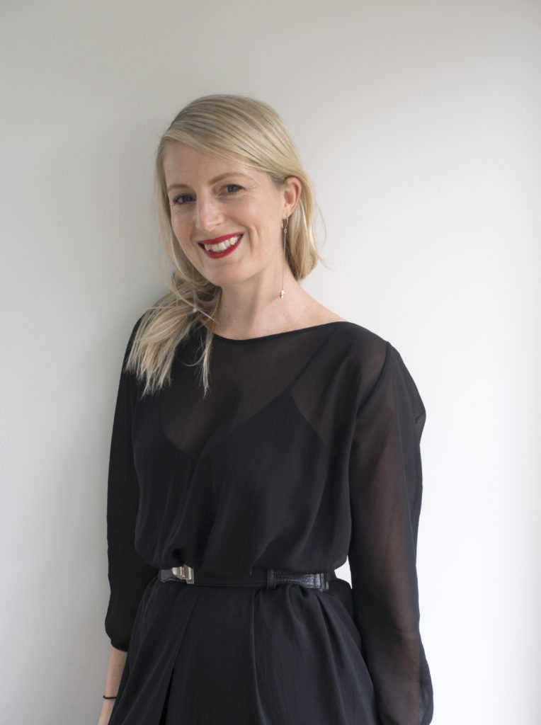
5 minutes with… Keely O’shannessy
The PANZ Book Design Awards were established by the Publishers Association of New Zealand (PANZ) to promote excellence in, and provide recognition for, the best book design in New Zealand.
Innovative design combined with impeccable production standards made the task of whittling down a shortlist challenging for this year’s judging panel who spent a day pouring over beautiful books to create a shortlist of 33 finalist titles.
Convening judge David Coventon said: “Our four judges, from varied fields, enjoyed a day of discussions and deliberation over this year’s entries. Competition categories were familiar, yet judges agreed it’s good to see a number of new names appear across the colophons and categories. Some beautiful design solutions were both discovered and discussed – with the children’s category in particular full of strong entries – the design community is clearly nurturing a support of, and strength in, the publishing industry.”
Design Assembly was thrilled to see so many of our DA friends listed in the PANZ BOOK DESIGN AWARDS shortlist. As we read through all the books nominated Keely O’shannessy’s name came up time and time again with 4 books in the running for 5 awards, 4 of which are shortlisted for Best Cover.
Ahead of the announcement, we caught up with Keely to learn more about her career journey, design methodology, production methods and the challenges of distilling a manuscript down to a successful cover design.
What is your background and how did you get into book design?
I completed a fine arts degree in Auckland straight out of high school then moved to Melbourne to do a postgraduate course in Electronic Design and Interactive Media. After that I worked as a video artist and multimedia designer. I got into book design when I moved back to Auckland in 2006. A friend of mine was working at Penguin and asked me if I’d like to design some books and covers for them. I had recently seen the exhibition ‘Communicate: Independent British Graphic Design since the Sixties’ at the Barbican Art Gallery in London and I was very inspired by the book cover designs on show. I remember thinking what an extraordinary, perfect medium it was – it seemed like such a special and creative form of graphic design. So I was very excited to be offered the opportunity to design some book covers myself.
What project, personal or professional, are you most proud of and why?
This is a very difficult question! I don’t think there is a single project that I am most proud of. I was very proud of my exhibition ‘Lost and Found’ that I put together in my final year at art school. And I made this cool interactive artwork called ‘Alice’s Conversations in Cyberspace’ which was exhibited at CCP in Melbourne when I was living there. Both of these things felt perfect and complete (like I had created the exact thing that I had set out to create and there was nothing more that needed to be done to them. They seemed flawless). I aim for this with every professional project that I work on too. And, happily, I have managed to achieve this with quite a few book covers over the years. I feel most proud of my work when it manages to bring together a thoughtful, considered concept with a striking, appealing, polished aesthetic.
I love the striking typography you have employed in ‘Feverish’ Can you tell us a little about the brief for this project and the design process?
For Feverish, VUP simply said that they were ‘thinking of something quite abstract, suggesting brain fever, burning, dissolving’. I loved this idea and thought that I could approach it in a couple of ways – either with an abstract image that evoked this feeling or otherwise by applying it to the typography. Before I started, I really tried to remember how I’d felt when I’d had a fever – I recalled that hot and cold, burning and melting, blurry and hallucinating feeling.
I tried a few different things before I got to the final cover but the process was actually fairly straight forward – we got there quite quickly. 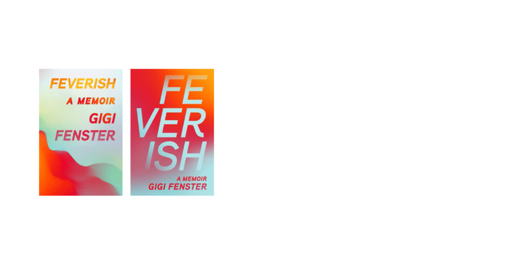
Feverish Concepts Above, and Final Below.

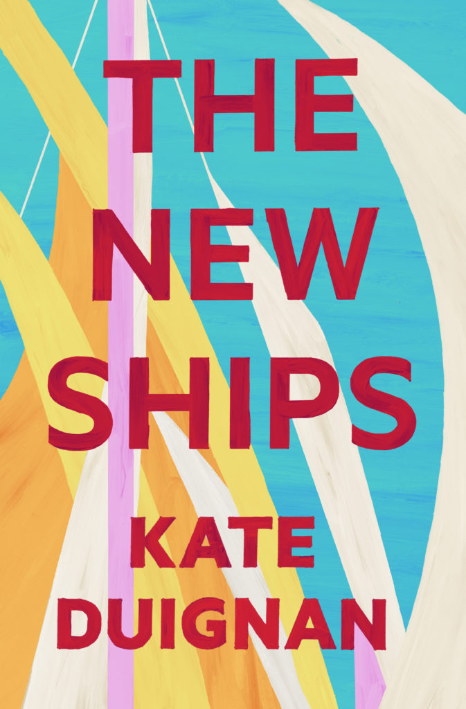
‘The New Ships” also employs bold typography this time delightfully hand painted. What lead you to this analogue production method – and what do you hope the painterly approach conveys to prospective readers?
Every brief for a cover is different. For this one, I was given quite a lot of direction. Fergus Barrowman and Ashleigh Young from VUP said that there were ‘literal ships in the novel – a US naval ship, an Amsterdam houseboat, a Wellington-harbour yacht’ but that they’d ‘like to take a general and abstract interpretation to this theme via a cover of billowing sails.’ They also said they wanted something ‘contemporary, clean, crisp’, ‘a bright, modern, colourful or stark colour palette – just generally striking and eye-catching’ and they also suggested that it could have a painterly feel (as the protagonist’s wife was a painter and there were a lot of references to art in the book).
I initially imagined something far more geometric, minimal and pared back. And something that had a cooler colour palette to reflect the sad overtones in the novel

But we were all happier with the more organic, colourful covers. (Here are a few variations of the refined concept along with the final cover)

‘Pasture and Flock’ is incredibly tactile, utilising hand lettering and vernacular illustration block printed on a textured paper. Why did you choose block printing for this text and what (if any) were the challenges in the design development for this project?
The brief for Pasture and Flock was very open. I read the poems and came up with a few different ideas including using a photograph that the author had supplied by Tracey Williams and a few paintings by Monica Rohan. However, I had also been told that the author, Anna Jackson, really liked the idea of having chickens on the cover. I was initially confounded by this idea because, as far as birds go, chickens are not the most elegant or poetic. I was also told that it shouldn’t be ‘too pretty’. So I decided that the way forward was to create something that was very stylised and hard edged (rather than soft or painterly). The artwork for the cover is not actually a woodcut but it is modelled on that aesthetic. I drew it in Illustrator and then applied a number of textures to make it look that way. The most challenging thing about creating the artwork for the cover was getting the grass right – it took forever – I drew all of those little blades individually!


In ‘Whatever it takes’ cover we see John O’Shea’s dedication to capturing the perfect shot! How do you go about distilling a books manuscript into the perfect image for a cover?
This is a good question and it is certainly not always easy! However, in this case I had the luxury of having the image supplied to me by the publisher. The image I was given was very damaged so it took quite a bit of time to get it respectable enough to use for the cover. And then I hand-coloured it. The brief was to use that image and create something that referenced the poster for one of John O’Shea’s classic films Runaway (without it looking too derivative or period – in the end the reference was quite subtle).


As designers, we are often personally invested in our work… Did you have any cover concepts rejected for these 4 books and if so are there any that you were particularly excited about/attached to?
This is so true. But actually, with these four books I was very happy with covers that made it to print.
Design Assembly wishes Keely and all the finalists the very best of luck for the awards evening where the winners will be announced at a special ceremony in Auckland tonight.