Fresh From The Field — Sincerity/Irony Heldane Specimen Book
This edition of Fresh From The Field features a delightful type specimen book for Klim’s Heldane as a collaborative work with NZ poet Hera Lindsay Bird designed by AltGroup.
If you have new or recent work that you would like to share in Fresh from the Field email Louise for details.
The Brief:
The type specimen is the accepted way to illustrate a typeface’s constituent parts. It’s been this way for years, decades, centuries. A specimen sheet, or its digital equivalent, lets you illustrate, typically to an audience of graphic designers, a type family’s constituent parts – the weights and styles, ligatures and numerals, all set in different point sizes. But what do you do if you want a wider audience to know about the craft of designing type?
Wellington, New Zealand-based type designer Kris Sowersby, from Klim Type Foundry (Klim), has been recently experimenting with new ways of pushing his typefaces out into the world. In 2017, his typeface ‘Untitled’ was an inaugural exhibition at Auckland design gallery Objectspace. In 2018, ‘National 2’ was the subject of another gallery exhibition about the relationship between national identity and type. (The British have Gill Sans, the French, Garamond, the Italians, Bodoni, the Swiss, Helvetica. Is there a relationship between a typeface and place? Can a typeface have a regional accent?). The exhibition, ‘There is no such thing as a New Zealand typeface’, went on to win a Purple Pin, New Zealand’s highest graphic design honour and has recently been short-listed for an ADC award.
For his new typeface, Heldane, a serif that took 10 years to research and draw, Sowersby was interested in making a more literal fusion of New Zealand arts and letters.
The Response:
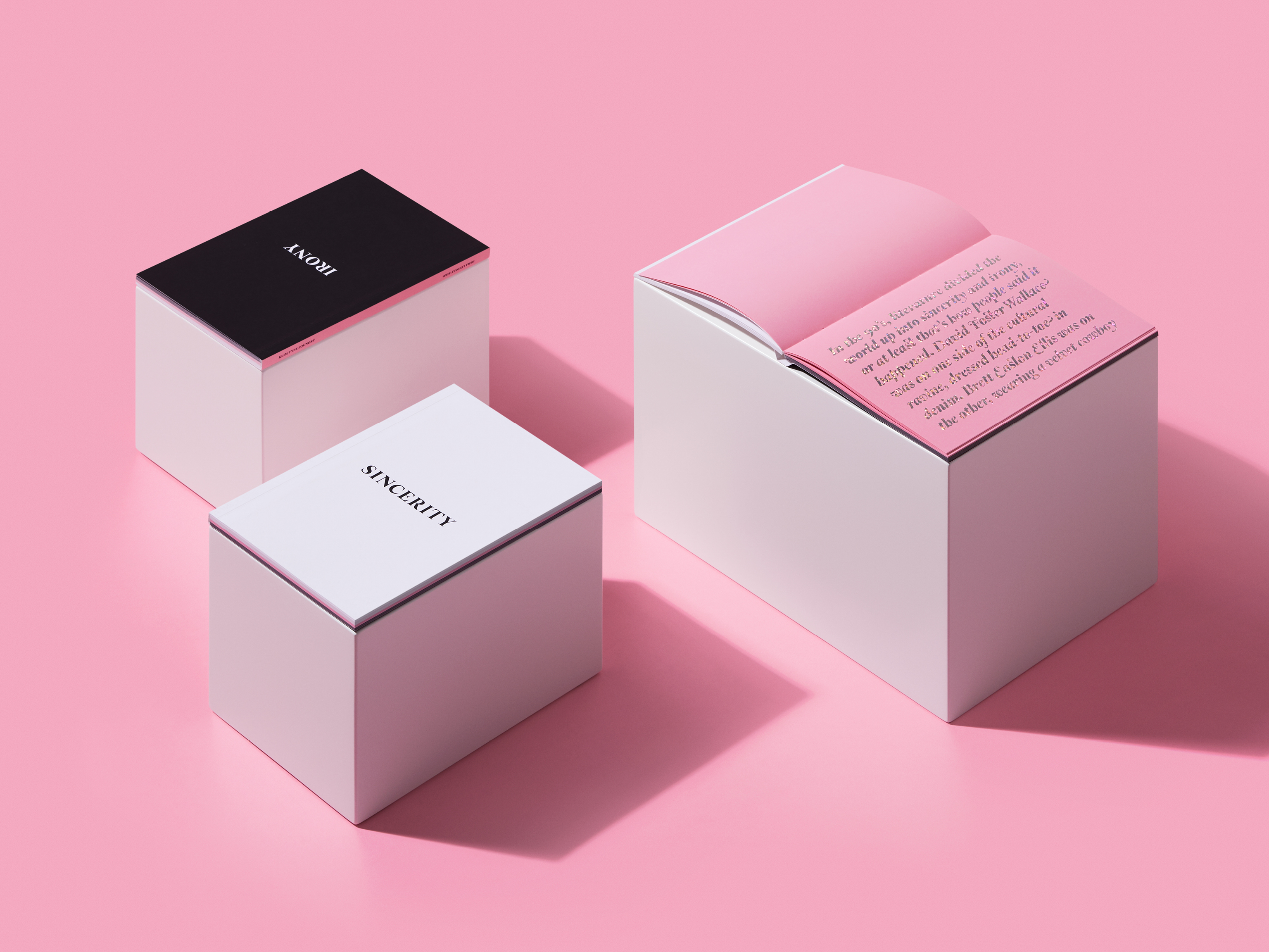
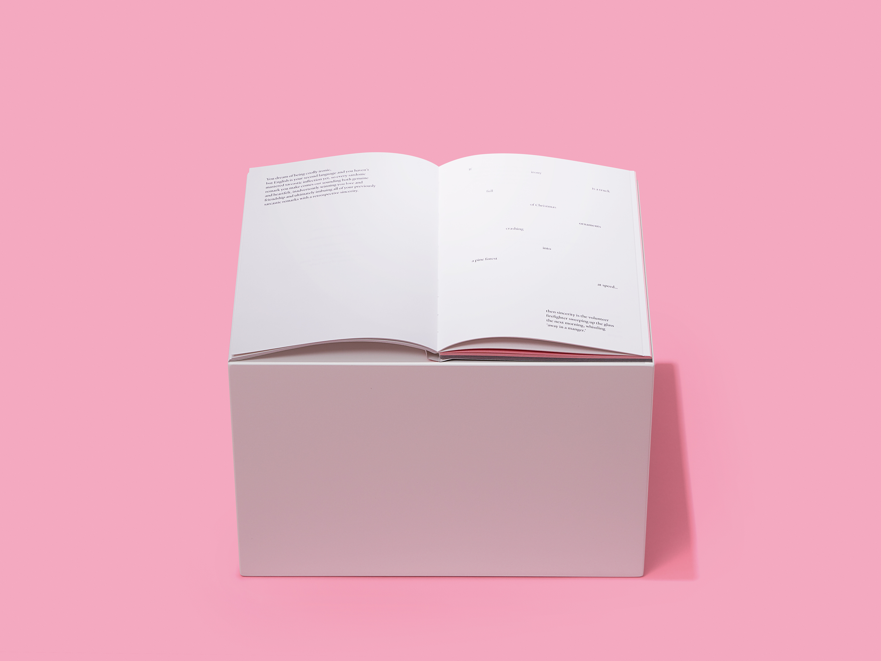
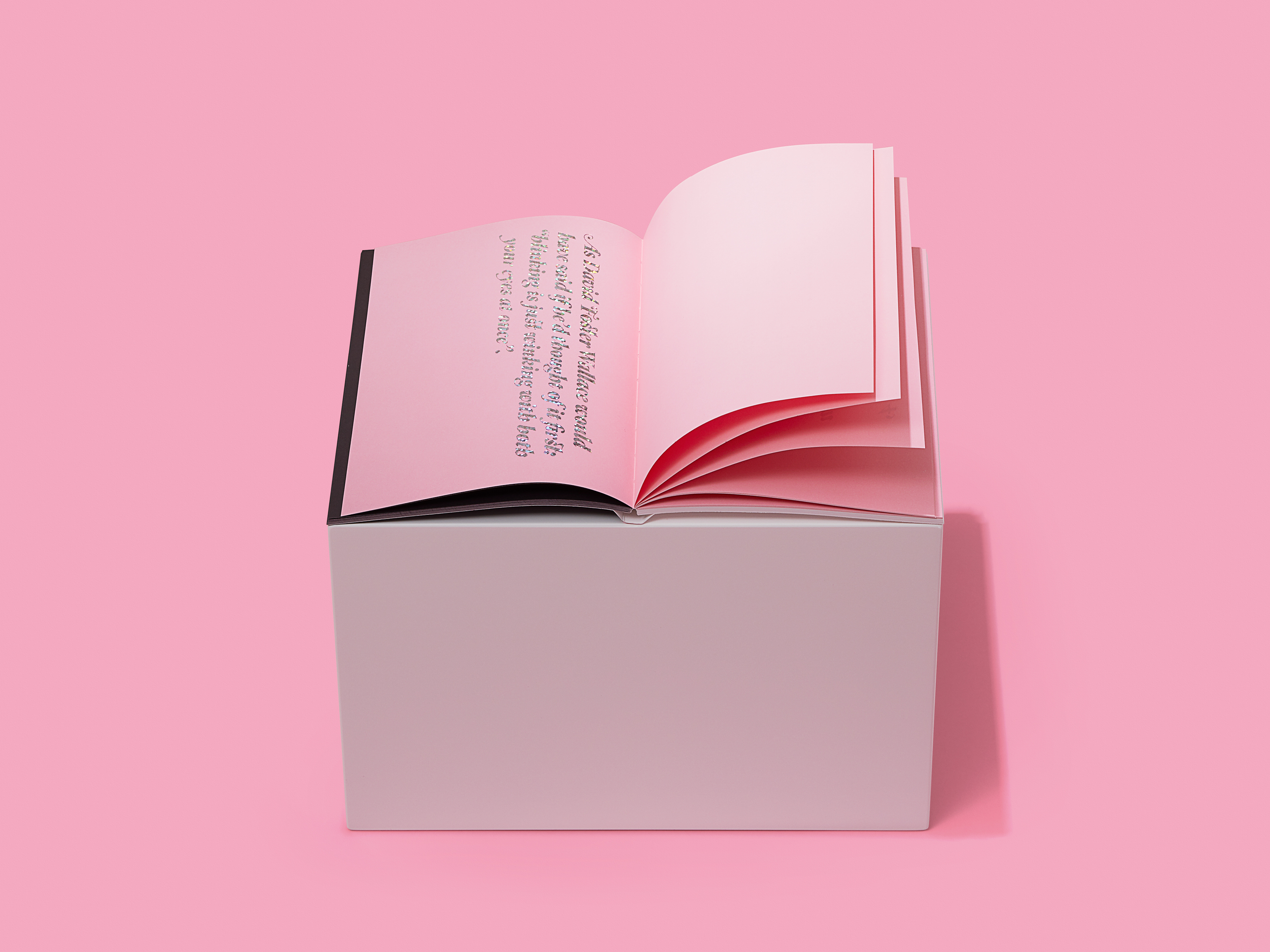
The typeface’s characteristics are especially suited to text and display. Thinking of ways to illustrate these qualities Klim approached Hera Lindsay Bird, a leading contemporary poet, to see if she would be interested in collaborating on a publishing project. Sincerity/Irony is the result – a book written by Bird that was designed and set by long-term Klim collaborators, Alt Group, to show the range of Heldane’s talents.
In the book, Bird mines the absurdity and humour of sincerity and irony. The texts start at opposing ends, before meeting and muddling in the middle, decked out in a spray of Heldane in rainbow glitter. “I’ve always been interested in the relationship between sincerity and irony in literature. Sometimes it’s impossible to tell where one ends and the other begins,” Bird says. “People talk about them like they’re contradicting forces, but I love the grey area in-between, where the mutations occur. I still don’t really know what irony is. Is that ironic? Probably not.”
Of the collaboration, Bird says, “It was really exciting to work on something outside the scope of poetry. I have always loved the quick brown fox AND the lazy dog he jumped over, so it was great fun to create a text where the typeface was the central focus and things like punctuation, font size and italicisation took on greater import.”
The Sincerity/Irony book is available exclusively via the Klim Goods Store.
The Production:
Book size: 210mm × 150mm × 10mm. 300gm.
Cover: 324 gsm Mohawk Super Fine Smooth Ultra White.
Text pages: 120gsm Munken Polar. Offset printed, foil-stamped. Lay-flat binding, sewn signatures.

About Heldane:
Klim Type Foundry’s Heldane is a contemporary serif typeface with serious Renaissance antecedents.
The typeface represents the culmination of 10 years’ work by type designer Kris Sowersby, during which time type he analysed, interpreted and rigorously redrew aspects of Renaissance typefaces designed by Hendrik van den Keere, Claude Garamont, Robert Granjon and Simon de Colines.
“Heldane is a hybrid, a bastard, a fabrication,” Sowersby says. “I vultured my way through history, picking the bones from old fonts to make something new. I hesitate to call it original, but it is new. I used to say Heldane is ‘my Garamond’ as a shorthand explanation, despite having very little to do with Garamont’s work. But it’s very much in the garalde genre. I’ve drawn fuzzy golden threads from his contemporaries to weave my own texture.”
Heldane is available in two families: display and text. The fine detail and tight spacing of Heldane Display is best expressed at large sizes, while Heldane Text thrives at smaller sizes, taking stylistic cues from the display cuts, but with an additional focus on optical functionality.