Postcard from Blighty: Bletchley Park brand identity
Written by Nigel Smith
Nigel Smith is the Director of Transformer Design in Auckland and currently lives in England. In this series he shares his views and opinions on graphic design work, exhibitions and conferences that he comes across.

Bletchley Park brand identity
I came across this excellent brand identity while visiting Bletchley Park museum in Milton Keynes, UK: Bletchley Park is the famous WWII home to the Allied code breakers. They cracked the German’s incredibly complex Enigma codes by using machines that have become known as the forerunner of the modern computer. The role of the code breakers was top secret during the war but is now acknowledged to have been a vital part in turning the tide of the war in favour of the Allies. Alan Turing is the most famous of the code breakers, but there were in fact over 13,000 people per day working at Bletchley during the war.
As a museum it’s been steadily growing visitor numbers and, in recent years, has had a major overhaul leading to this rebrand. The movie The Imitation Game released in 2014 also gave Bletchley a new audience.
The branding work was created a couple of years ago but I hadn’t seen it before so it came as a nice surprise when I visited Bletchley Park recently. The identity was done by Rose, a London design agency with a long track record of museum work including The Tate.
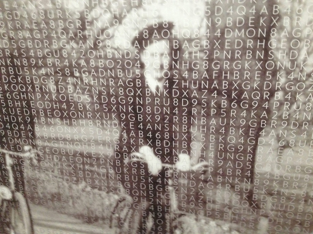
The Bletchley identity makes use of patterns formed by sequences of letters and numbers. By highlighting some of these characters shapes are cleverly made on the way-finding signage and large format display panels. Arrows and large numbers have been made to appear by highlighting pairs of this grid.
Rose say, “What made the people of Bletchley Park so special, was their ability to recognise patterns in code. The new identity provides an insight into what code-breakers faced, and allows the public to experience the revealing of patterns within the code, and the Park’s extraordinary stories.”
The power of the identity is enhanced by its clever, consistent application to everything from stationery, to uniforms to merchandise.
It’s a simple idea but a clever one. The kind of idea I look at as a designer and think, “Why didn’t I think of that?”. It shows the power of a great idea, well executed.


