Fresh from the field — Maven from Onfire Design
This week’s Fresh from the Field reveals a 3-dimensional graphic design project completed by Onfire Design for Maven.
If you’ve got new or recent work that you’d like to share in our weekly Fresh from the Field series email Zoë for details.

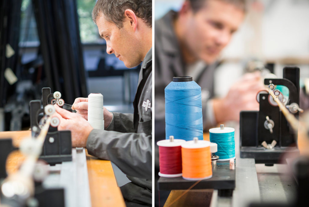
Located on the edge of native bushland in Auckland, Maven handcrafts some of the most sought after fishing rods in the world.
Using the very best rod componentry to deliver unmatched quality and performance, Maven sought a graphic design partner that would share its ideals. That company is Onfire Design, in Birkenhead, on the North Shore.
As Maven’s Gayleen Pratt, says, “Our vision for Maven was to build a unique range of top-end fishing rods that were unlike anything in the market. We were after a retro-cool design aesthetic, a strong New Zealand identity, and signature details that would really make them stand out. Onfire understood our direction perfectly, and delivered a carefully considered range of designs, as well as some challenging ideas, such as a pinstripe along the full length of our rods. After many iterations of prototypes and testing, the results were stunning.”
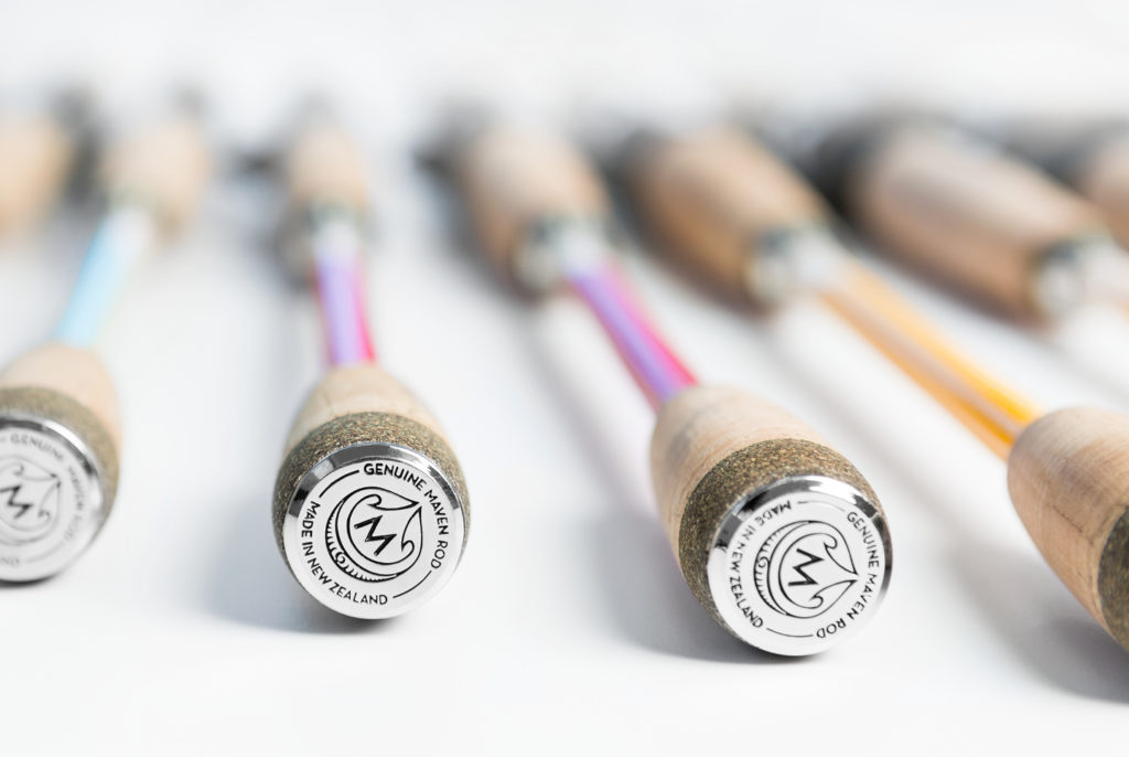
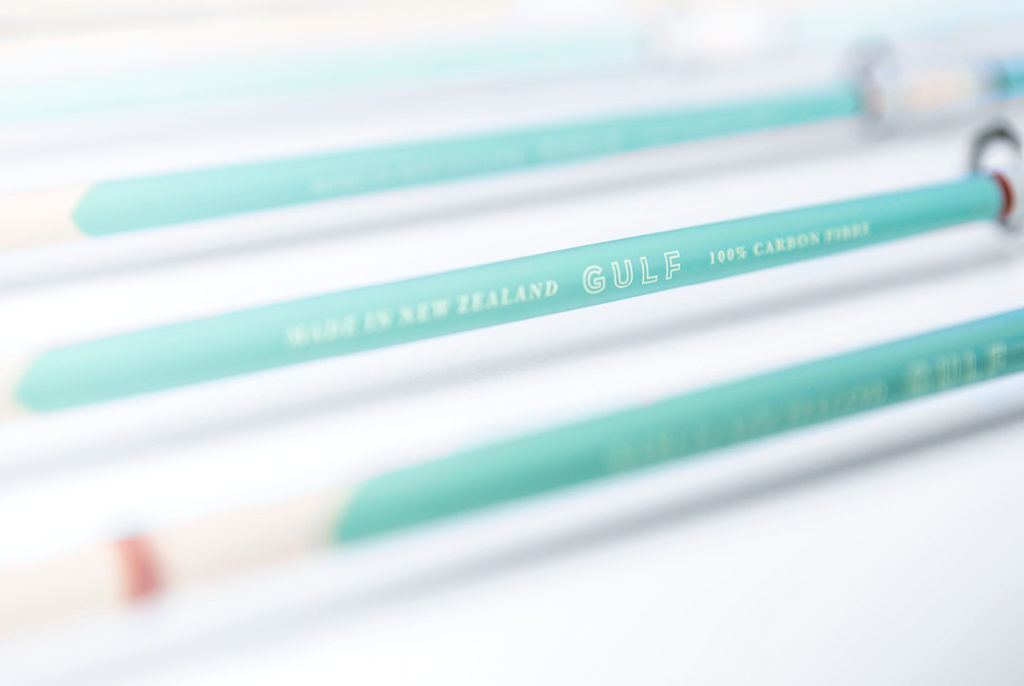
Integral to the design is the Maven crest. Taonga Tuku iho, meaning legacy, best exemplifies the rationale and purpose of the signature crest. It also acknowledges that the design represents a unique, locally manufactured treasure that is tuturu Aotearoa.
Onfire Design’s Sam Allan elaborates, “To complement the beautiful craftsmanship of the Maven carbon fibre fishing rod we developed an elegant brand identity, thread patterns and muted colour palette to hook the high-end salt-water angler. Destined for overseas markets, the identity pays homage to its New Zealand origin and takes cues from traditional Maori art, based around the story of Maui and his magic hook. Hats off to Maven, the finished product could easily be mistaken for a piece of art.”
Onfire Design is making a habit of creating 3-dimensional graphic designs for sporting goods companies having also developed branding for well known cycling, rugby, fishing and sailing products.
You could say it’s something that Onfire has become very knowledgable, even expert at. Which, coincidentally, is the meaning of the word maven.


You can learn more about Maven’s products here.
And to see more from Onfire at: www.weareonfire.co.nz


