Fresh From The Field: Waha – By Strategy Creative
Grounded in hā, whakapapa and kaupapa Māori, Strategy Creative’s identity for Waha is a future-facing brand where ancestral knowledge meets modern tools, created as a place for creativity and community to breathe, connect and thrive.
Fresh from the Field is a weekly article series sharing fresh and inspiring work from the Design Assembly community. Want to submit your work to Fresh From The Field? Fill out the form here.
The brief
Waha is a whānau of thinkers, leaders and makers helping Aotearoa thrive through creativity. Their work spans storytelling, production, and events. Led by a team with a deep knowledge of mātauranga Māori, combined with digital and creative expertise, Waha is a fusion of generations. Where ancestral knowledge meets modern tools.
They needed a brand that could hold both depth and direction. One that felt grounded and forward-looking. A visual identity that could proudly stand tall as a place for creativity and community to rally around.
The design response
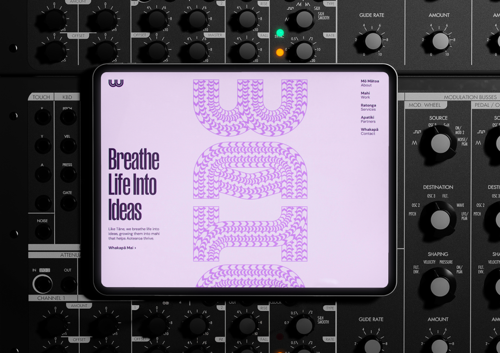
At the heart of the brand is hā, the breath, spark and life force. Inspired by Tāne breathing life into Hineahuone, Waha is positioned as the breath that connects people and projects, kōrero and action, kaupapa and outcome.
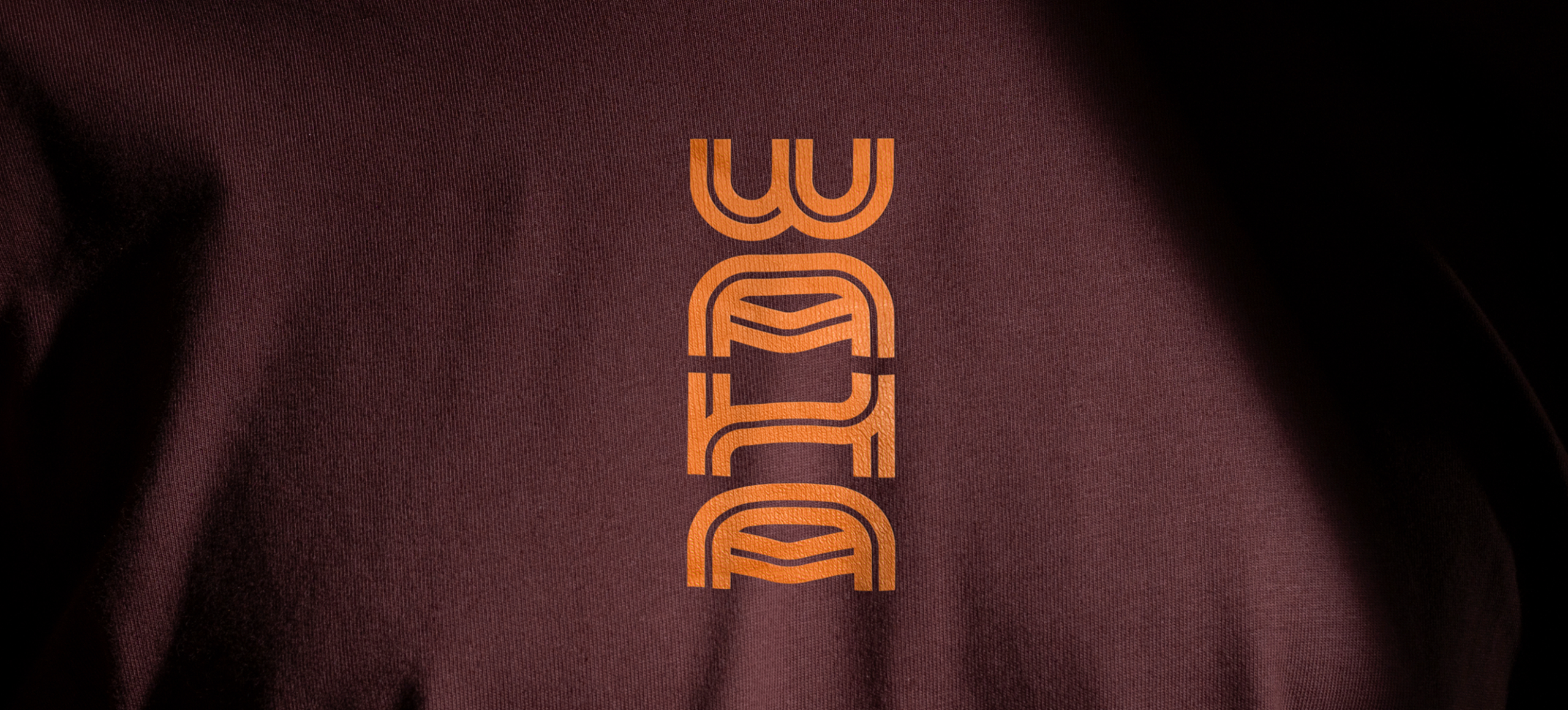
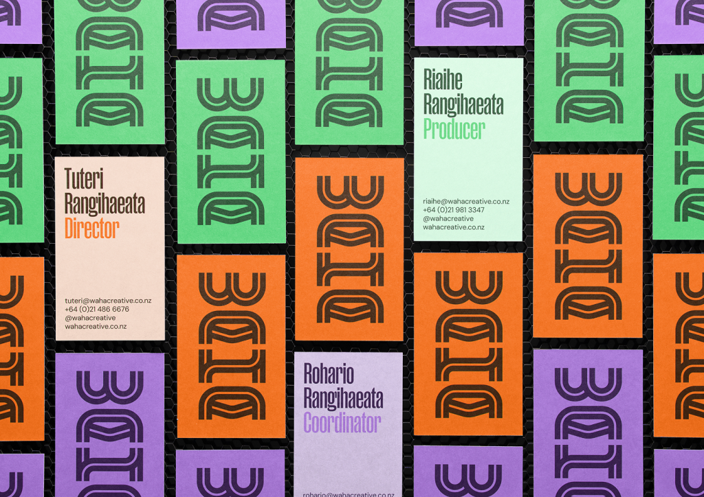
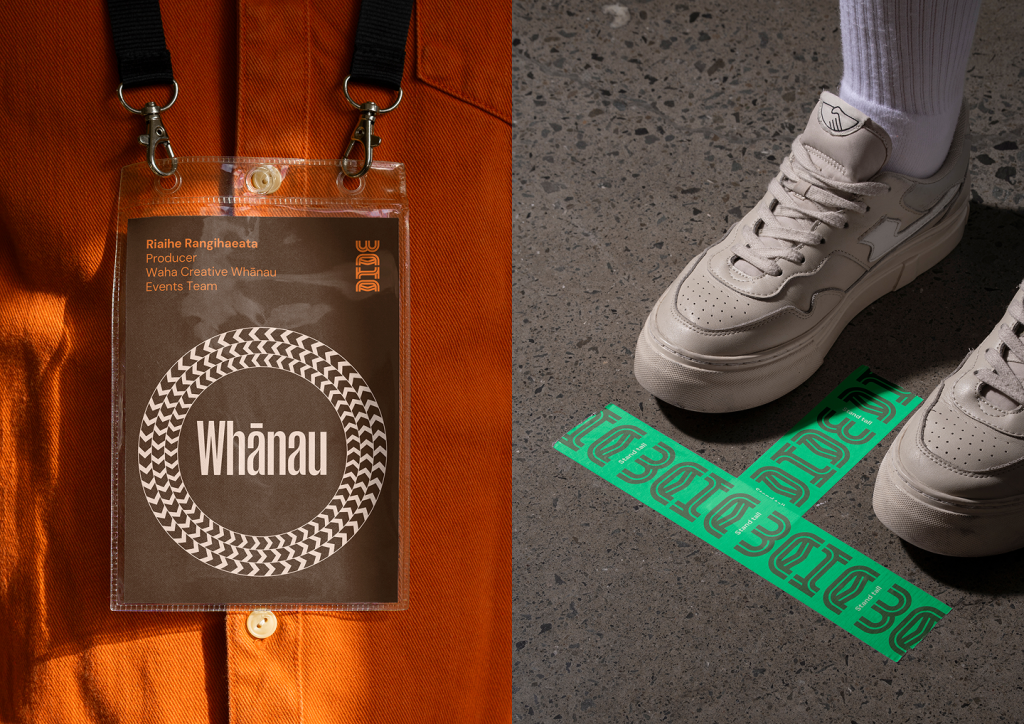
The creative system is built around pou, representing Waha’s kaupapa. These structures hold and guide the work, with hā flowing through them, a metaphor for creativity empowering communities across Aotearoa.
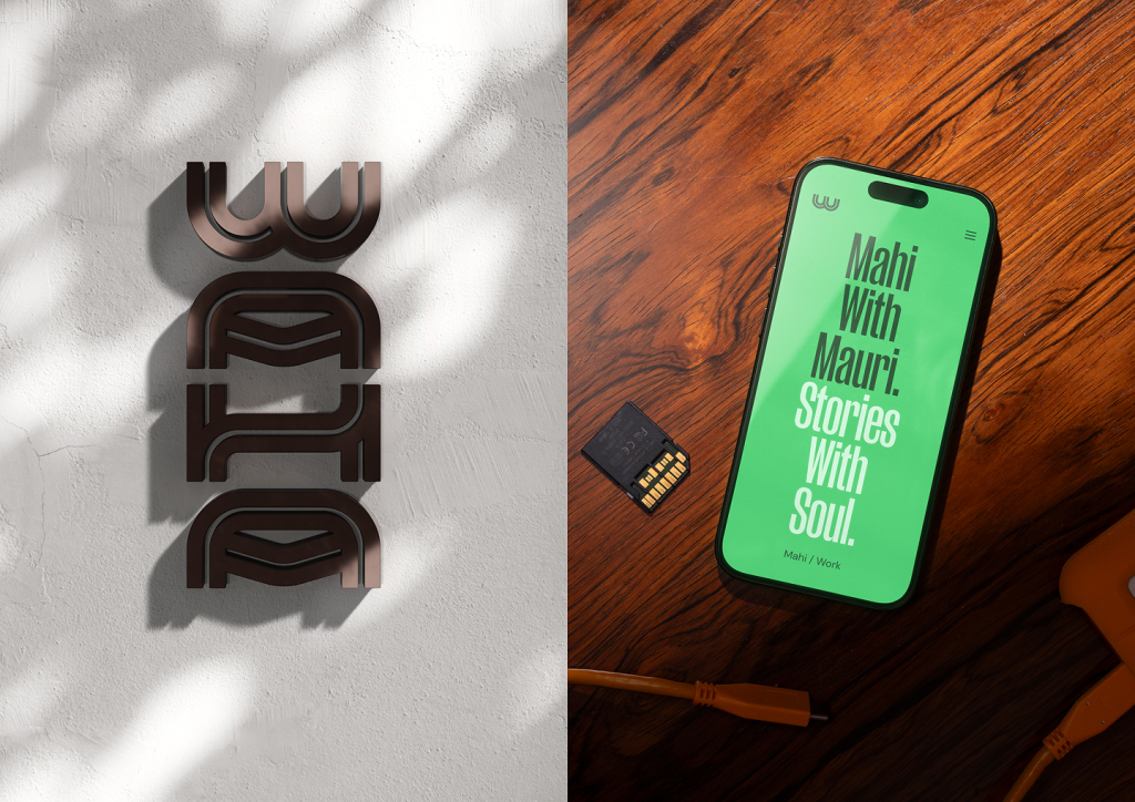
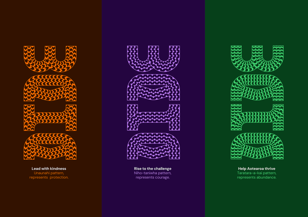
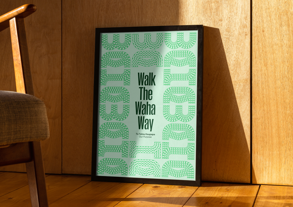
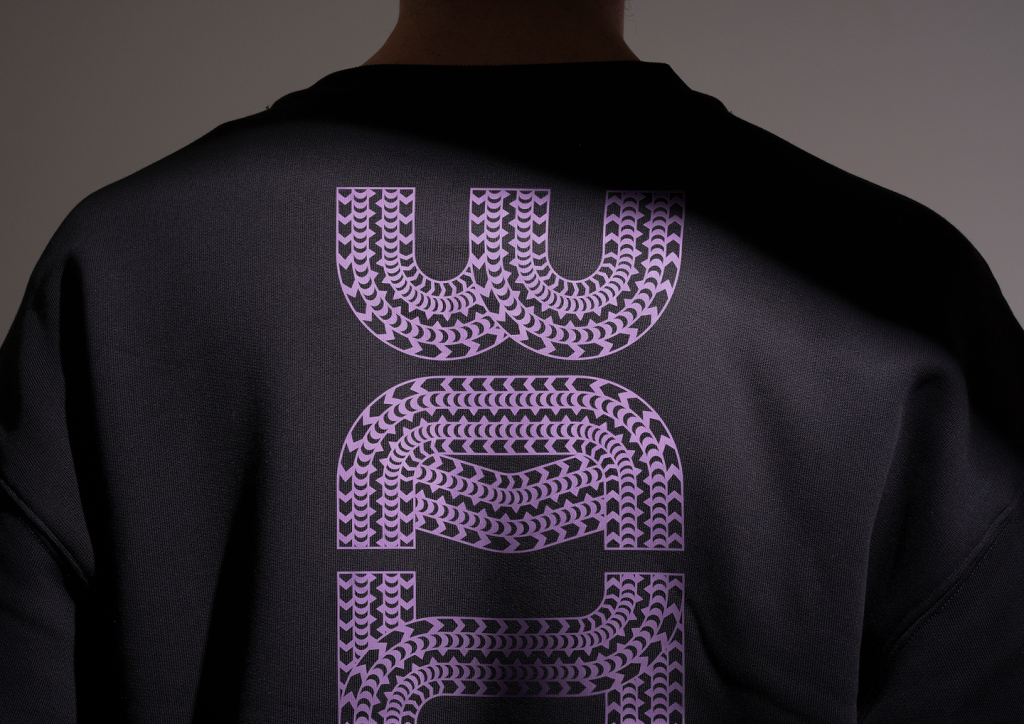
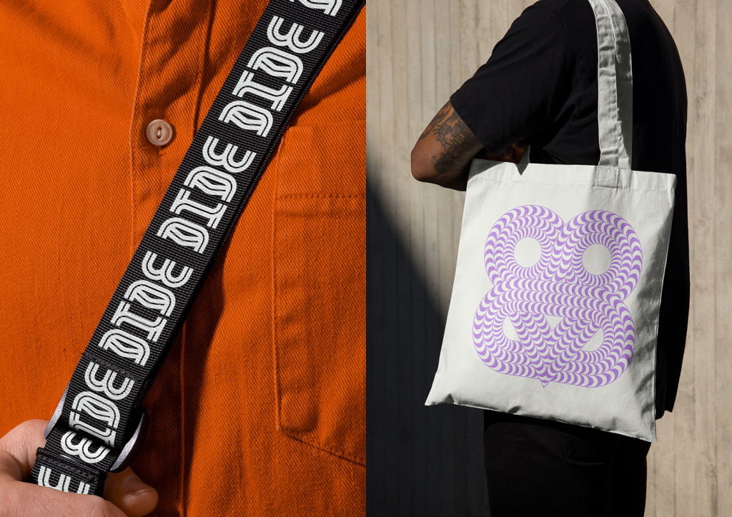
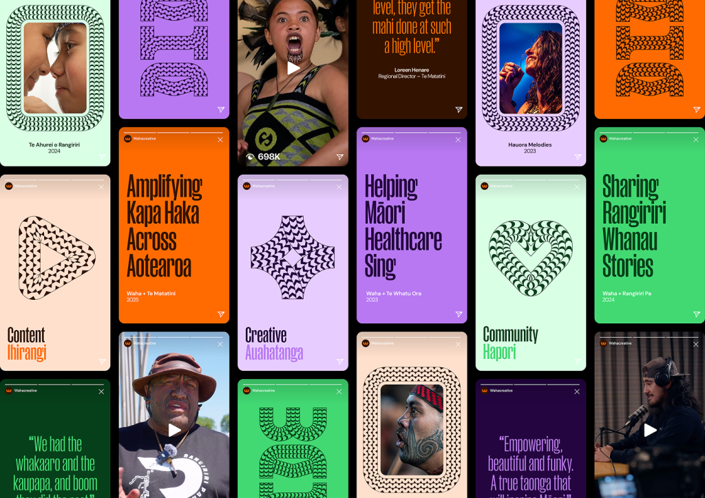
Heritage and modernity come together in a pou-shaped tohu formed from stacked letterforms. Flowing patterns draw from contemporary whakairo, each reflecting a core value. Unaunahi represents kindness and protection, niho taniwha represents courage, and taratara-a-kai represents abundance and helping others thrive.
A vibrant colour palette and the Manuka typeface add energy and strength, echoing the vertical rhythm of the pou. The system is proud yet practical, flexible across platforms without losing its heart.
This is a future-facing vision for kaupapa Māori design, grounded in whakapapa, led with purpose, and created to support Māori-led creativity to grow. The brand doesn’t just show what Waha does. It embodies how they do it, with care, clarity and people at the centre.
The Waha identity was recognised as a finalist at both the 2025 Best Design Awards (NZ) and the Australian Graphic Design Awards (AGDA).
The design team
Creative Director: Oliver Ward, Matt Innes, Fraser Callaway
Cultural Lead: Tuteri Rangihaeata
Designer: Michael Peters
https://www.strategy.co.nz/
https://www.instagram.com/strategycreative
https://www.linkedin.com/company/strategycreative