Fresh From The Field: Ads on Pads Brand Identity – By Hula
Hula shares the playful brand identity they created for Ads on Pads, a social enterprise using design to break taboos and help make period products free and accessible across Aotearoa.
Fresh from the Field is a weekly article series sharing fresh and inspiring work from the Design Assembly community. Want to submit your work to Fresh From The Field? Fill out the form here.
The brief
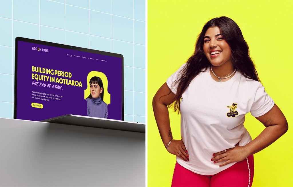
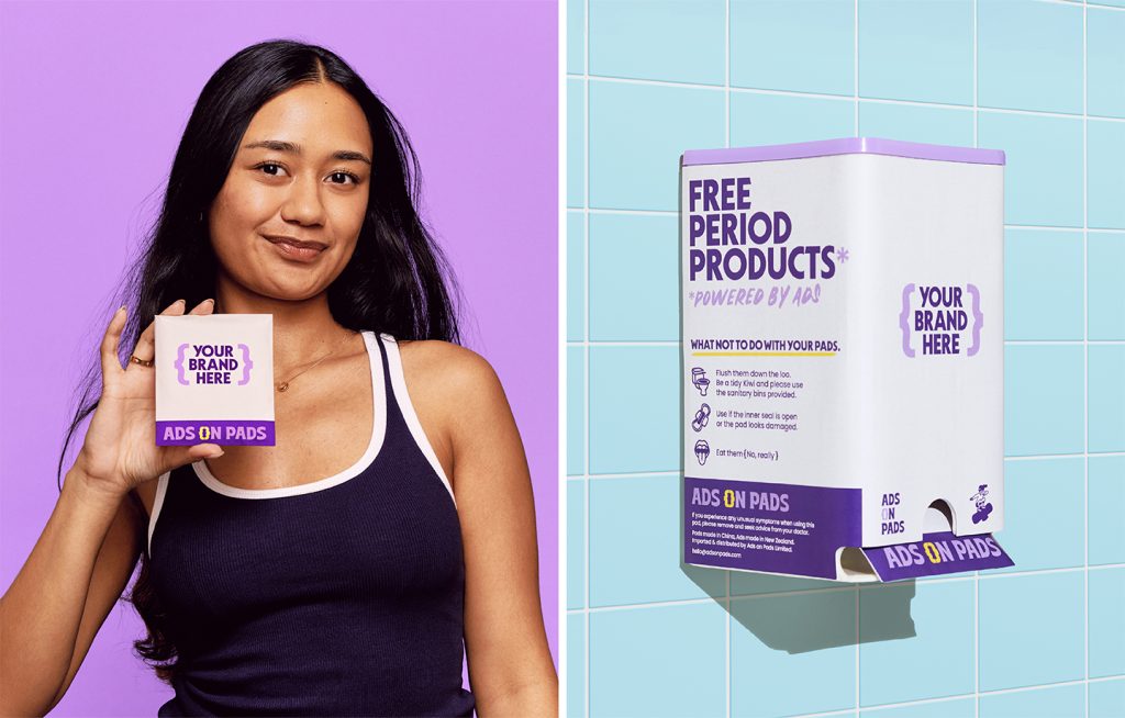
Ads on Pads is a social enterprise that increases access to free and more sustainable period products by placing ads on their packaging (informally known as {p}advertising).
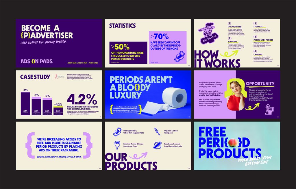
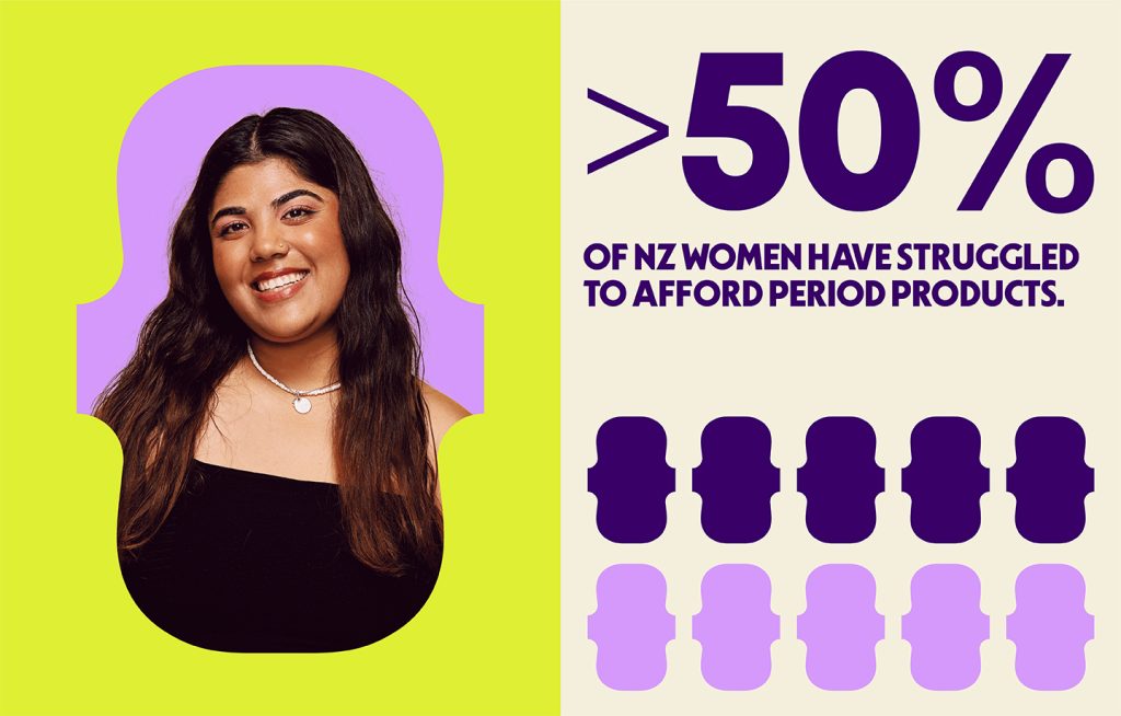
The business was created for one reason: to give people with periods the chance to access free products, because if toilet paper is free and available in public bathrooms, why can’t period products be too? It would surely work to help the 50% of women in Aotearoa who have struggled to afford period products – an extremely sobering statistic for 2025.
Hula was tasked to design a brand identity that stood up for all people with periods while also standing out to prospect {p}advertisers as a powerful and meaningful ad space for their own brands.
The design response
As a starting point, we knew that messaging would be key for the brand – Ads on Pads needed to educate as much as advocate.
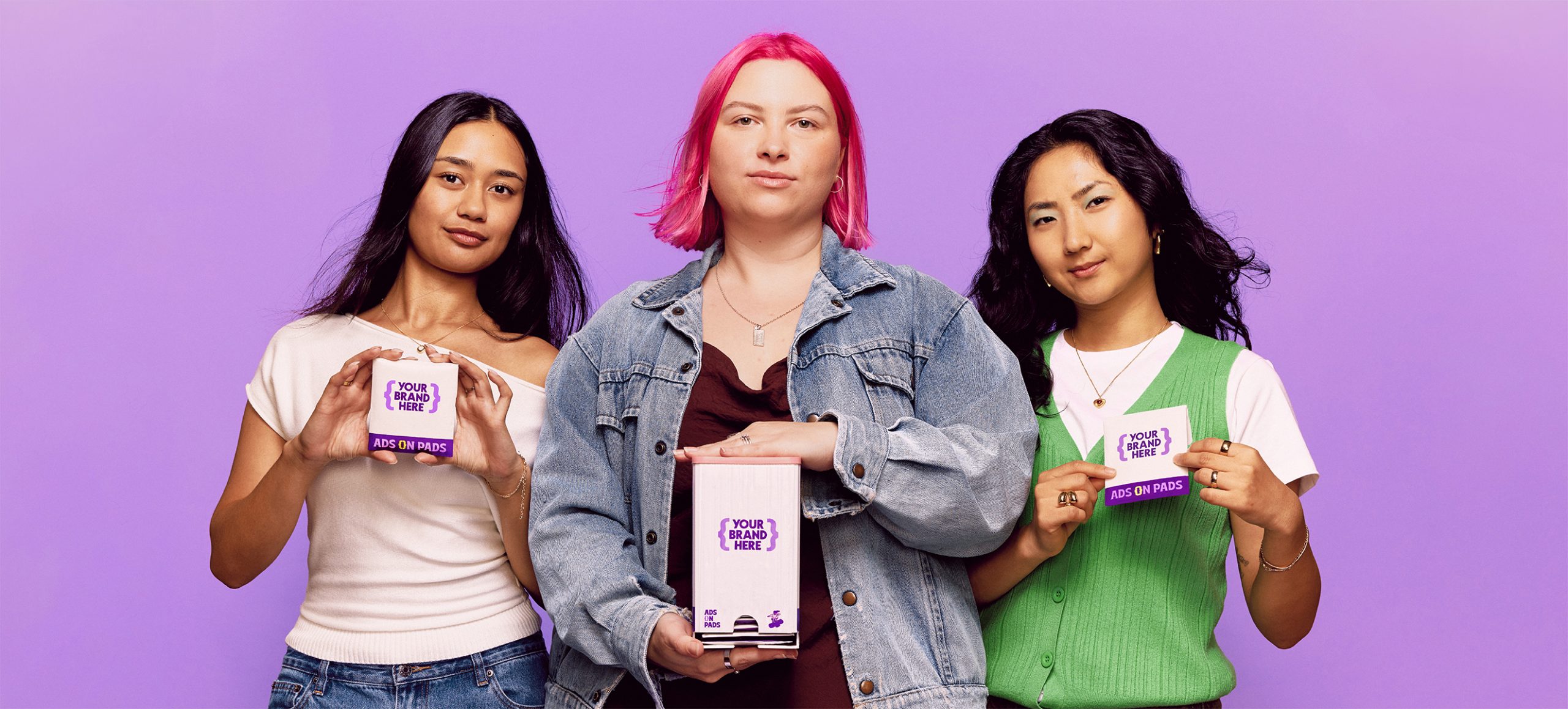
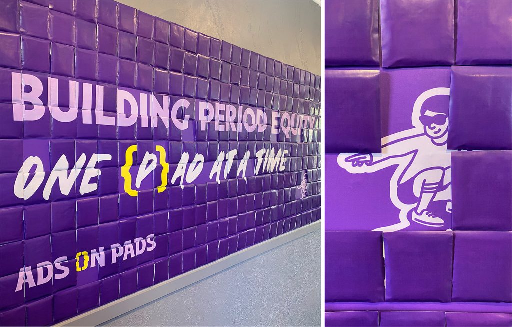
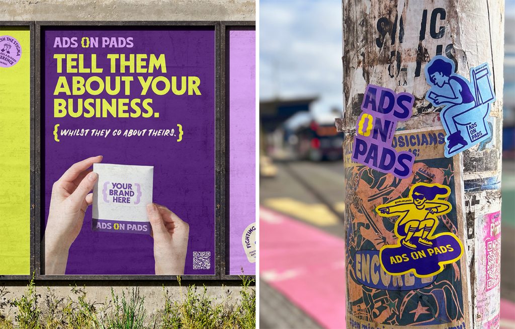
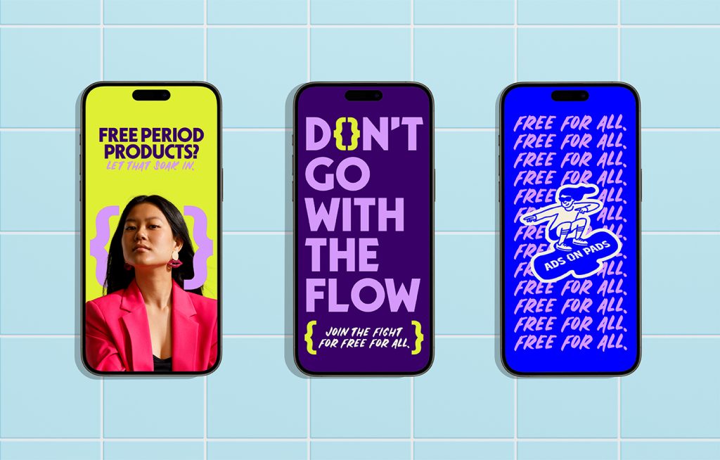
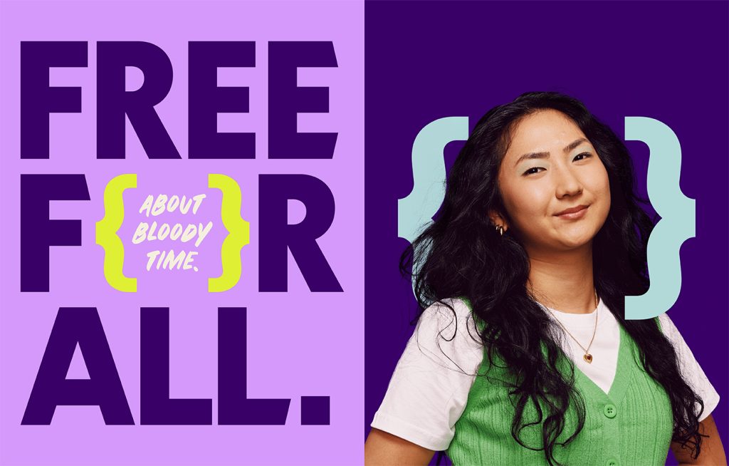
Colour had an important role in championing the brands mission so we designed a palette to be one that you couldn’t blink and miss. We veered away from the deep crimson colours of other period-championing brands and leaned into unique bright, provocative colours that make your eyes widen in delight. It’s disruptive and charmingly disarming.
We carry this feeling of provocation and charm into all elements including positively disruptive statements and punky hand-drawn characters and icons. Ads on Pads is a brand that you can’t help but admire.
We also wanted to introduce an element of surprise that would complement (and not clash with) the {p}advertisers and stockists that Ads on Pads were working with. Enter the brace brackets {}.
Together they resembled the very thing we were championing {sanitary products} whilst also creating a space for humour, advocacy and brand partnerships to live.
Ads on Pads is on a journey to make the topic of periods less taboo and make period products free for all in Aotearoa. At the heart of the identity was the challenge to build a brand that not only stood proud but one that everyone, including people with or without periods and {p}advertisers, could get behind and support.
The design team
Creative Director: Mark Benseman
Principle Strategist: David Lyall
Creative Lead Content: Sokpart Pao
Senior Design Lead: Ann Davenport
Intermediate Designer: Caitlin Mitchell
Senior Designer: Simone Lash
Copywriter: Sophie Hickey
Strategist: Kate Goudie
Senior Account Director: Gabrielle Lawlor
Account Manager: Kate Barry
Senior Account Manager: Anna Lim
Executive Digital Producer: Elle Kiddie
https://www.hula.nz
Instagram – @hula.nz
The client team
Ads on Pads
Instagram: @ads.on.pads
https://adsonpads.com
Collaborators
Frances Carter: Photographer
Erica Boyd White: Photographer
Henthoiba Nongmaithem: Motion Designer