Censoring Colors: Did the New Zealand government stop a famous image of Queen Elizabeth from being published?
Written by Emma Rogan
Supported by Creative New Zealand
![]()
Emma Rogan is a contributor to Aotearoa Design Thinking 2018, a series of commissioned critical design essays published by Design Assembly and funded by Creative New Zealand.
In 2015 the New Zealand government stopped an image from appearing in a new book about a famous magazine. At least, this is what is suggested in a review of the book COLORS on the AIGA website.
*
“The only thing Damiani wasn’t able to print was the image they consider the
“most iconic and recognizable in the universe of COLORS:” the picture of the British
Queen with black skin. “The government of New Zealand didn’t allow us to publish it,” Mastroeni, Cavallini, and Cavallini sigh.”
– AIGA, Eye on Design article by Madeleine Morley
*
The image, of a dark-skinned Queen Elizabeth ll with African-American facial features and black hair, was originally published in the fourth issue of Colors (the magazine, not the book)—an issue published in 1993 and singularly devoted to rasse/race.
The image sequence in the original magazine was entitled “What if…?” and ran across five pages. It featured a Chinese-looking Pope, a white Michael Jackson, and a blue-eyed Spike Lee and a Black Arnold Schwarzenegger. The quality of the post-production is impressive, each person looks convincing as their other counterpart—the Queen is quite beautiful in her new ethnicity, and even now I admit that it makes my subversive heart sing to see her represented so.

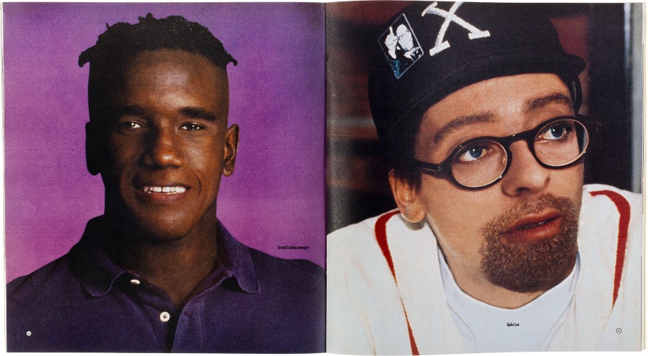 Above: That image. Below: Spread from issue 4; Arnold Schwarzenegger and Spike Lee
The image is still floating around the internet, on design blogs, Pinterest, and even appears as a prop for the occasional “the Queen is actually black” conspiracy-theory. In 2000, it was published again along with other images in the same series, in the book Tibor Kalman, Perverse Optimist months after the designer-editor himself died of cancer.
I have not been able to find out how our representatives were able to censor the Italian publisher Damiani, or even if the New Zealand connection is true. But it got me thinking about when I first encountered Colors as a design student and the impact it had on me as an 18-year-old.
Colors began as an imprint of the clothing giant Benetton in the early 1990s. The first editorial team was headed by Kalman, a spirited Hungarian-American graphic designer known for his ‘undesigned’ style and a tradition of politicising his work and Oliviero Toscani, the Italian photographer responsible for many brilliant and shocking Benetton advertising campaigns between 1982 – 2000.
 Cover of Colors Magazine, issue 4, 1993
Although Colors is still in publication, it is most well-known for the first issues produced by that original editorial team between 1993 and 1999. Unconventionally formatted and large-scale, each issue from number four was devoted to a single theme, exploring culture and social issues through image-based editorial treatments and a design style that is now synonymous with the 1990s. Designed by Paul Ritter, the spreads feature big heavy typography, split, cut, and rearranged in floating compositions or staggered and scaled text, with strong, often clear-cut photographic elements. The editorial design fits a trend of the period that was in part an aesthetic reaction to the slick and polished corporate design that dominated the mid-late 1980s. It feels collaged and free-floating, printed on heavy newsprint. This was no fashion glossy.
The magazine was untraditional, unflinching and brash. Looking at it now, there is a spirit of the rebel in the language and aesthetic that I associate with a Generation X coming of age. That generation is often summarised as cynical of institutions and sceptical of brands. Not many current pop-culture publications can match Colors for its provocative content, brazen style and commitment to the idea of an inclusive humanity. The magazine spanned cultures and belief systems with the whole thing being printed in at least two languages.
Colors was for the youth of the 1990s, coming out of the first Gulf War, a post ‘87 recession, and the 1989 Exxon Valdez environmental disaster, this generation were living through an AIDs and HIV epidemic where suddenly a sexual encounter could be deadly. Not to forget the 1994 genocide in Rwanda, the Bosnian war and the Srebrenica massacre of 1995. The 90s also saw an explosion in hard drug use, and the race riots in the US. Then as now, really scary shit was happening in the world.
 Spread from issue 4.
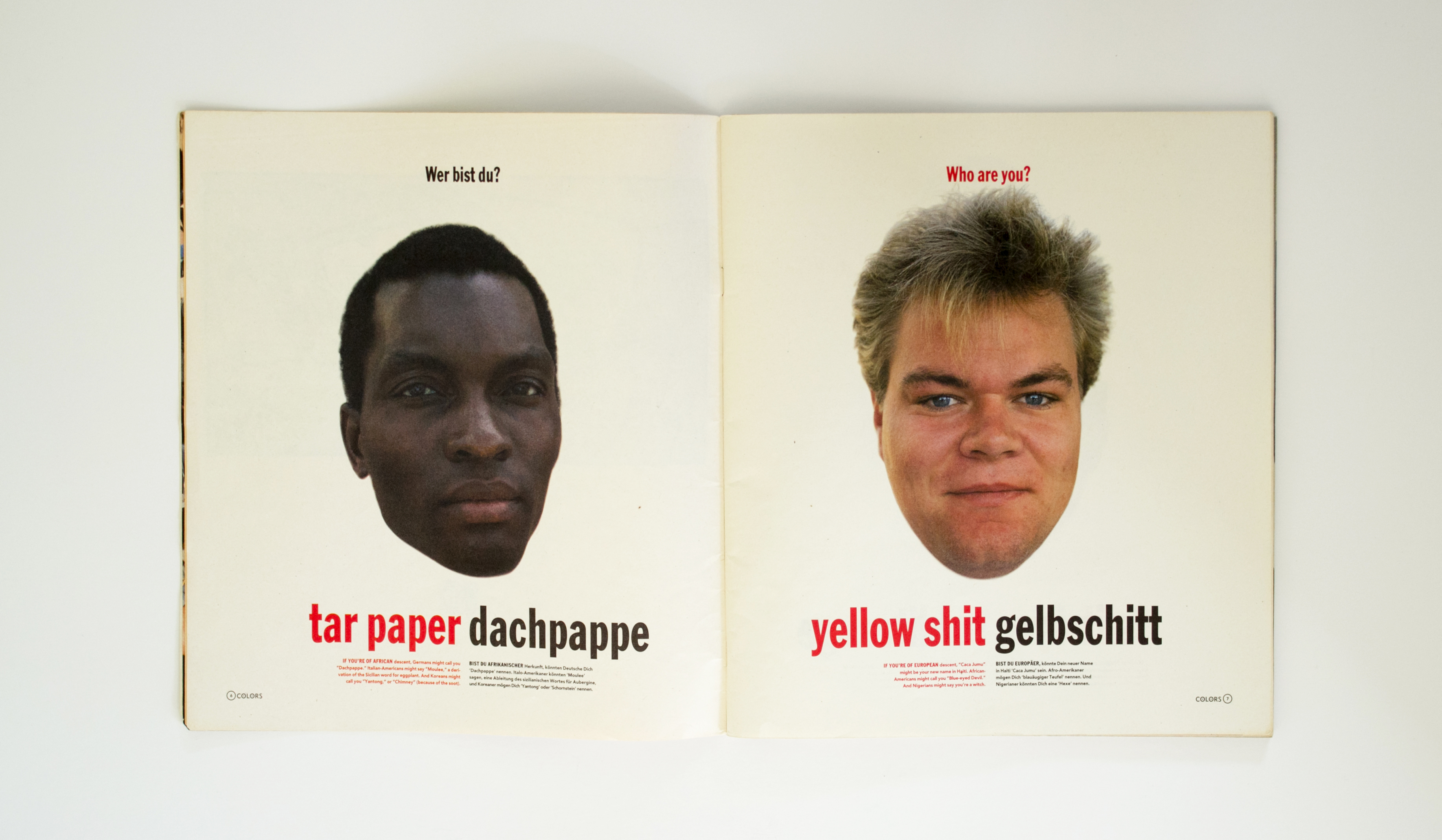
The content is sometimes simplistic and lacks nuance. Reading it now 24 years later, I notice the editorial lens. Being inclusive sometimes still looked like one dominant culture reaching out and caricaturing others, however well meaning. The spreads from pages six – nine of the same edition on rasse/race are clear cut images of heads – an African, a white European and an Asian. Each with a summary of colloquial insults that they are called by others. There is a section comparing blood and different ears. But it wasn’t all so glib. In the same issue there is also an article about how young people in Germany were affected by the fall of the Berlin wall and refugees who were being pursued by groups of young Neo-Nazi skinheads. There are photographs of a refugee shelter in Rostock going up in flames. It had been firebombed. The article gives an insight into the experiences of East Germany’s struggle to come to terms with the new unified Germany, and the impact of losing their collective identity to the west. So many years later, and considering recent events, it makes for fascinating reading.
If it was sometimes flawed and simplistic, Colors was also fresh, stark and fearless in the face of global turbulence. It provided non-commercial images of regular folk from all over the world. It was irreverent, upbeat, and poked fun where no-one outside of the arts could or would at the time.
“Of course we know we create brand awareness with our ads.
But, we also raise questions in a very provocative way.”
– Peter Frissola, Benetton Communications Director, 1993
It was the image of the Queen that got the UK press in a tangle and caused a proper stir. According to this article, The Sun ran a piece in 1993 with the headline ‘Fury as Benetton blacks up the Queen.’ Benetton shopfronts were graffitied with black paint in protest. And surprisingly the image is still somehow being censored from print all these years later. But then again, Trump. KKK rallies. And here, Don Brash, our own dusty old bastion of colonial racism.
Whatever the issue was around the re-publication, the censorship of that image only adds to its appeal, it shows that it is still important. Now, post-Brexit, and when an old white guy is still being given air-time here to lambast broadcasters speaking Te Reo, it feels as relevant as ever.
“We discourage companies and organizations from using images of the royal family in any promotional context.”
– Spokesperson for Buckingham Palace, 1993
The British Royal Family discourages images of the Queen used for commercial gain. That might be the simplest explanation for why the image doesn’t appear in the 2015 book about Colors. But they had printed it once, twice, and so why not again? If there was legal action taken against the publishers at the time, or a copyright infringement I cannot find reference to it. AIGA writer Madeleine Morley can’t remember any more detail and no longer has the full transcript of the interview. The book designer said he was jetlagged but would respond soon—Ciao! When I prompted him after a reasonable recovery time—he didn’t. The publishers also declined the opportunity to respond. I tried asking Oliviero Toscani directly, no response. Then, somewhat desperate, I contacted Michael Bierut at Pentagram. He knew Tibor Kalman and designed The Perverse Optimist in 1999. He did respond, and gave me the name of the young art director who had worked on Colors in the early days, the guy is now an established designer in New York, but he didn’t get back to me either.
*
 David Kirby with his family. Photographed by Therese Frare.
Using social issues as a platform for selling knitwear is an enduring criticism of Benetton, and not just because of the magazine. Benetton had an established tradition of ‘shockvertising’. An image captured by Therese Frare then colourised and used by Benetton—of David Kirby dying of AIDS while being embraced by his distraught family—was evocative (and altered to be more so) of an image of Christ. It is a powerful, distressing image.
Gay rights activists marched the streets calling for people to boycott the brand for capitalising on individual suffering. More complicated; Ann Rhoney, the colourist who worked on the black and white image (so that in colour, it would appear to be more real) took on the job, in part to honour the friends she had lost to AIDS. Bill and Kay Kirby, David’s parents—were clear about their motivation to honour their activist son’s life, and to show the world the reality of his death.
*
“I was falling to pieces. But Bill Kirby told me something I never forgot.
He said, ‘Listen, Therese. Benetton didn’t use us, or exploit us.
We used them. Because of them, your photo was seen all over the world,
and that’s exactly what David wanted.’ And I just held on to that.”
– Therese Frare, Photographer
*

The company ran billboards of a white baby being nursed at the breast of a Black woman and a newborn baby covered in afterbirth while still connected to the umbilical cord. These images should not be shocking as they are glimpses of intimate and specific human experiences. Yet at the time prominent magazines such as Elle and American Vogue refused to publish the ads. The censorship was not an objection to a clothing brand using images so unconnected to their products, but that the images in themselves were offensive.
In the years since, we’ve seen the capitalist machine of western culture finely hone it’s ‘adopt and consume’ response to social change. Well-meaning perhaps, but ultimately driving important, interesting innovations into the mainstream by commodifying them, simplifying the messages into sound-bites and turning them into something packaged, sanitised and popular.
Capitalism, Bill Maher reminds us, eats everything.
Benetton’s response to accusations of profiteering from shock tactics and social issues seemed sincere; yes we sell clothes to the world, and we’ll use this power to talk about the things we should. But profit-based organisations are not really trying to change the world as much as they’re trying to make us buy things. If individual consumers (and designers of those things) feel somehow empowered and liberated by the exchange, perhaps we’ll buy more things and become loyal, repeat purchasers and even evangelists of that brand. I guess I come to Colors and Benetton from that place. I am conflicted by the influence of advertising, yet loved what they did.
 Benetton advertising examples from 2015, a departure.
Walking into a Benetton store in Tokyo recently, it was curious to experience the product first-hand for the first time. Rows of brightly coloured, carefully constructed clothes hang in small groups—it is a range of well-made garments in premium wools and thick cottons. They are very expensive and exclusive. It was like any other high-end clothing boutique. Nothing radical on the racks, but for an array of shockingly bright yellow and red wool jackets.
The actual clothing felt so far away from the idea of the brand that I had cultivated in my imagination, that I now consider the magazine as something truly separate from the product. An independent channel. For starters, how were the youth of a 90s-recession going to afford the clothes? I doubt they’d even want them. It occurred to me after leaving the store, that even though the magazine felt youth-oriented and relevant to our lives, we weren’t the target market for the clothes. The magazine had the support and funding of Benetton, but it was Kalman and Toscani who had the vision. Toscani and later Kalman, who led the radical Benetton advertising campaigns.
They never did explicitly advertise the merchandise in Colors either. I can’t speak for later editions but in 1993 there was only one single advertising spread for Benetton in the centre of the magazine where two hands; one white, one black, are joined by handcuffs in the copy of the rasse/race edition. There is no message apart from the small green “united colors of Benetton” logo.
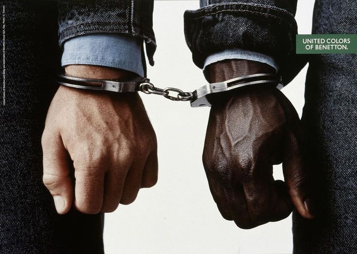 The ad that appears in the centre-fold of Colors issue 4.
But there is no doubt that the main magazine’s content could and did give rise to a material desire to be closer to the brand and want to wear it. Benetton became a huge publicly listed company and the 1990s are now considered to have been the brand’s golden age.
Now, in abandoning their own marketing position as a firebrand for inclusive humanity and tolerance (they pulled the 2011 Un-hate campaign in which world leaders were portrayed kissing each other), how are they not now just behaving like any other fashion retailer? What do they do next?
 ‘Unhate’ campaign, pulled by Benetton in 2011.
*
“Benetton believes that it is important for companies to take a stance in the real world
instead of using their advertising budget to perpetuate the myth that they can make consumers happy through the mere purchase of their product. The company has opted for a communication strategy in which issues and not clothes, play the lead part. The company has decided to devote some of its advertising budget to communicate on themes relevant to young and
old people worldwide.”
– Benetton company document, c 1982
*
Benetton once had a voice—a radical, loud, disruptive and ultimately capitalist voice, yes, but they actually stood for something. There was a power and unique earnestness that still resonates all these decades later. Benetton was relevant, recognisable and unforgettable.
As a student, and then designer in a New Zealand creative industry that has long been monocultural, I have always felt like an outsider. I am female and I am of mixed heritage. The rules of graphic design here are western and have root in European design aesthetics. For a long time, there was no other kind of design to see at all. It is exciting to watch a new Indigenous vernacular evolve slowly in our graphic design, and to try my best to contribute to that.
But I’m not just an outsider of the design industry. As anyone of multi-ethnic backgrounds will tell you; you exist in a space neither here nor there. Not one thing, or another. I am not fully Palagi and nor can I call myself a Samoan. The world reminds me of this constantly, often painfully.
*
“How dark was your father?”
– Palagi mother of my daughter’s friend upon discovering my father is Samoan, 2013
*
Now, as a relatively light-skinned adult I am often privy to racist remarks by Pākehā, who wrongly assume that I am white. Sometimes they see fit to probe me on my own ethnicity, and what percentages I am, so that they can draw their own conclusions about whether I am Samoan ‘enough’. I have often wished I was darker-skinned, so I could be protected from hearing things that hurt me so intensely. Yet I know that I also have various levels of white privilege rendering me ignorant to other more punitive kinds of prejudice. I lament that I am seen as Palagi when I go to Samoa, by all but my family there. It’s complicated.
And it’s why that image of the Queen is still so powerful.
The race issue of Colors appeared at a time when all the models in magazines were white except for Naomi Campbell. The Queen image subverts the dominant narrative into something else, something more textured and complex, to a place where being diverse and multi-ethnic is normal. I went a long time never seeing any people who looked like me in media. I still remember the first time I saw a Pacific Islander in the media that wasn’t an All Black.
It was exhilarating. It wasn’t very long ago.
Postscript:
At the time of the censorship of the Queen image from the new book celebrating the magazine, John Key was our prime minister. In the coffee table book about Colors there is a page that reads simply:
“THERE WAS AN IMAGE OF QUEEN ELIZABETH WITH BLACK SKIN.”
– page 14, “Colors; a book about a magazine about the rest of the world.”
Asking around, it was suggested that the original unretouched image may have been copyright of a New Zealand publication – though that still wouldn’t explain why the publishers refer to the government specifically in the AIGA interview.
Oliviero Toscani (picture a 75-year-old, grizzled Italian Jack Black) eventually took things too far. Perhaps it was inevitable that he would. In 2000, after a backlash against a campaign featuring portraits of men awaiting execution on death row in the US; he resigned. 17 years later, just a week before I wrote this, he was reinstated as creative director of Benetton.