Fresh From The Field — Toi Kai Rawa – By Taputapu Toi
For June & July we are focusing on Design & Te Ao Māori on the Design Assembly website – featuring interviews with Māori designers, project features spotlighting their work & design processes, to thought leadership articles that inspire and challenge the Aotearoa NZ Design community.
Fresh from the Field is a weekly article series sharing the fresh and inspiring work of our Aotearoa Design Assembly community.
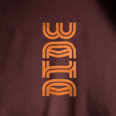
“Symbolising ahi (fire) as a manifestation of energy and the idea of sparking and igniting the fire within to realise our infinite potential as Māori”, Taputapu Toi walk us through their recent work for Toi Kai Rawa
Want to submit your own work to Fresh From The Field? Fill out the FFTF form here.
The brief
Toi Kai Rawa Trust is a regional Māori economic development Agency working across the wider Bay of Plenty and was officially incorporated under the Charitable Trust Act 1957 on the 8th day of January 2020.
Since 2020, Toi Kai Rawa has used a placeholder logo and approached us to create a meaningful and connected design that truly represents their mission. The name Toi Kai Rawa holds deep significance: “Toi” refers to an esteemed ancestor, “Kai” signifies eating or wealth, and “Rawa” means exceeding all. They desired a logo that symbolised ahi (fire, flames) in an abstract way, evoking warmth, drawing people close, and igniting inspiration.
They emphasized the importance of maintaining their purple color palette, which holds special significance for them.

The Design Response
This project was particularly interesting because it required incorporating the themes of fire and warmth in an abstract way while drawing on elements of Māori design and meaning. Both Rosa and I developed individual concepts, each with a unique interpretation. Rosa’s design, inspired by the shape of a taiaha, especially resonated with our client.
Her concept featured the distinctive tip of the taiaha, which became a central element of the design. During the editing process, we added a subtle flick at the top and bottom of the design to mimic the movement of a flame. This small touch introduced an elegant sense of motion and enhanced the overall warmth and inspiration the logo conveys.
Overall the logo symbolises ahi (fire) as a manifestation of energy and the idea of sparking and igniting the fire within to realise our infinite potential as Māori. The intricate Rauru pattern within the tohu holds a whānau connection to the story of Toi, which is connected to the name ‘Toi Kai Rawa’. The rauru pattern can also be viewed as a central space of energy or an idea of ‘enabling the flow of mauri’.


The Design Team
Director: Nikki Kennedy
Graphic Designer: Rosa Flood
@taputapu_toi
The Client Team
Toi Kai Rawa Trust
Client details
https://www.facebook.com/Toikairawa
https://www.toikairawa.co.nz


