Field Art: Carol Green
In this series, we shine a spotlight on the incredible artists contributing to our 2020 Field Guide.
Today we hear from Carol Green

How would you describe your illustration/artwork style?
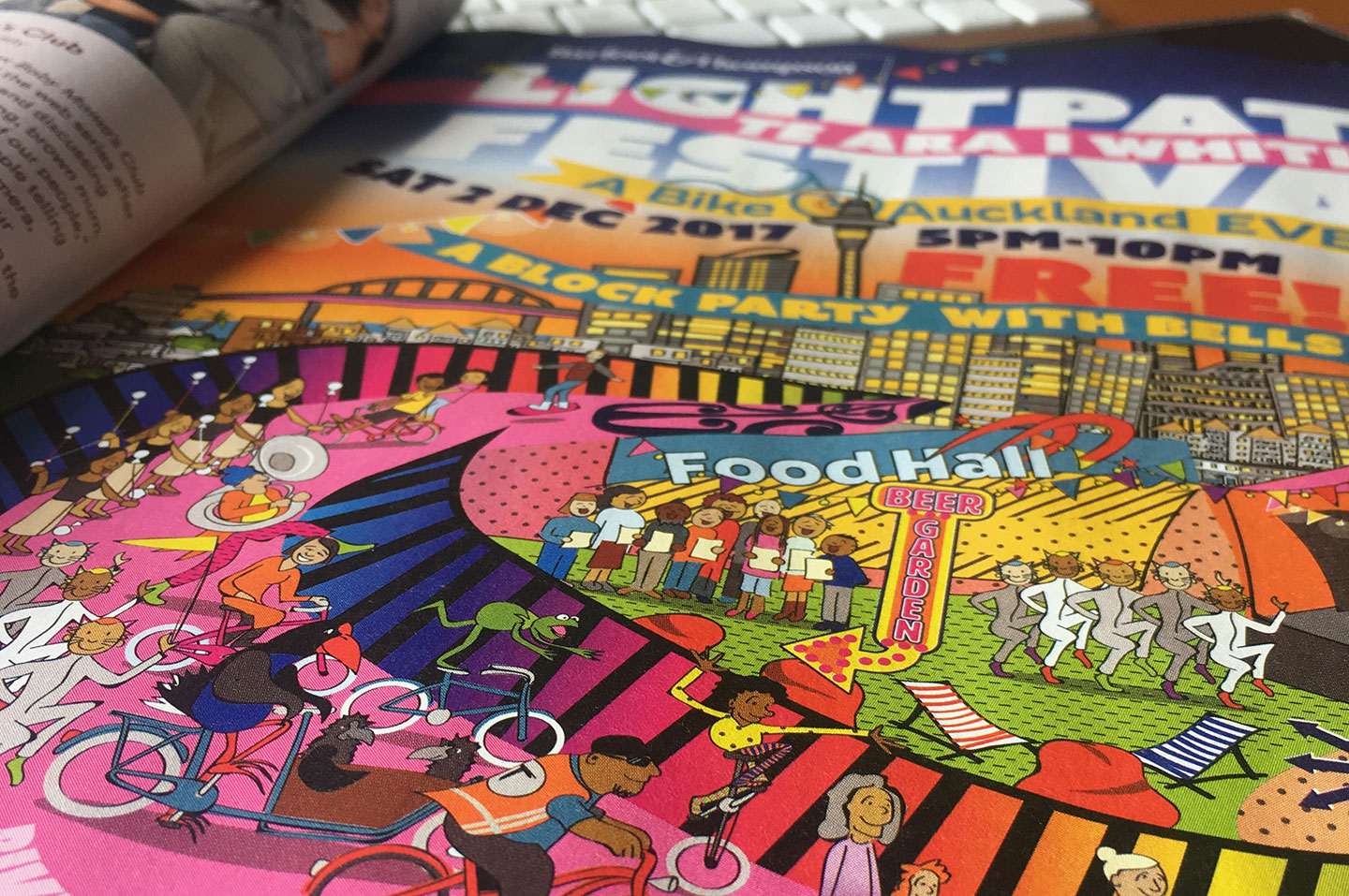
Cartoony and people-focussed.
Is illustration your full-time gig or how does it fit around the other mix of work you do?
Self-employed illustration is my full-time gig. There’s a few bits and bobs of graphic design and web design crammed in there but mainly drawing.
What attracted you to illustration over other creative mediums?
I’ve drawn pictures since I was little. My mum has a drawerful of my cartoons she’s kept over the years. I feel as if I’ve come full circle back to illustration: My degree was in fine art and performance art, and I tried to keep that trickling along, as a creative outlet, while I did some teaching and spent 20 years making websites. It was really the 100 Days Project that brought me back to illustration and I did a shuffle sideways as I divested of websites and did more and more drawing. It fulfils the creative itch as well as being something I can do for work.

How do you feel like your practice has evolved since you started out?
I’m always tweaking my technical process – for commercial work I like to stay vector-based, since I know clients who insist the finished artwork is only ever going to be a 600×600 pixel web image eventually will want a billboard. I pretty much always still start with pencil and paper, then use Illustrator with a Wacom. I’m experimenting with drawing directly to my iPad Mini, but I haven’t yet got over that hurdle of skipping the paper stage.
What does your dream project or commission look like?
A paid residency somewhere quiet, comfortable and near the sea to illustrate a children’s book. However, I am a terrible procrastinator, easily distracted and spend way too much time on social media. I’d need at least 2 months – the first for some kind of time management intervention, and the second to actually do the work.

We are so grateful of the work you are doing on DA’s field guide – Could you give us some behind the scenes into your process for the field guide artwork. What aesthetic or conceptual decisions did you make?
I wanted to use a very limited colour palette and started with “COVID yellow”, the red I used when I drew a coronavirus molecule for a project, with two colours in between. I did try to loosely link the content of the illustrations to the text content without being too literal. I wanted to include people in all of them, since that seems to be what’s getting us through these extraordinary times.
What project (personal or professional) are you most proud of?
Since the start of my illustration side-step, I have done a lot of work for Talking Trouble Aotearoa New Zealand, an organisation of speech-language therapists who work with young people going through the NZ legal system. It’s really worthy work, helping young people understand what’s going on in court or with various agencies. They use a lot of picture resources since many (most) of their young people have significant communication challenges. It’s these resources that I work on, drawing people “who look like New Zealanders”. I think this is the work that has been most helpful in the world.
How does your workload compare to before the COVID-19 Lockdown?
As a freelancer, my workload is always a bit up and down, so it’s quite hard to compare. Some projects have not eventuated because of COVID but on the other hand a couple of extra projects have popped up directly because of it.

Given the Field Guide series is putting a lens on our post COVID practice… what do you hope for the future?
In general I hope we can be a more tolerant, equitable and kind society. I think these last few months have widened the inequality gap even further and we must work hard and consistently to close that gap. In relation to our industry, I hope it galvanises designers to work towards the kind of world they would like to live in.
Finally, where can we see more of your work?
www.carolgreen.net

