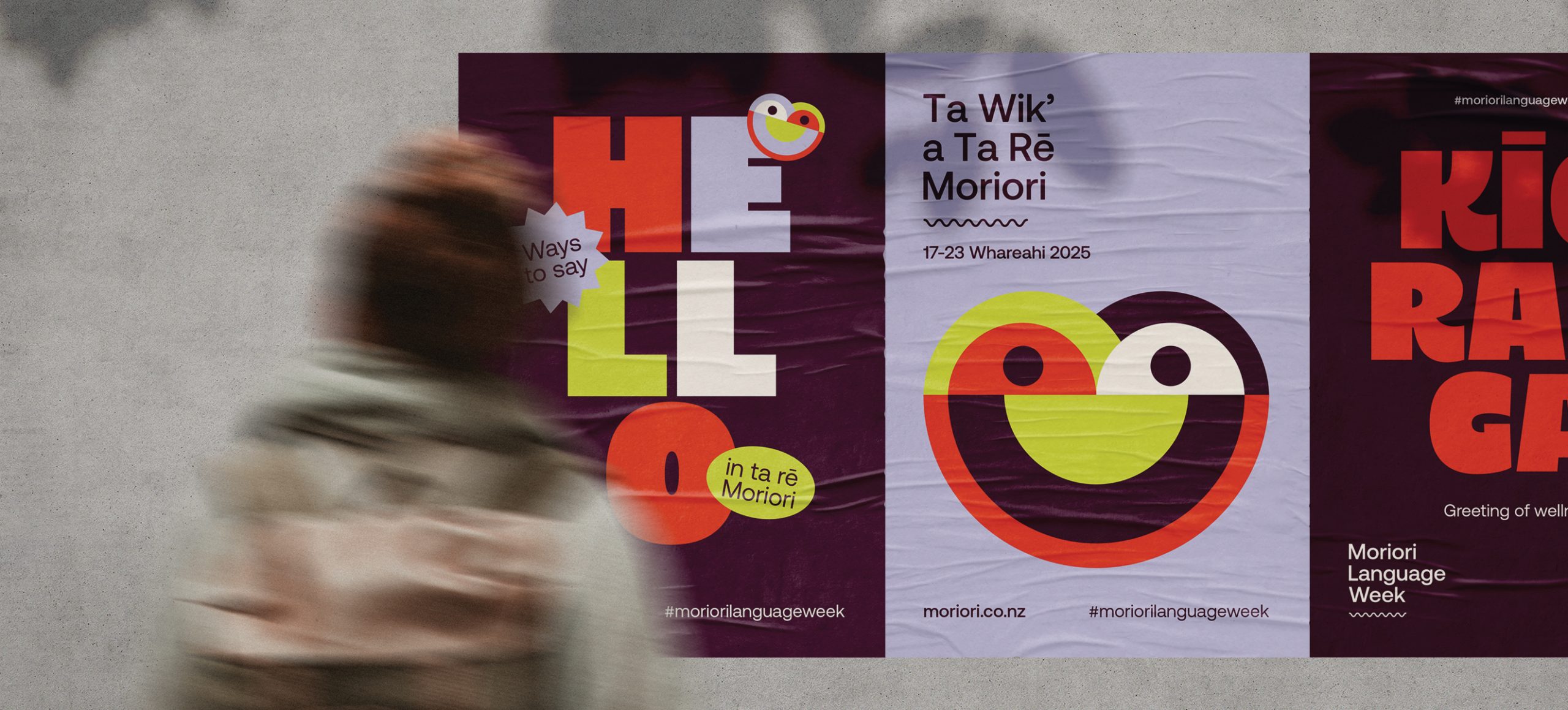
Fresh From The Field: Ta Wik’ a Ta Rē Moriori | Moriori Language Week – By Ashleigh Ryan
Designed by Ashleigh Ryan, this Fresh From The Field showcases a bold, future-focused visual identity for the world’s first Moriori Language Week, celebrating ta rē Moriori, peace, and cultural renaissance.
Fresh from the Field is a weekly article series sharing fresh and inspiring work from the Design Assembly community. Want to submit your work to Fresh From The Field? Fill out the form here.
The brief
Design a visual identity for the world’s first Moriori Language Week, Ta Wik’ a Ta Rē Moriori, that celebrates ta imi Moriori its cultural and linguistic renaissance.
The brief was to create a fun, bold, and positive campaign that proudly represents Moriori as the indigenous people of Rēkohu (Chatham Island) and Rangihaute (Pitt Island), while clearly differentiating Moriori culture from Māori design. Addressing the common misconception that Moriori are a tribe of Māori was a key consideration, without positioning the work as corrective or historical in tone.
The identity needed to steer clear of narratives of tragedy associated with Moriori history—particularly post-1835—and instead support the hopeful, future-focused work of Hokotehi Moriori Trust, encapsultating the Nunuku’s covenant of peace.
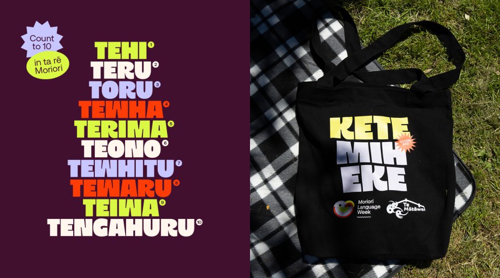
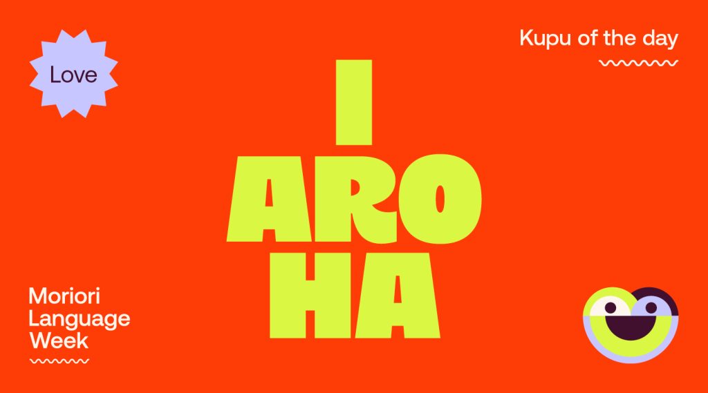
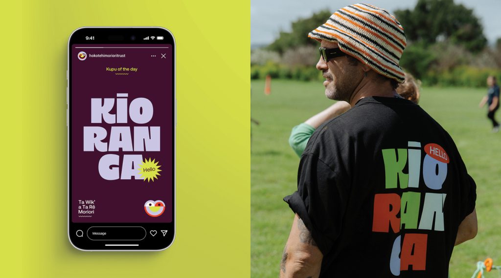
All campaign outputs were to function as language-learning tools, requiring a design system that was simple, accessible, and engaging for a wide audience.
From a practical perspective, the campaign was to be predominantly digital, with a strong emphasis on print-at-home resources suitable for display in schools, staff rooms, and community spaces throughout the week.
The design response
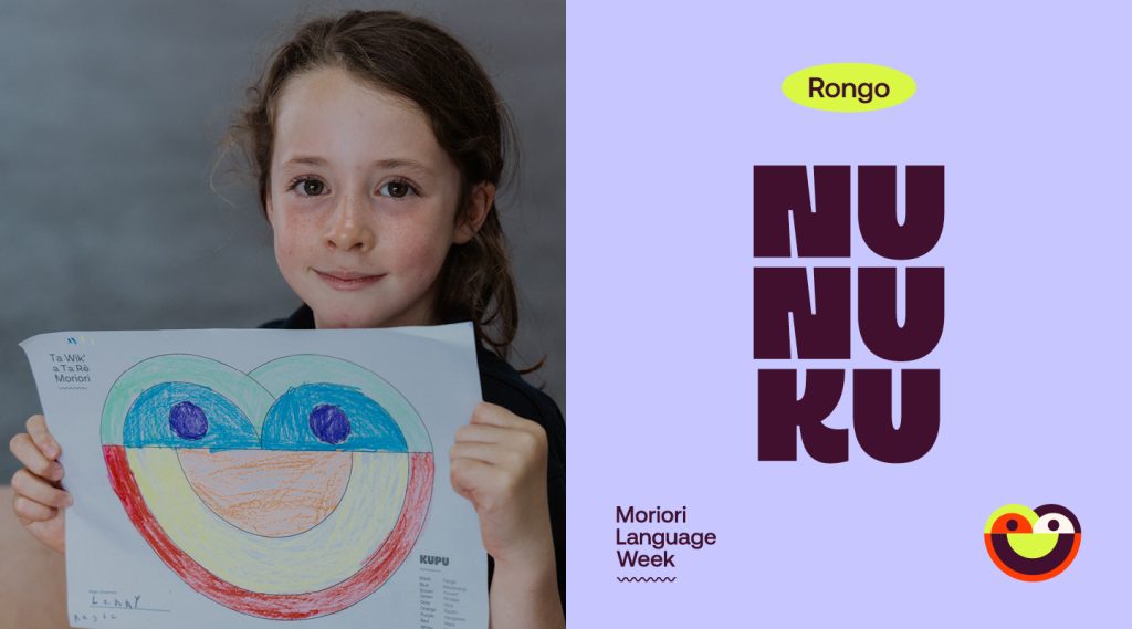
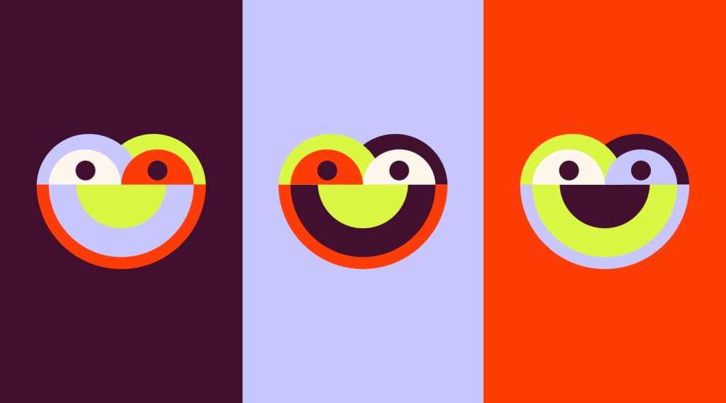
My starting point was to look closely at the visual and cultural resources already available to support a confident, contemporary expression of ta imi Moriori. One of the most immediately recognisable Moriori forms is rākau momori — ancient tree carvings found across Rēkohu. These carvings are often simple, human-like depictions, and many carry an unmistakable warmth and joy in their expression. That sense of positivity felt like a natural fit for a campaign focused on language, peace traditions, and forward momentum.
I also reviewed the existing Hokotehi Moriori Trust brand to assess whether its foundations could be extended into the Ta Wik’ a Ta Rē Moriori campaign. While the Trust’s identity is grounded and purposeful, it sits within a more corporate visual space. To achieve the boldness, accessibility, and energy required for a nationwide language week, I made a deliberate decision to branch out visually. The system was designed so that colour palettes could evolve year to year — keeping the campaign fresh and celebratory — while the core elements such as typography, icon, and wordmark would remain consistent for recognition and continuity.
Drawing from archival material, I selected a rākau momori carving to form the basis of a simplified icon that could act as the “face” of Ta Wik’ a Ta Rē Moriori. This icon needed to feel welcoming and unmistakably Moriori. The colour palette was then developed from the natural environment of Rēkohu, echoing the Trust’s brand foundations, but pushed into a far more vibrant and electric space to signal celebration, visibility, and confidence.
The wordmark presented its own set of challenges. With only a small number of fluent speakers of ta rē Moriori, it was essential that the campaign’s purpose was immediately clear to audiences encountering it for the first time — often through a quick scroll or glance. At the same time, it didn’t feel appropriate to lead solely with English. The final solution was a bilingual wordmark system, allowing the ta rē Moriori and English versions to be used interchangeably depending on context, while always keeping the language at the centre of the campaign.
The design team
https://www.moriori.co.nz
https://www.instagram.com/ashryanchathams
The client team
Collaborators
Chas Taurima – Ta Rē Moriori knowledge