Fresh From The Field: Forest Water – By MAKEBARDO
Step into the forests of Appalachia with Forest Water, a sparkling craft beverage brought to life by MAKEBARDO through a visual identity rooted in resilience, heritage, and mindful consumption.
Fresh from the Field is a weekly article series sharing fresh and inspiring work from the Design Assembly community. Want to submit your work to Fresh From The Field? Fill out the form here.
The brief
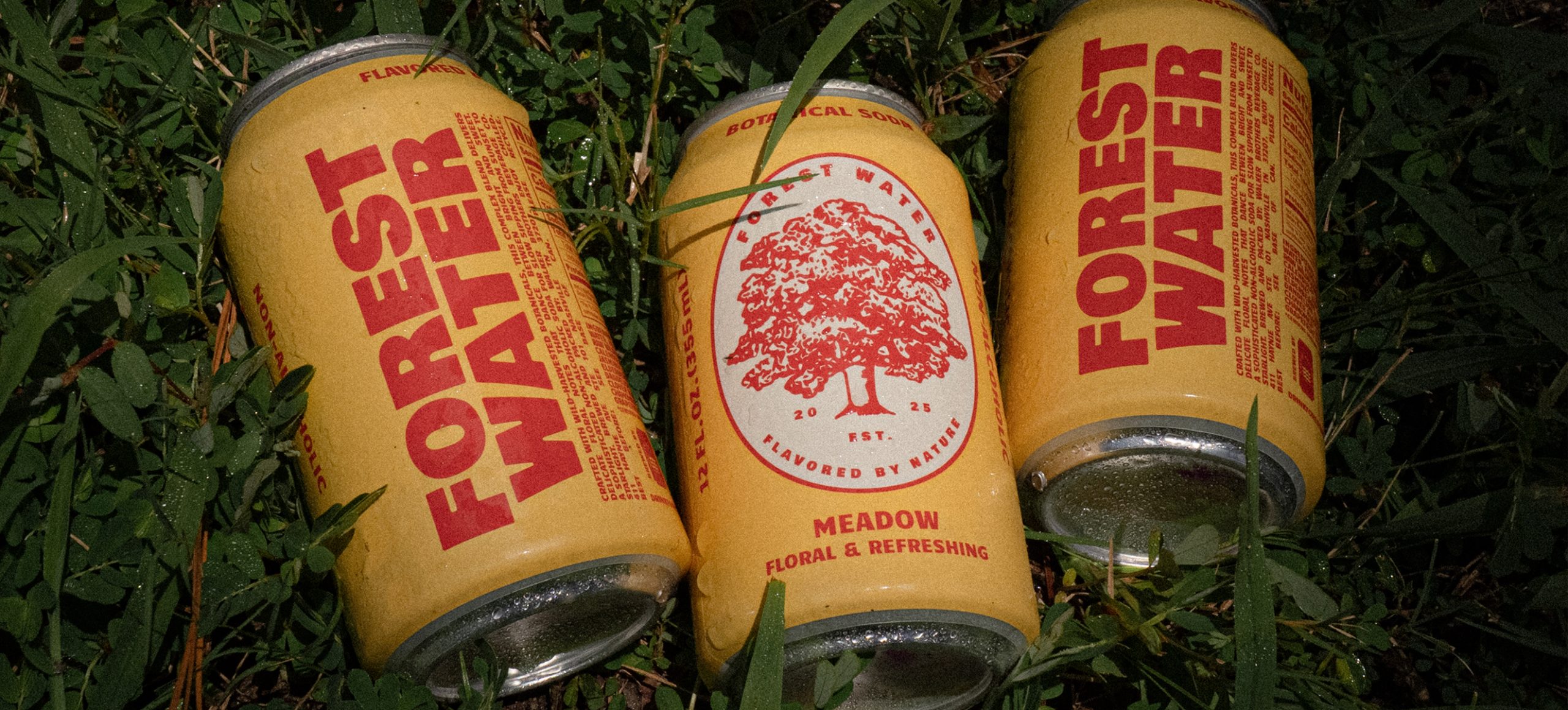
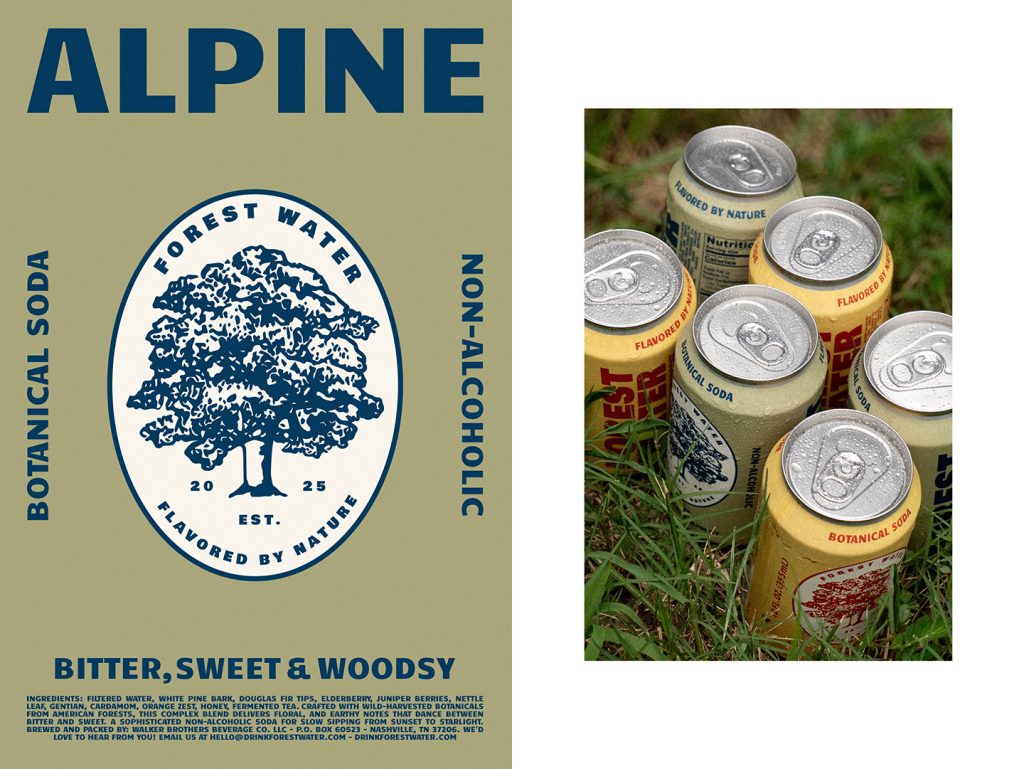
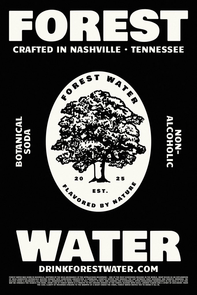
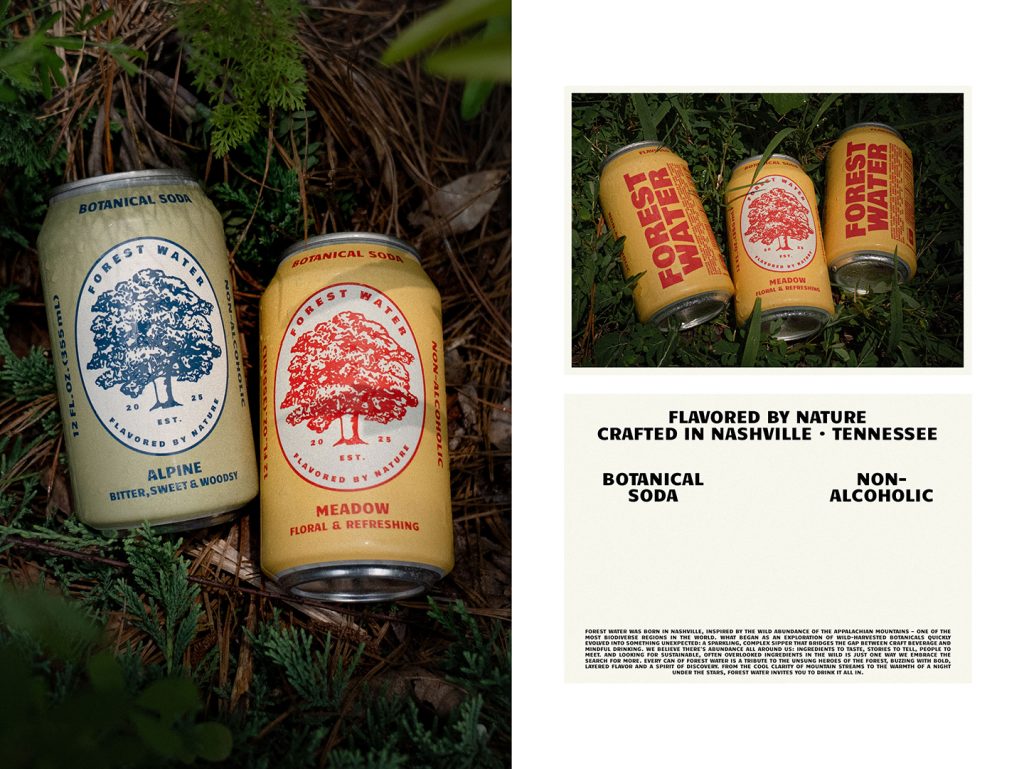
Born in Nashville and inspired by the wild abundance of the Appalachian Mountains, Forest Water began as an exploration of wild-harvested botanicals. It has evolved into a sparkling, complex drink that bridges the gap between craft beverages and mindful consumption. The brand embraces the search for sustainable, often overlooked ingredients, making every can a tribute to the unsung heroes of the forest. Packed with bold, layered flavours and a spirit of discovery, Forest Water invites you to enjoy the whole experience—from the clarity of mountain streams to the warmth of a night under the stars.
The design response
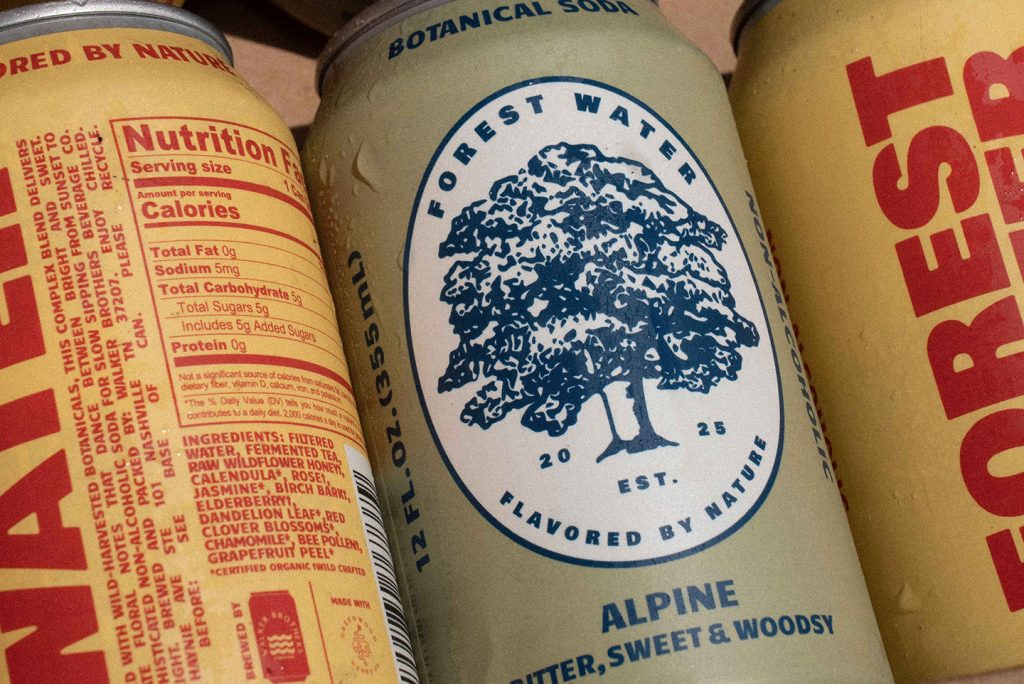
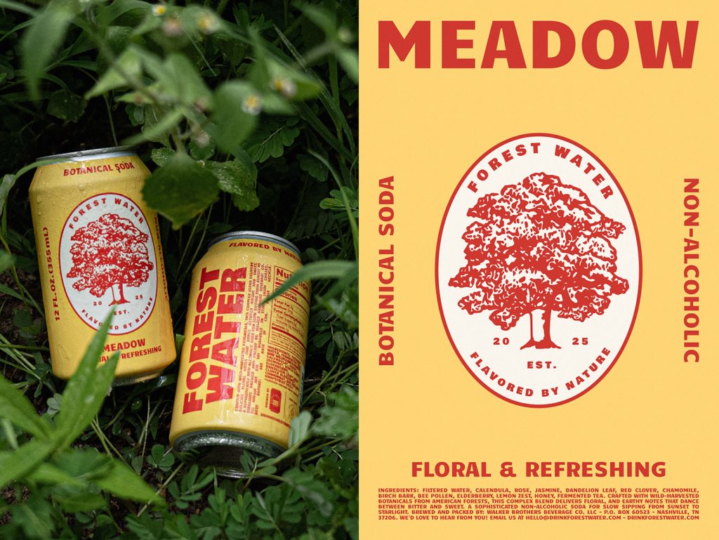
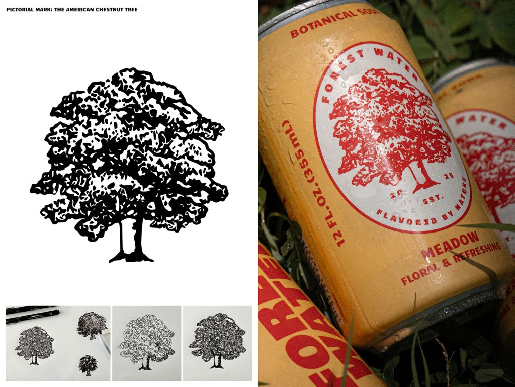
The brand’s visual identity reflects its story, anchored by a hand-drawn pictorial mark of the American Chestnut Tree—an impactful symbol of resilience and a tribute to the native flora of the Appalachian landscape. The typographic system draws inspiration from WPA-style artwork, specifically the National Parks posters, to evoke a sense of American history and wonder. To position the brand as a timeless entity rather than a passing trend, the establishment date is included in the emblem as a conceptual anchor. The identity balances nostalgia and contemporary style by utilising a black-and-white base, combined with specific colours for each SKU to capture the character of each unique blend.
The design team
Website
Instagram – @makebardo
The client team
Forest Water
Website
Instagram – @drinkforestwater
Collaborators
Photography Hannah Pearson from ahpear.com
Brand Strategist – Fern Diaz from librarie.studio