Fresh From The Field: Pt Chevalier Bowling Club brand refresh – By Gina Beck
A brand refresh for the Point Chevalier Bowling Club by Gina Beck that balances heritage with contemporary appeal, honouring nearly a century of community spirit while welcoming a new generation.
Fresh from the Field is a weekly article series sharing fresh and inspiring work from the Design Assembly community. Want to submit your work to Fresh From The Field? Fill out the form here.
The brief
The opportunity came up to work on a brand refresh for our local Point Chevalier Bowling Club, a destination that’s been at the heart of the neighbourhood’s social life for nearly a century. The project was part of a wider effort to grow the customer base and reinforce the club as a go-to spot for catchups, kids’ dinners, sports viewing and of course, bowls.
The brief was to modernise the brand, so it resonates with a younger demographic and families, while still honouring the club’s rich history and ensuring long-standing members feel respected and included. The challenge was to strike a balance between heritage and contemporary appeal, to create an identity that feels fresh yet captures the essence of the club.
The design response
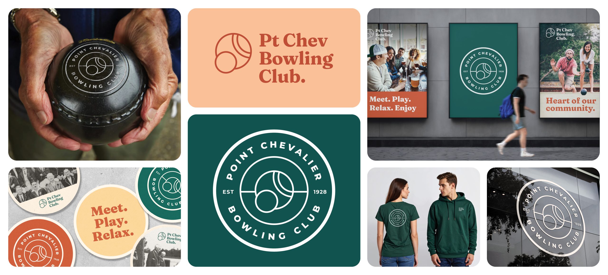
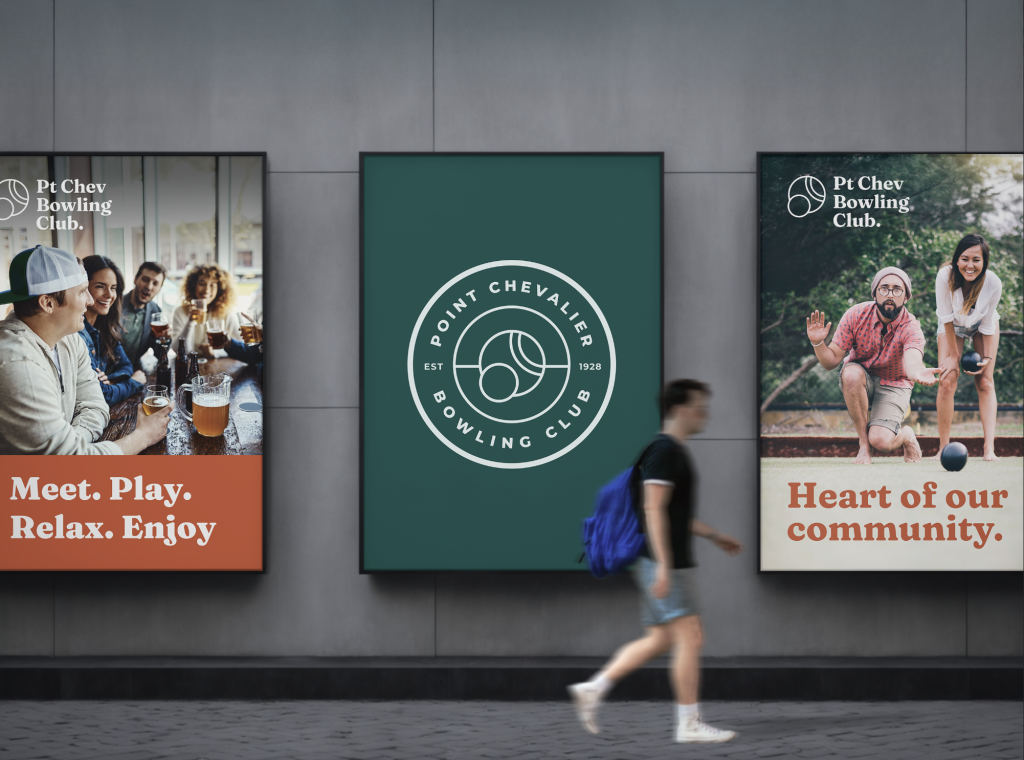
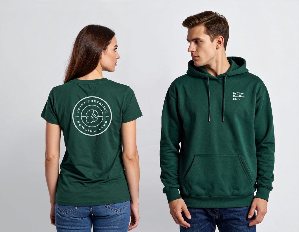
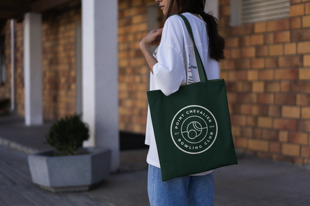
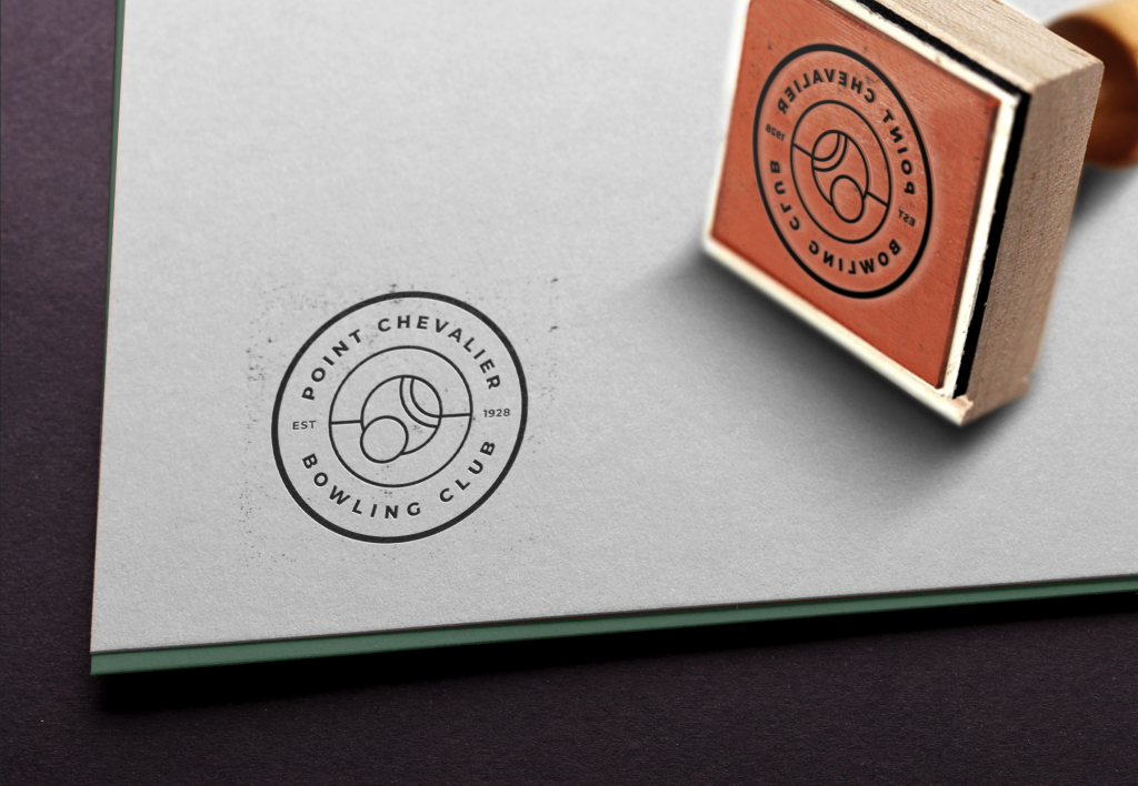
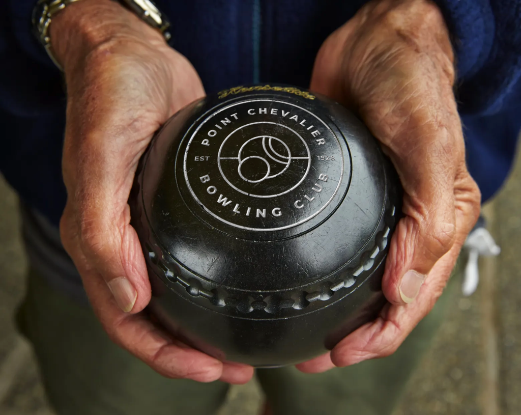
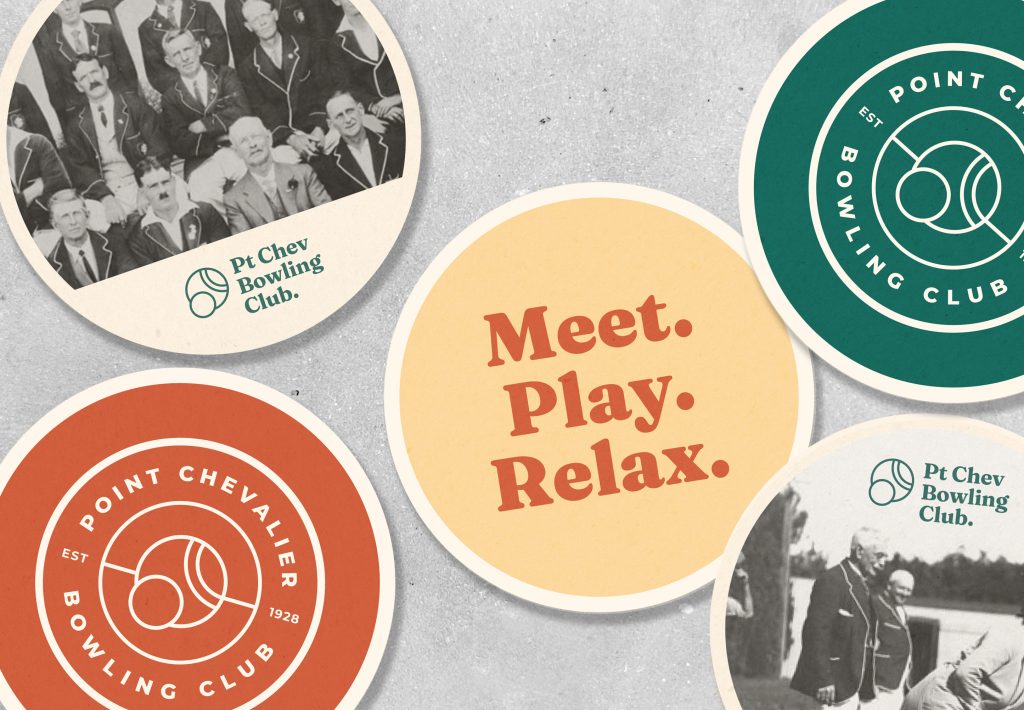
A key part of the project was developing a new logo suite that could work across different touchpoints, from signage and apparel to social media and event collateral, ensuring the brand feels familiar and welcoming wherever it shows up.
I started by researching the club’s history, from its founding in 1928 to its role in the community as a multipurpose gathering place. The goal was to distill that heritage into something simple and contemporary. I drew inspiration from the Art Deco period, the era when the club was established, with a small nod to Streamline Moderne to suggest movement and progress.
The colour palette references 1930s tones that complement the club’s traditional green, adding warmth and depth without clashing with existing signage. A playful retro typeface keeps the tone approachable and lighthearted.
What made this project rewarding was bringing long-term members along on the journey and showing them it wasn’t just about a new logo. It is a new identity for the club that honours their legacy while helping it thrive in a new era. For me, it was about creating a sense of pride and belonging for everyone involved.
The design team
https://ginabeck.myportfolio.com/work
https://www.linkedin.com/in/gina-beck-51691b16
The client team
Pt Chevalier Bowling Club