Fresh From The Field: Holy Aioli – By Onfire Design
Dip your nose into this new design from Onfire Design, where they transformed the branding that lacked the desired impact to something bold, playful, and unapologetically focused on making every chip-dunking moment unforgettable.
Fresh from the Field is a weekly article series sharing fresh and inspiring work from the Design Assembly community. Want to submit your work to Fresh From The Field? Fill out the form here.
The brief
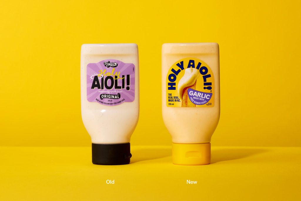
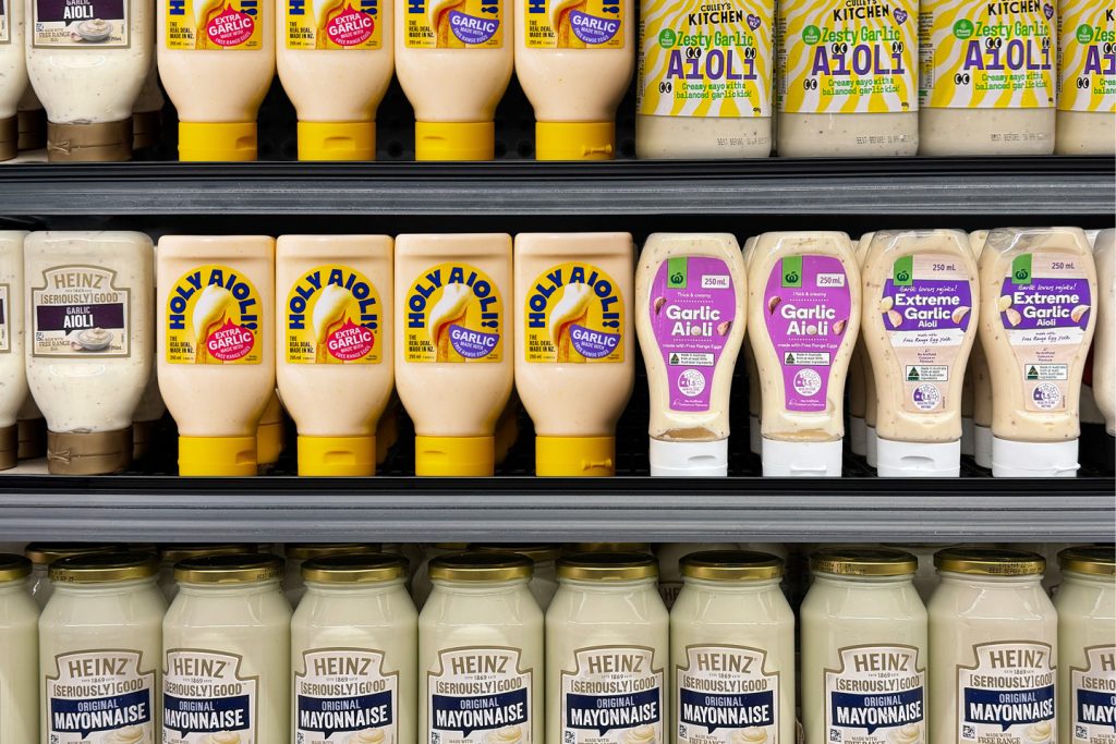
Since its launch into the condiment aisle, Tongue and Cheek’s Holy Aioli has established itself as a viable #2 brand for consumers in a category dominated by one large global brand. Proudly New Zealand-made and obsessive about good aioli, it was a brand with a perfectionist mindset.
However, it lacked the desired impact, and there was a distinct misunderstanding about that brand’s name. Our work revolved around recapturing the reason why it was created in the first place; the simple notion of aioli that is so good that it elevates the experience of eating the humble Kiwi chip to an unforgettable moment.
The design response
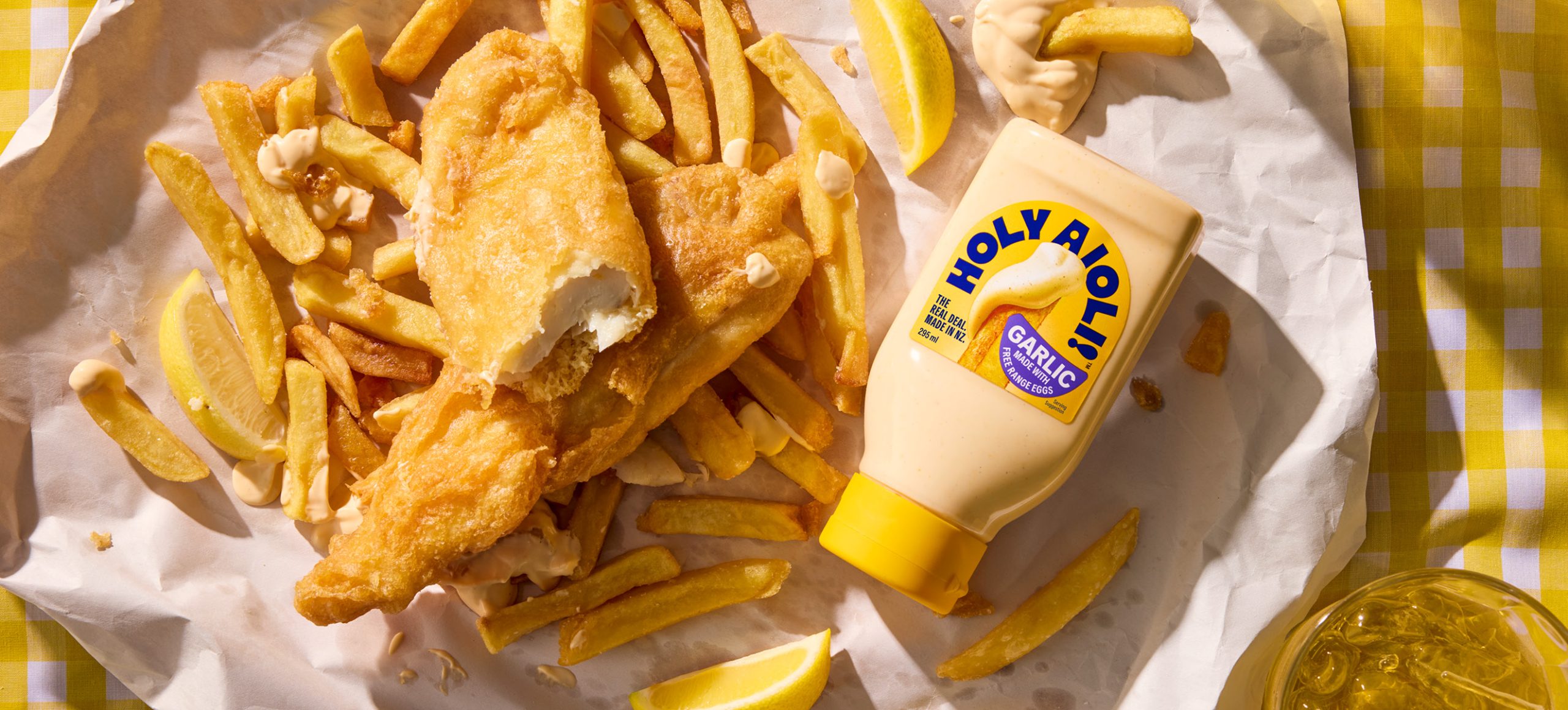
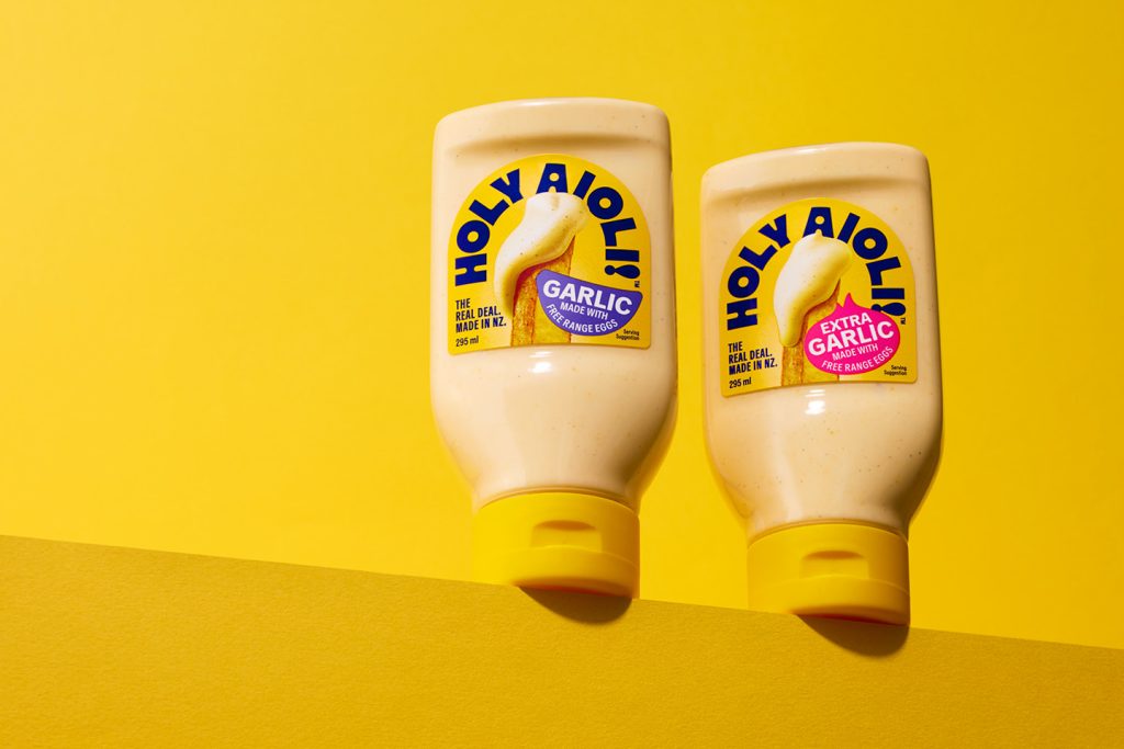
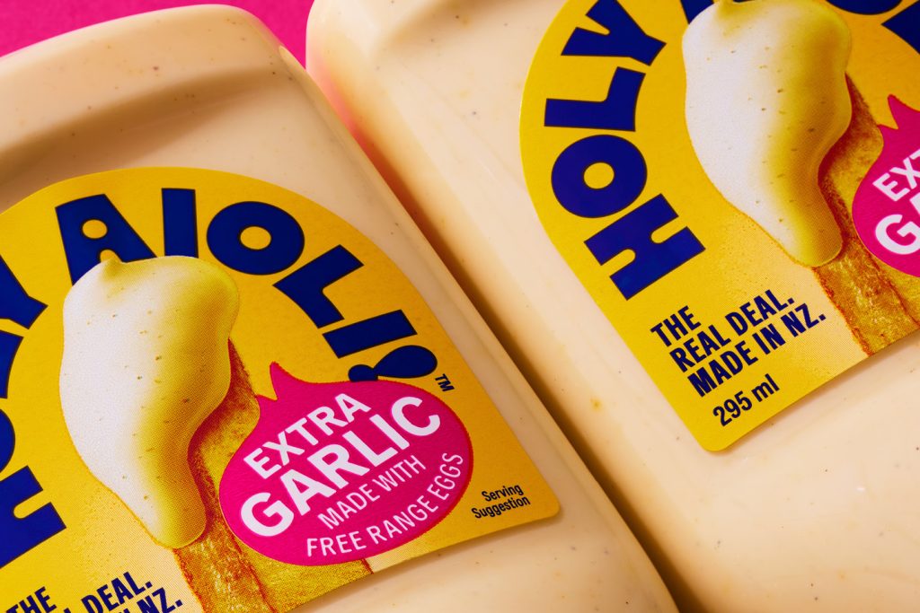
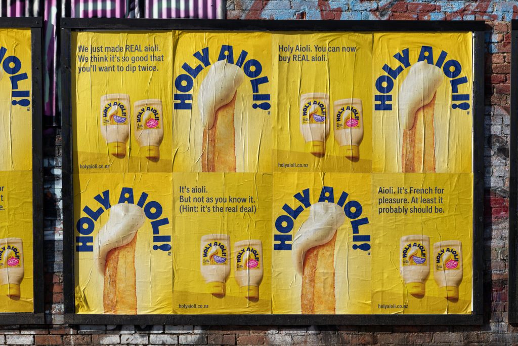
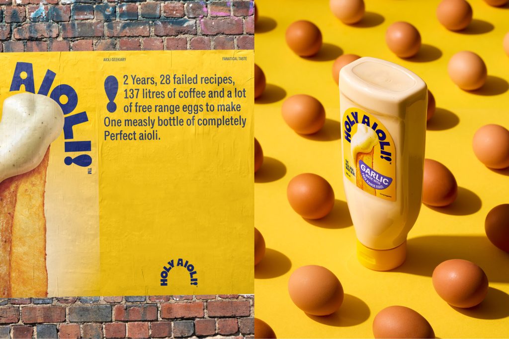
The brand became Holy Aioli, a simple all-in-one statement. Visually, it is single-minded in its storytelling. The humble chip, with a perfectly dunked creamy dollop of aioli, is shown in all its hyperrealistic, textural glory. The bottle fully embraces yellow, inspired by the free-range eggs that is a core ingredient. Simple, brightly coloured ingredient-shaped stickers define flavours. The label shape was amended to focus attention on the proposition.
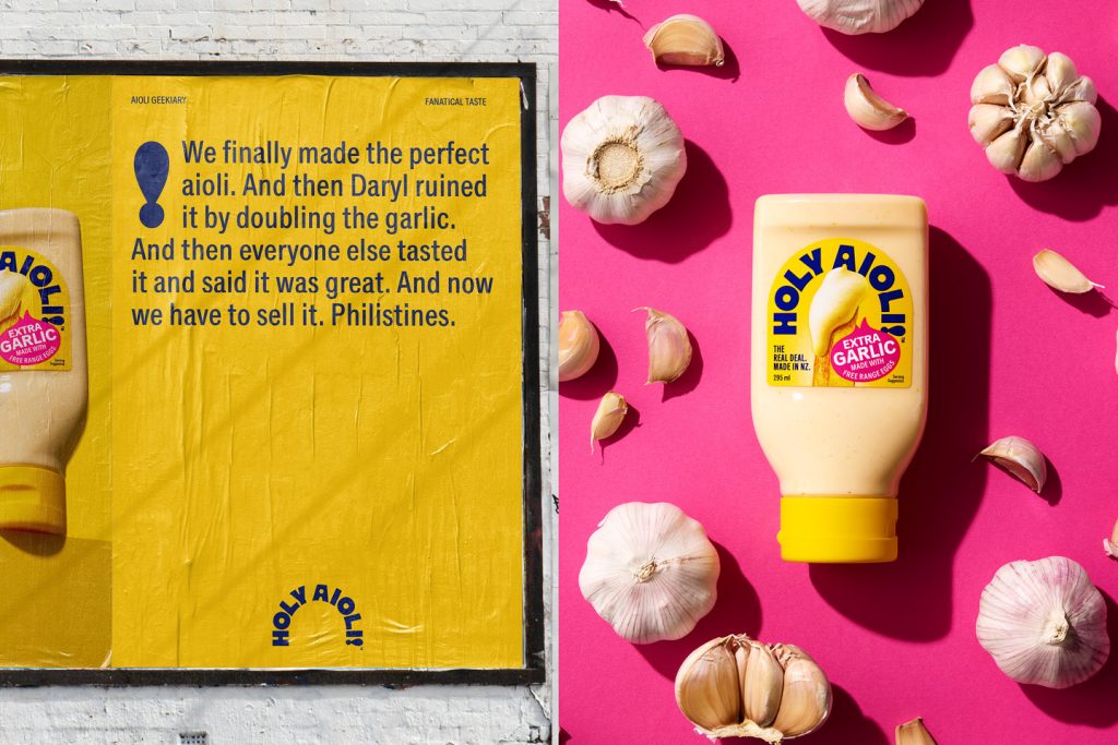
Tone-of-voice is geeky and obsessive, referencing how the aioli is made, what real aioli is, and why Holy Aioli will never compromise.
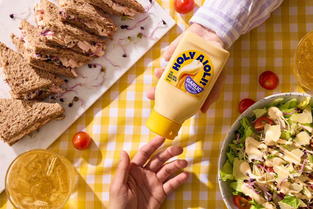
The result is an aioli on a mission: to promote what real aioli is. On the shelf, it is all about the food porn of the perfectly dunked hot chip, as well as being an ever-so-subtle middle finger to the competition.
The design team
Design Director: Sam Allan
Creative Director: Matt Grantham
Designer: Natasha Alimova
Finished Artist: Kendal Dunlop
https://www.weareonfire.co.nz/
Facebook: Onfire Design
Instagram: @onfiredesign