Fresh From The Field: Venerdi – By Onfire Design
Our work revolved around bringing wider meaning and storytelling to the firmly established Gluten Freedom brand that was working well in retail.
Fresh from the Field is a weekly article series sharing fresh and inspiring work from the Design Assembly community. Want to submit your work to Fresh From The Field? Fill out the form here.
The brief
Established in 2002, Venerdi was the generational New Zealand family business at the frontline of the bread revolution. By rethinking the conventions of white and brown bread recipes and styles, the brand became the go-to brand for Organic, Gluten-Free, Dairy-Free, and Paleo bread products. All led by the mission of making extraordinary food that is nutritious and healthy at heart. And not forgetting, very tasty.
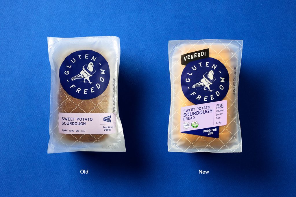
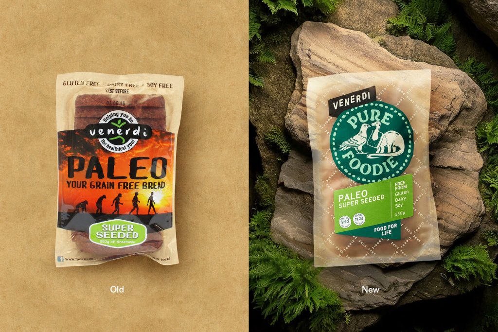
The business growth resulted in a range of retail sub-brands covering multiple health and lifestyle options. The latest of which, Gluten Freedom, was launched in 2019 and went on to become a firm consumer favourite. The recent business challenge for the business was two-fold – Gluten Freedom was such a success that consumers perceived that as the brand, not Venerdi. They also needed to rationalise and align their overall product portfolio to be more cohesive for consumers, while also making the product navigation simpler.
The design response
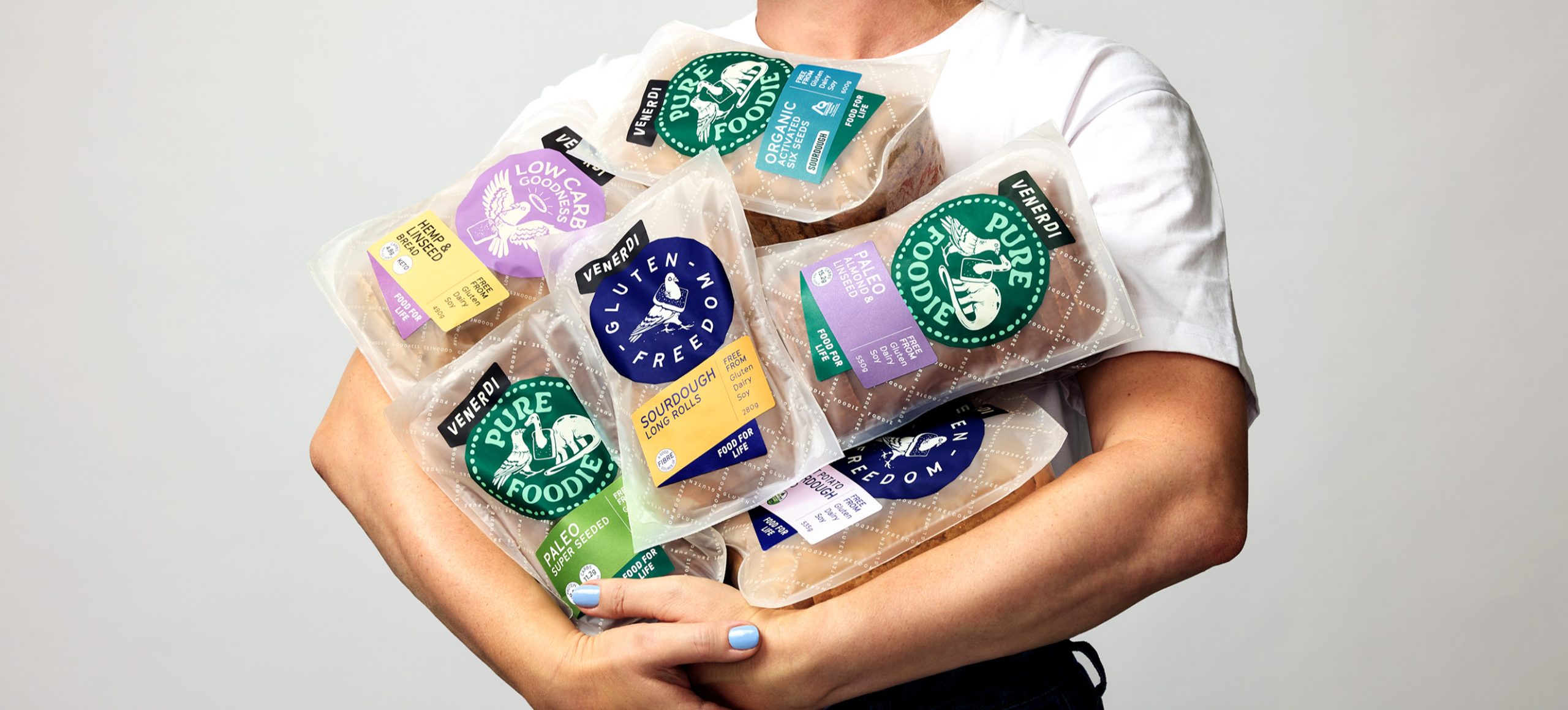
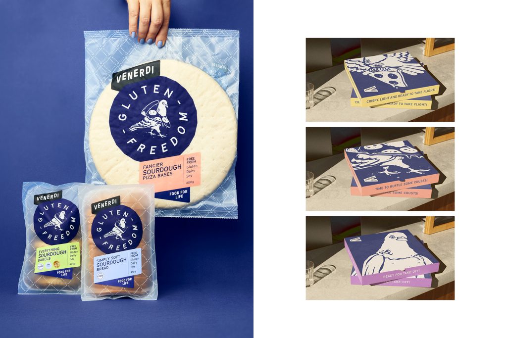
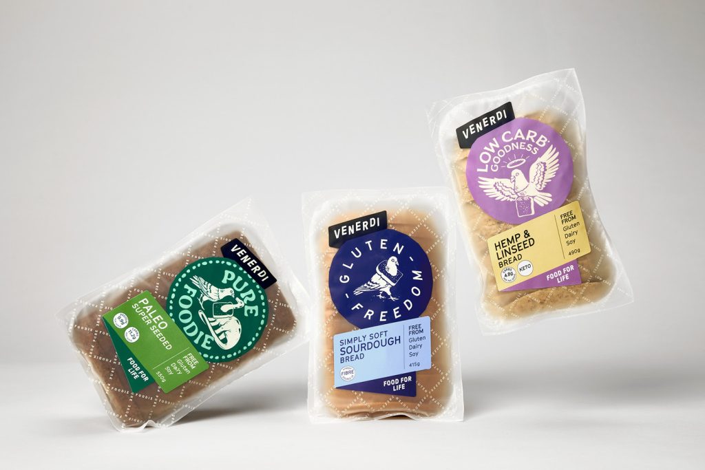
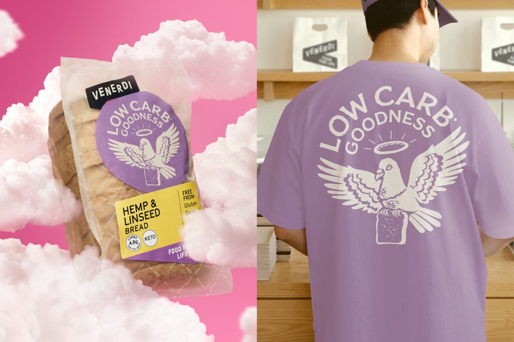
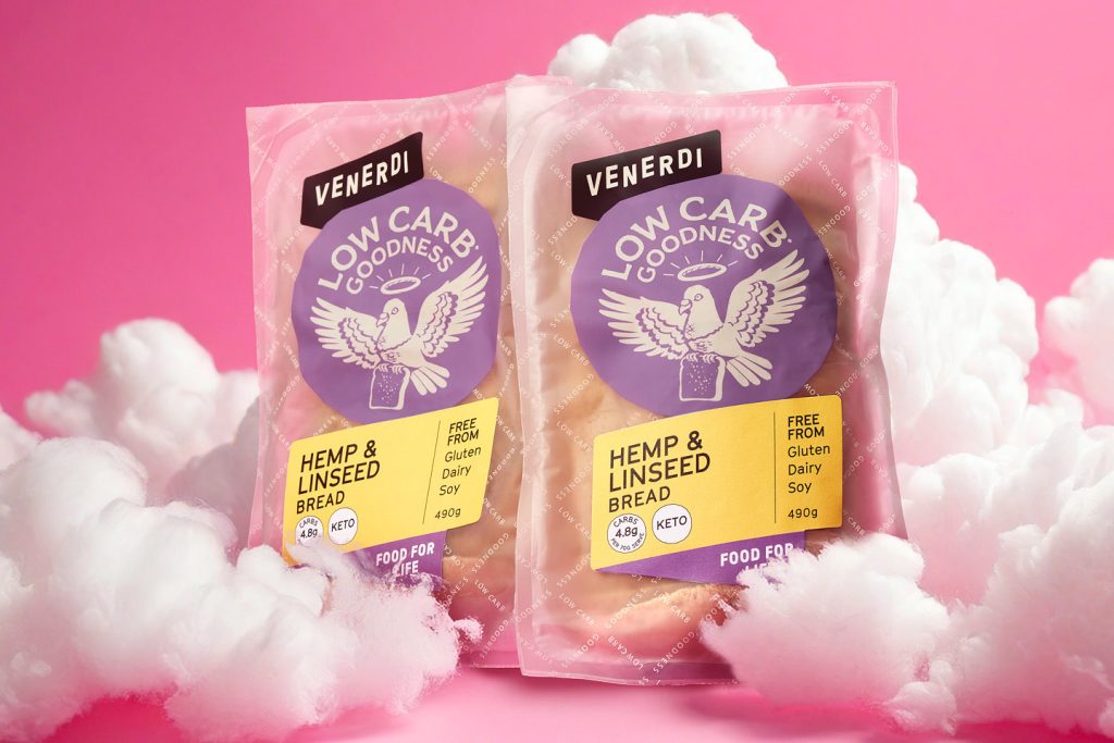
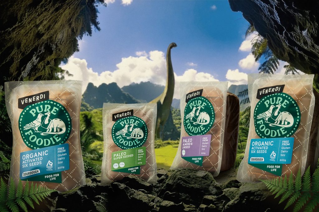
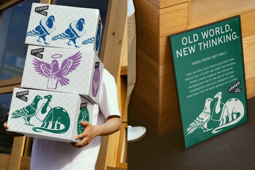
Our work revolved around bringing wider meaning and storytelling to the firmly established Gluten Freedom brand that was working well in retail. The result was bringing Pedro (the pigeon) into the wider product offerings – essentially leveraging the familiarity already established. A heavenly sent Pedro now denotes low-carb breads, while Paleo-based products feature Pedro’s first meeting with Emily, the paleo-loving Brontosaurus. Illustrations are in the same style, retaining the same circular shape and introducing category defining colours.
The Venerdi brand was also elevated, shifting it from a smaller quality sign-off to being the banner that adorns each range. Product labels were redesigned, taking on the shape of the Venerdi ‘V’ device, with prominent typography, health messages and colour palettes.
Tone-of-voice was built upon and each product’s story is buzzing with nerdy passion, taste cues and quirky word-play.
The result is a realigned, refreshed, and consistent range of breads that builds on what was previously working, dives deeper into the broader story of Pedro and his adventures, and elevates Venerdi to the proud, passionate, and playful brand that it is.
The design team
Design Director: Sam Allan
Creative Director: Matt Grantham
Designer: Natasha Alimova
Finished Artist: Curtis Walker
https://www.weareonfire.co.nz/
Facebook: Onfire Design
Instagram: @onfiredesign
The client team
Venerdi
Instagram: @venerdi_bread
https://venerdi.co.nz/