Fresh From The Field: FLEX — By Special
Special Group flex their new work.
Fresh from the Field is a weekly article series sharing fresh and inspiring work from the Design Assembly community. Want to submit your work to Fresh From The Field? Fill out the form here.
The brief
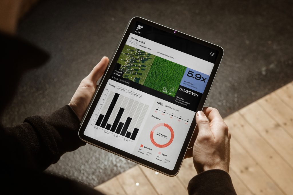
Flex is a smart energy solution for farmers that helps businesses take control of their electricity usage, reduce costs and prepare for an electrified future.
Flex and their joint venture partner Farmlands went to our Friends at Special looking for a brand strategy and identity that tells the story of who they are, what they do—with the focus on the customer, community and rural Aotearoa New Zealand.
The Design Response
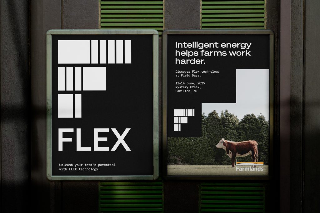
Inspired by the intersection of agriculture and innovation, the FLEX brand has been thoughtfully designed to support their new platform with a bold, contemporary identity. It was important to ensure the brand reflected the intelligence of the technology, while being relatable and accessible for farmers’ daily lives.
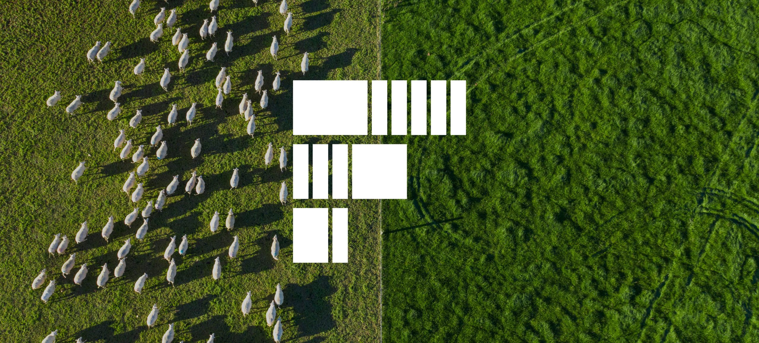
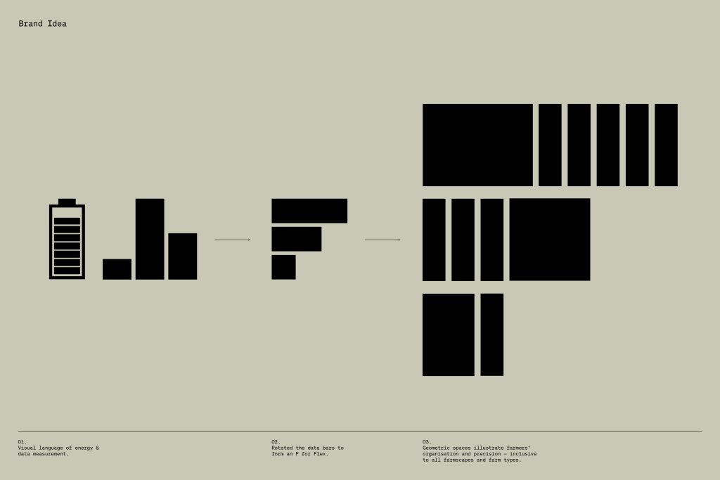
At the heart of the brand is the logomark, a visual expression of technology and performance. It draws from the visual language of data bars and energy infographics, symbolically embedded into the land. The varying bar sizes represent the diversity of types of farms and scale of paddocks, sheds, utilities, and terrain while subtly forming the letter ‘F’ for FLEX. The logo is confident and authoritative with sharp, geometric lines that reflect the precision, discipline, and technical expertise of farmers.
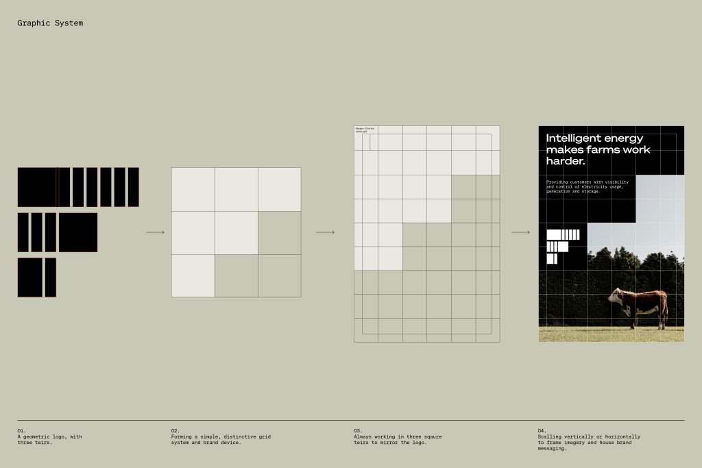
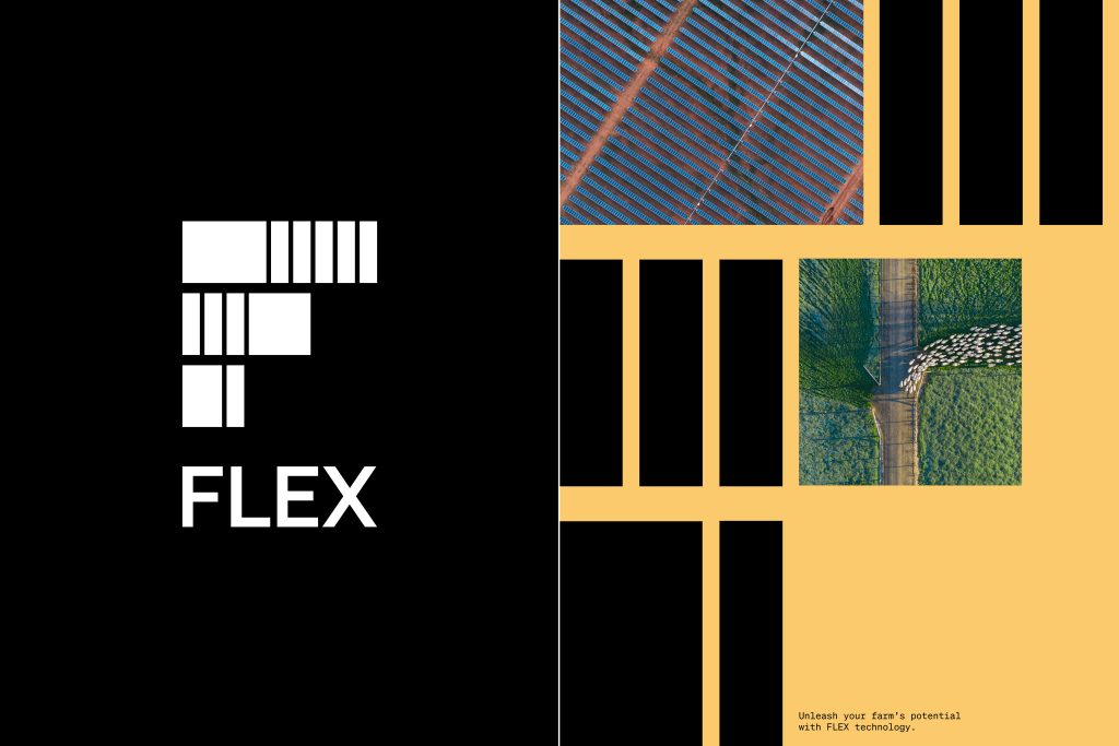
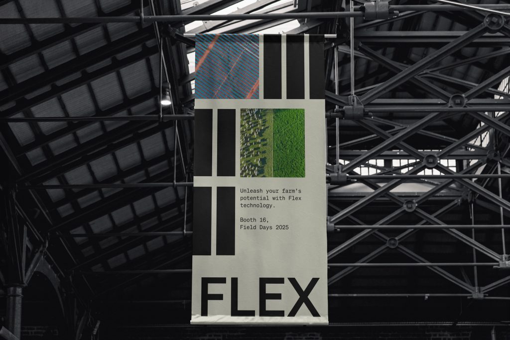
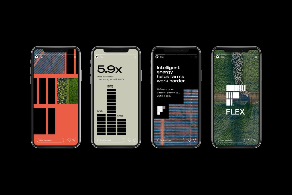
Supporting the logomark is a distinctive and adaptable graphic system, derived directly from the Flex logo. Paired with aerial photography captured through a graphic, technical lens.
The challenge was to create this new brand in enough detail for this innovative startup to design their various digital assets, while keeping it flexible enough for their internal dev teams to work with. The result is a brand that connects with rural Aotearoa New Zealand in a way that feels smart, trustworthy, and entirely fit for purpose.
The Design Team
Lead Business Partner: Matt Barnes
Group Strategy Director: Bethany Omeri
Business Manager: Amie Meadowcroft
Executive Design Director: Heath Lowe
Senior Designer: Madeline Lissington
Creative Director: JP Twaalfhoven
Junior Copywriter: Jess Skyler
The Client Team
Flex Founder: Andrew Peglar
Farmlands CEO: Tanya Houghton
Collaborators
Petra Leary – Photographer
Kieran Scott – Photographer
Fresh from the Field is a weekly article series sharing fresh and inspiring work from the Design Assembly community. Want to submit your work to Fresh From The Field? Fill out the form here.


