Design & Books… Nature—Stilled
This is the first in a new series of articles looking at book design and books on design. We begin with Nature — Stilled a Te Papa press title designed by Inhouse.
Publication date: October 2020
NZ RRP (incl. GST): $70.00
Extent: 364 pages
Format: Hardback
ISBN: 978-0-9951136-9-5
Cabinets of curiosities are not a new concept; wonderous collections housed in an object to delight. Nature—Stilled is exactly that. Award-winning photographer Jane Ussher spent weeks in residency at Te Papa capturing remarkable natural history specimens in macro (and marvellous) detail. The resulting book is an artefact worthy of collection itself, paying tribute to the glories of our natural world.

Content
Jane Ussher is one of New Zealand’s foremost documentary and portrait photographers, in 2018 she was commissioned to take a series of portraits of Te Papa curators and collection managers at the museum’s Tory Street natural history collection.“While I was looking for suitable locations I was shown some of the collections. I had no idea these objects, which are not on display to the public, existed and was astounded by their rare beauty. The idea of creating a book to document these hidden treasures seemed to be a way of not only making them accessible to the public but also celebrating the dedication of the collectors and curators.”
Despite having a luminary photographer guiding the project this Nature—Stilled is more than a photography book. This beautifully conceived document is an opportunity to learn about the natural history of New Zealand beyond the museum’s displays. Jane Ussher worked with the curators to explore legacy specimens in storage, discovering and documenting parts of the collection not often accessible to the public.

Plate 141
Lodictyum yaldwyni
Lace coral
This specimen of Lodictyum yaldwyni was collected in 1978 by a scuba diver on Middleton Reef, north of Lord Howe Island in the western North Tasman Sea. Although it is preserved in alcohol, it has retained its purple colour, which is laid down permanently in the skeleton rather than in the animals that built it.
This collaboration with the curators was critical; “I spent time with each member of the natural history team, being shown the collections, and from there a shortlist was made that included rare or important specimens and then allowed some latitude to include objects or groups that I found so compelling either because of their beauty or some other indefinable quality which meant that I felt the book wouldn’t be complete without them.” Ussher was not able to handle any of the objects and viewed each still life as a portrait – she wanted to discover the stories behind the extraordinary objects, capturing the special characteristics of each item. The insight, dedication and expertise of the curators were invaluable to the success of each photograph and the book as a whole.
“I was compelled to do this book because I was astonished by the beauty and richness that I saw in the various collections. The colour and diversity of the species plus the care that has gone into protecting and collecting them over the decades is breathtaking. If I have been able to communicate this passion I will feel that the time I spent with the natural history team has been worthwhile.”
In a recent Radio NZ interview, Ussher admitted she was particularly drawn toward the packaging, handwriting and labelling of the items which she found as beautiful as many of the specimen.

Plate 007
Wrapped lichen specimens labelled as Ompharia, Opegrapha and Parmelia.
Old, original specimen wrappers: Overland Mail newspaper, 5 November 1886; a glassine packet; and a piece of handmade paper. These wrappers contain lichen specimens labelled as Ompharia, Opegrapha and Parmelia, collected and assembled by Charles Knight, 1880s.

Production
The casebound cover with gold foil embellishment nods to this book being both art and artefact. The endpapers have combed marbling in a secondary nod to the zeitgeist of the victorian curiosity cabinet aesthetic while also signalling the volume is of quality.
The front part of the book is reproduced on a satin coated stock to allow the vibrancy of colour and detail in the imagery to shine. The extended captions, short essays and acknowledgements in the later part of the document are reproduced on uncoated stock in 2 colours.

Journey
Arch MacDonnell at Inhouse was tasked with the design, despite the images being provided in obvious catalogue groupings MacDonnell made the bold move to reject the categorisation using a colour wheel to inform a chromatic plate sequence for the 157 images. As part of the design process images were blurred in photoshop to the point of abstraction, where just the most essential colour could be distilled. In doing so each image became a colour swatch that could be assigned a value and placed within the colour wheel. Hues become a unique way to navigate the natural world and curate the collection within the interior pages of the book (a decision the author acknowledges as genius in the books backmatter).

Rhythm is always critical in reader experience, in Nature—Stilled the colour and scale of plates set an intentionally slow pace of movement. There is a right-hand bias to single images; the grid is flexible to accommodate the varied proportions of the imagery throughout. Where images are not full-bleed, compositions have generous margins allowing each plate room to breath. MacDonnell described “giving oxygen” to compositions as being one of the first design decisions made; so each specimen would be contemplated by the reader.

Typography
Nature—Stilled features two new custom typefaces and has a considerable volume of text. Museum curators provide both short-form didactic (alongside the imagery) and then extended captions and short essays (in the backmatter) with narrative overlays to provide fascinating detail, conservation and contextual information about each photographed specimen.
Alistair McCready is an accomplished type designer and was Inhouse’s lead on this project. “Let’s just double down on this and love it up,” Arch MacDonnell tells radio New Zealand on the decision to have McCready design a typeface for the book.

The Inhouse team were working on the project from home during lockdown. They had already done an enormous amount of work on the book. Still, they seized the opportunity to ensure the visual language of Nature—Stilled was as thoughtfully crafted as the photography and text supplied by Ussher and the TePapa curatorial team.

McCready has a particular interest in New Zealand monuments and war memorials. During his honours research (2016) Alistair produced a body of work called Type as monument. As part of that project he took a rubbing of the foundation stone of the Dominion Museum. This rubbing inspired the sombre headline display type used Nature—Stilled. Rather than take an exact trace McCready replicated the sentiment of the characters.


Everything about this book is bespoke. The interior (and all that wonderful context provided by the Te Papa curators) is typeset in Still Sans (below). The typeface is composed of 6 styles (x3 weights + italics) drawing on type-centric ephemera from yesteryear’s museum catalogues—a monumental effort from Mcready and the Inhouse team. The text is easily read and forms robust despite appearing delicate on the page. Still Sans also offers the perfect juxtaposition to the inky handwritten annotations that are photographed with many of the specimen.


McCready writes “My favourite part of this typeface are the disobedient figures. We decided to create proportional, 3/4 height and tabular variants seeing as the book is so numeral heavy.”

Audience
This beautifully considered book has broad appeal but its visually rich pages will be especially relevant to designers, artists and photographers based in Aotearoa. MacDonnell notes that while there is not a lot of money in making books Inhouse viewed this project as contributing to New Zealand’s visual culture, and an opportunity to honour these astonishing objects. Nature—Stilled undoubtedly delivers.

Plate 020
Priocnemis monachus
Black spider-hunting wasp
These wasps are best known for catching and paralysing spiders to serve as living larders for their young.
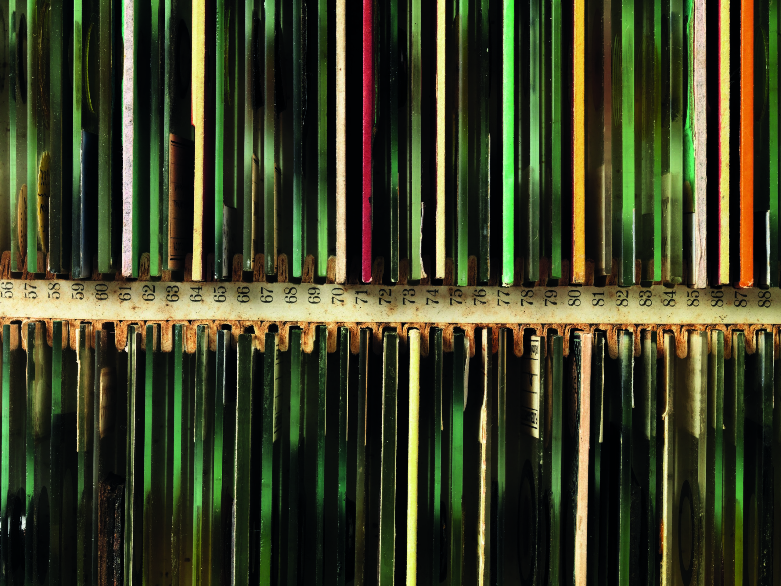
Plate 065
Assorted microscope slides
This box contains slides of all major branches of life on Earth. Old slide collections like this could be used
in university courses and also in scientific research, for comparative purposes. They were extremely
helpful at a time when quality images of microscopic structures were rare.
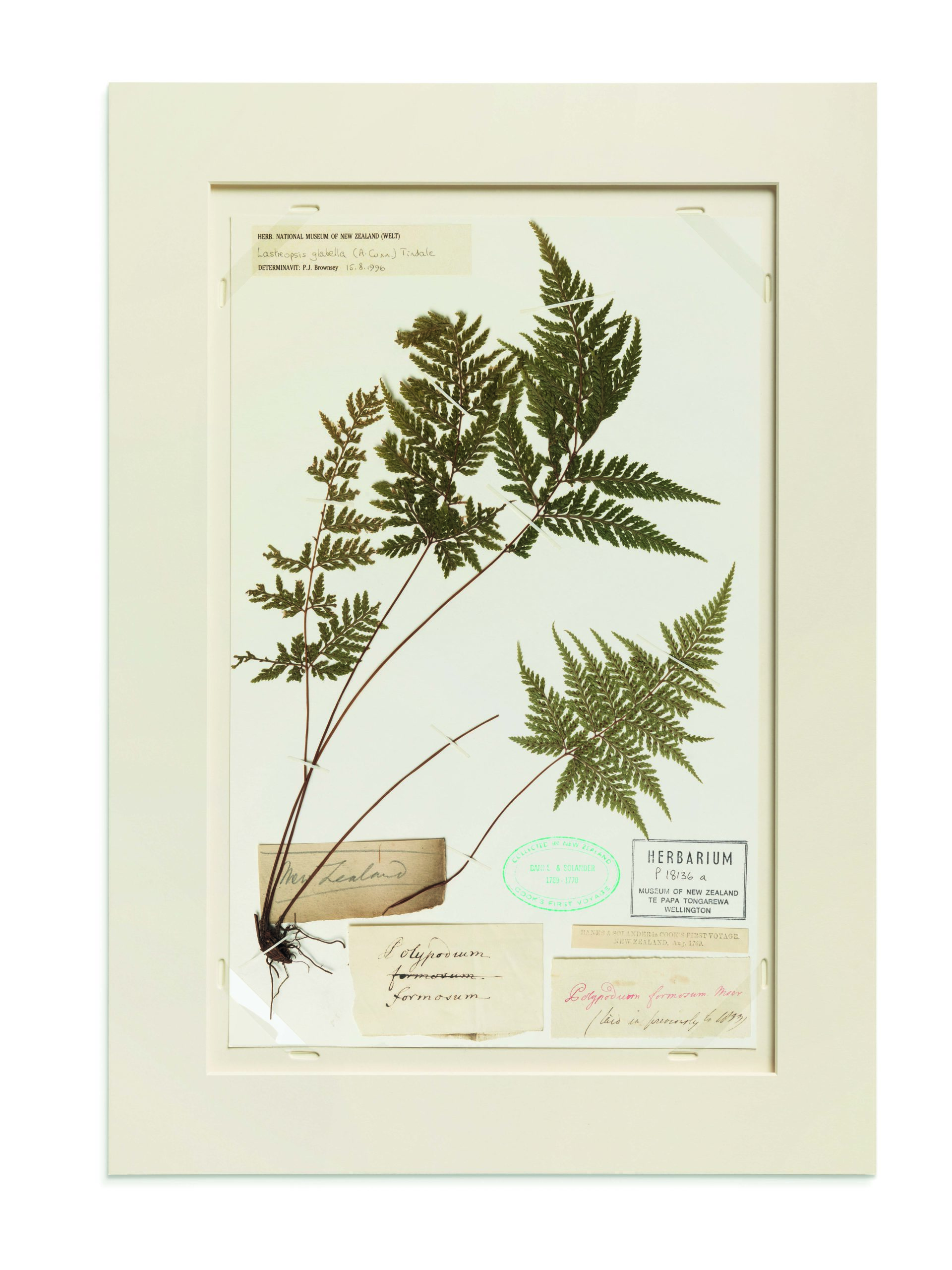
Plate 077
Lastreopsis glabella
Smooth shield fern
This fern was collected over the summer of 1769–1770 by naturalists Joseph Banks and Daniel Solander,
on the voyage of the Endeavour. It is one of 541 sheets of New Zealand specimens from the voyage held in the Te Papa Herbarium.

Plate 088
Emberiza citrinella
Yellowhammer
Study skins of adult male yellowhammers from throughout New Zealand.

Plate 093
Bhutanitis lidderdalii
Bhutan glory butterfly
Wing detail of Bhutan glory butterfly from the mountainous country of Bhutan.

Plate 123
Heliocidaris erythrogramma and
Heliocidaris tuberculata
Sea egg / Sea urchin
There are two sea urchin species in this drawer: Heliocidaris tuberculate from New Zealand and Australia, and Heliocidaris erythrogramma from Australia only. Both are in the same genus and you won’t spot any differences between them in the photograph, yet they are worlds apart in the way they reproduce.
All specimen images © Jane Ussher. Reproduced with permission from her new book Nature – Stilled, published by Te Papa Press. All specimens featured are part of the collection of the Museum of New Zealand Te Papa Tongarewa.
If you have a book you’d like us to review email nicole@designassembly.org.nz with details.


