Fresh From The Field — Bean Supreme by PRINCIPALS
This Fresh From The Field by principalsbrand.co.nz features a dynamic re-brand for Bean Supreme that delivers delight (& happiness) with delicious energy.
If you have new or recent work that you would like to share in Fresh from the Field email Louise for details.

The brief:
Bean Supreme launched one of the first soybean ranges in New Zealand in the 80s (when soy ‘gave boys boobs’ and beans ‘gave you farts’). Fast-forward 30 years and the plant-based FMCG category is now seriously competitive with 30% more New Zealanders opting to eat meat-free each year*.
(*Colmar Brunton)
With cool new kids on the meat-free block, it was time for Bean Supreme to take stock of its identity.
Customer testing showed that while the products were popular with loyalists and an increasingly-mainstream ‘flexitarian’ audience, brand recall was only for the ‘white pack’. Nobody knew the brand name, tag-line, who Bean Supreme was, or what they stood for.
Principals started at the beginning, chatting with the founder about his journey to China, where farmers showed him a variety of soybeans named ‘Brings Happiness’. The idea that you can eat your way to happiness and health formed the original Bean Supreme ethos (the team loved that and tucked the idea away for later).
Their job was to modernise the brand and packs with a renewed energy, bringing the bean front and centre without losing any customers along the way.

The response:
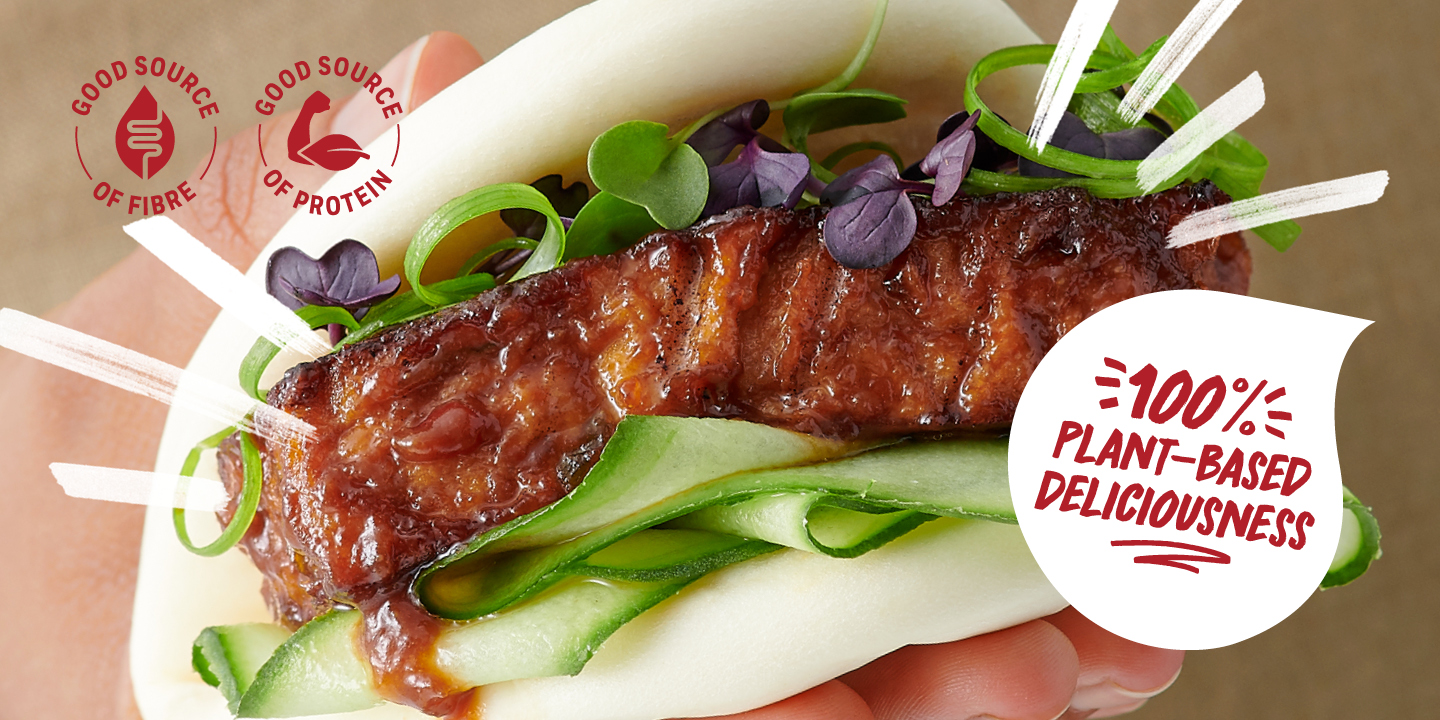
Principals wanted the photographic style to be Insta-worthy: so delicious it felt like ‘eating with your eyes’, but honest enough to feel homemade by the kind of hands-on social foodies we’d met at our customer-testing sessions. Achieving a tangible, human connection through photography was central to their vision of a warm, caring ‘Supremely Better’ feel.
Josh Griggs shot a range of people holding, offering, sharing and showing off baos, wraps, buns and bowls, focusing on their hands in front of natural linen aprons.
Once they had ‘eat with your eyes’ nailed, it was time to upgrade the pack. The pack whiteness was staying as a critical brand code (achieved by printing opaque white ink onto white paperstock for an ultra-white), but they needed a new way of expressing flavour and creating a happy energy vibe.
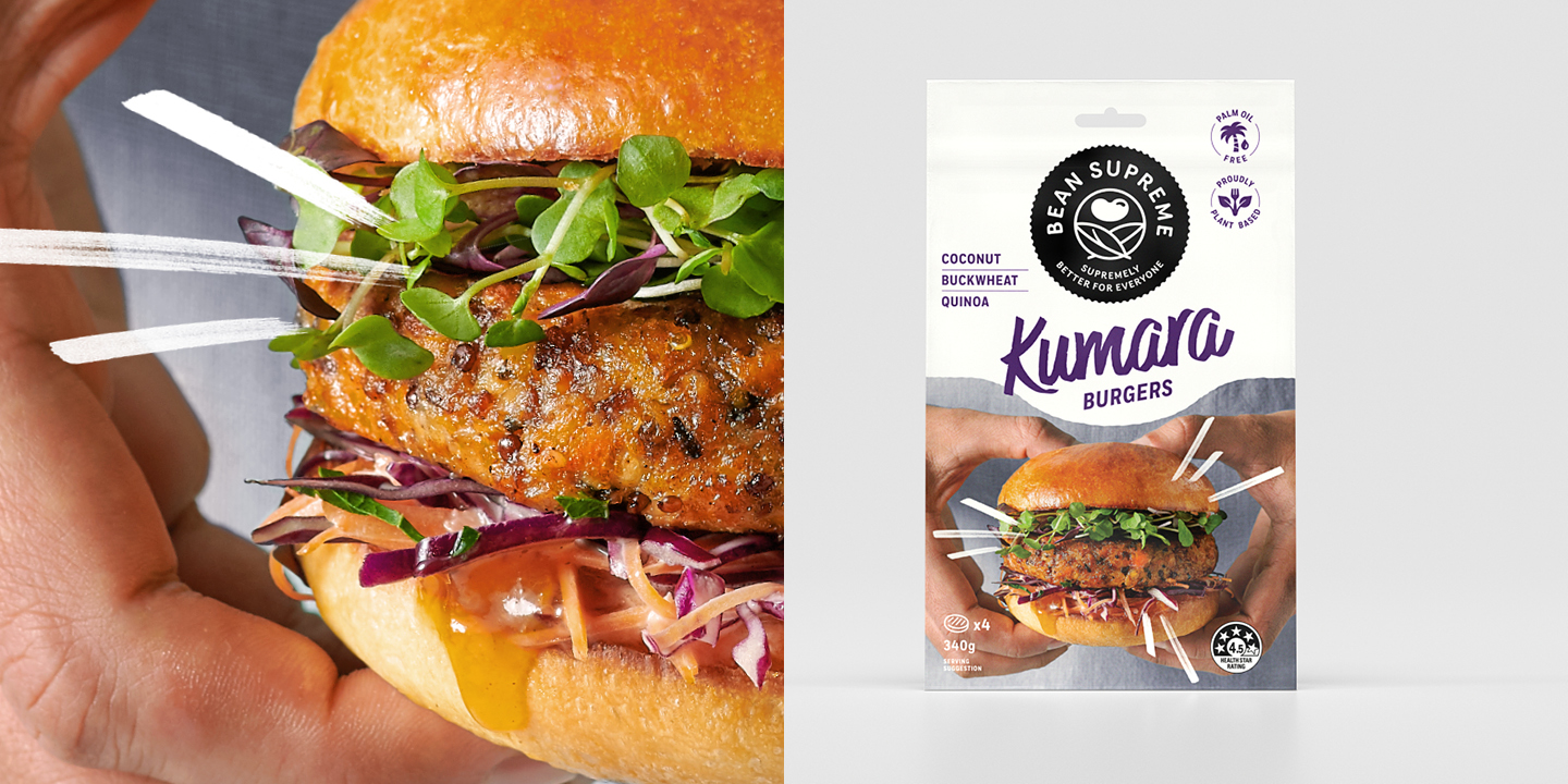
Hand-written marker style typography in bright ‘flavour-hit’ colours felt like the right match for our hands-on made-at-home photography and delivered on the energy. Add in the ‘fireworks’ (the expressive marker lines) to highlight product photography and copy on the pack, and things were starting to take shape.
Next up, the logo. Bean Supreme wanted ‘an evolution’…
By keeping the logo’s striking black and white simplicity and renewing the rolling hill shapes with natural plant shapes, Principals channelled the ‘Brings Happiness’ bean and created their very own ‘Happy Bean’.

Replacing the old tag-line “A matter of good taste” with “Supremely Better for Everyone” — for a more down-to-earth salute to the name and ethos.
Finishing touches included custom icons to hero individual product features and benefits — and just like that the new Bean Supreme was ready to be rolled out across multiple existing SKUs and exciting new ones (like pies!). Each product showcasing the classic white feel but now telling a unique story and bursting with delicious energy.