Designing exhibitions at Auckland War Memorial Museum Tāmaki Paenga Hira
Written by Layla Tweedie-Cullen
From 2009 until 2015 I worked as an inhouse designer at Auckland War Memorial Museum Tāmaki Paenga Hira. I accepted the position not long after I returned to New Zealand to live after eight years overseas. I studied graphic design at the Gerrit Rietveld Academie and Werkplaats Typografie in the Netherlands, and completed a design fellowship at the Walker Art Center in Minneapolis USA. Auckland Museum is New Zealand’s first museum, has pre-eminent Māori and Pacific collections, significant natural history resources and major social and military history collections, as well as decorative arts and pictorial collections. Its mission statement is to “tell the story of New Zealand, its place in the Pacific and its people”. My work in the Netherlands and the USA was predominantly focused around contemporary visual art practices. At the Walker Art Center, a multidisciplinary institution with departments in design and architecture, fine arts, music and performing arts, new media, and film, I produced all forms of printed matter for exhibitions and performances. These included posters, flyers, brochures, magazines, books, identities, exhibition graphics, gallery labels, signage and more. I produced similar material at Auckland Museum but my role had an increased focus on design work for exhibitions. I was involved from concept stage through to production and installation; working closely with curators, exhibition developers, spatial designers, architects, display team, building/lighting technicians and printers. Exhibitions at Auckland Museum appeal to a diverse audience, and incorporate all forms of display methods and interpretative graphic approaches. Three projects I will discuss in more detail include: Outrageous Fortune: The Exhibition, the story of one of New Zealand’s most popular TV series, Kai to Pie: Auckland On Your Plate, an exhibition celebrating Auckland’s history, cultural diversity and natural environment through the lens of food, and AQUA Trail, part of the travelling exhibition AQUA, which dealt with issues of sustainably and water conservation. The graphic design for Outrageous Fortune: The Exhibition, and Kai to Pie were developed in collaboration with my Auckland Museum design colleague Karen Tribbe.
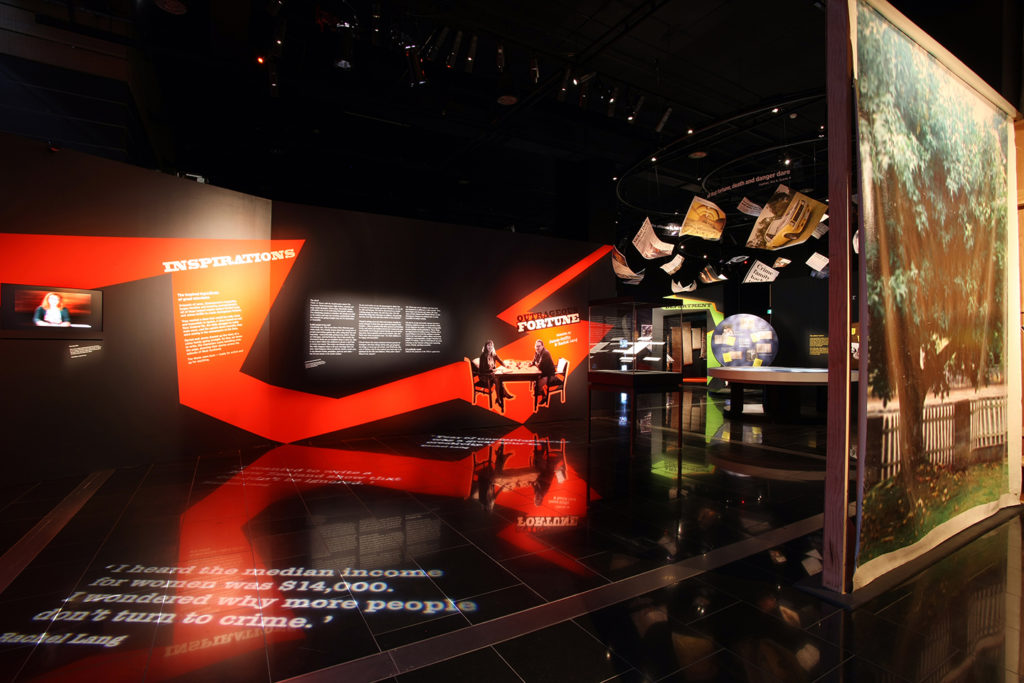
Outrageous Fortune: The Exhibition, told the story of the popular New Zealand TV series which had its own strong and consistent visual identity that had remained virtually unchanged for six years. Our challenge was to reference this graphic identity but take it somewhere new to reflect the transition from screen to exhibition. Furthermore, we had to develop a strategy that would effectively communicate to the loyal Outrageous Fortune fan-base, as well as to visitors who were not necessarily familiar with the series at all. The exhibition’s spatial design and content interpretation, by Gibson Group, had two distinct parts: ‘back stage’, with a sense of being behind the scenes and still in the real world of props and scripts, and ‘immersed in fantasy’, where the audience goes inside the TV series itself. The graphic brief required us to create two distinct communication methods: a ‘museum voice’ and a ‘cast and crew voice’. Both had to work together to successfully reference the formality of facts and information expected within a museum context, and the informality and immediacy of the production or back stage context. There was a large number of objects on display so a pared down approach was required to satisfy both interpretation/spatial design needs and visitor needs. We had to be clear about what was a label or information and what was an object/prop, and additionally break out of traditional exhibition visual language and text delivery.
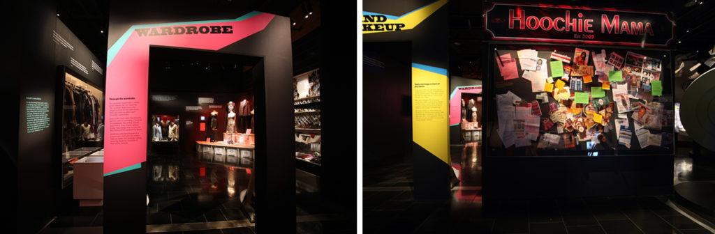
In response to the brief, we researched the Outrageous Fortune TV series opening titles, reshaped some of the elements, and transported these from the small screen onto the exhibition walls. The ‘lightning bolt’ referenced the dynamism of the opening titles, and in the exhibition became a functional element that aided navigation. We used bold colour combinations to separate sections and ‘voices’. A typographic approach provided the base solution for connection: Black Oak was used for the exhibition identity (consistent with the Outrageous Fortune TV series identity), Typewriter Serial for ‘cast and crew voice’, and Gotham Narrow (Auckland Museum identity) was used for the ‘museum voice’ and also to connect the external marketing identity with the internal exhibition graphics. Text was cropped and angled to create an appropriately bold tension. The graphic approach we created was recognisably Outrageous Fortune to create an authentic experience for the fans, but also communicated the boldness of the show to a new audience, and had functionality in terms of navigation. It was both tightly constructed yet flexible enough to create a clear visual shift between spaces and voices without compromising on readability.
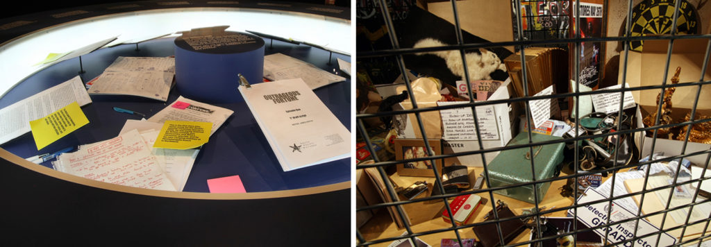
In order to move the audience between a ‘real’ space and a ‘fantasy’ space, the graphics responded to the immediacy of the context of a particular display. The ‘back stage’ space was brought to life by using contextual props to house labels, for example, in a case displaying original scripts we placed over-sized mock post-it notes containing information in the ‘cast and crew voice’. This suggested informality, conversation and immediacy, and brought to life the creative process within an otherwise static display. Then, using our paired bold colour schemes, we placed labels containing ‘museum voice’ information directly onto walls, plinths or cases. The ‘immersed in fantasy’ space required a related approach that responded to the context of the display, for example, in the ‘Police Evidence Locker’ area, labels were hand-written onto over-sized mock ‘police tags’.
The final challenge we faced was to visually connect the Outrageous Fortune TV series identity and the external marketing identity with the Outrageous Fortune exhibition at Auckland Museum. We collaborated with the marketing campaign designers (Alt Group) to develop a consistent, considered approach that drew clues from what visitors knew about the TV show and what they had seen externally regarding the exhibition. We then had to place these ‘clues’ into the context of the exhibition space. We also had to facilitate the transformation of traditional museum space into the fantasy world of the Wests’ family home. Part of the visual look and feel of the marketing campaign was the combination of the Museum’s Gotham Narrow font and strong monochromatic palette, with leopard-print and black satin fabrics that referenced Outrageous Fortune ‘Westie’ culture. We infused this particular choice of fabric into our visual strategy. The exhibition entry wall was covered in wallpaper similar to the Outrageous Fortune set. This created an intimate ‘home’ space within the Museum, making direct connections between the leopard-print pattern seen externally, and the very real behind-the-scenes/ inside- the-show ‘West’ exhibition experience. Lastly, Gotham Narrow font was carried from the external campaign into the exhibition as the base for the ‘Museum voice’.

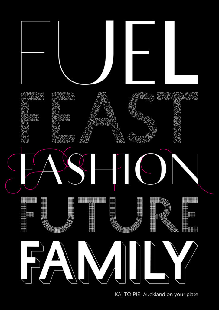
Kai to Pie: Auckland On Your Plate was an exhibition developed by the museum for the Auckland community with a particular focus on families, people with an interest in Auckland’s history and natural environment, and foodies. The exhibition consisted of five distinct thematic sections: Fuel (immersive and filmic), Feast (celebratory and personal),
Fashion (nostalgic and quirky), Future (contemplative and provocative), and Family (interactive and fun). One of our main challenges was to develop exhibition graphics that supported the thematic, stylised and non-literal approach of the 3D design, and would visually connect the diverse content. There were five stories within five environments requiring one graphic approach. We had to respond effectively to the exhibition’s use of a new writing style and voice, and break out of the traditional exhibition language and text delivery. We were also required to meet the experience and accessibility needs of a diverse range of visitors to the Auckland Museum.
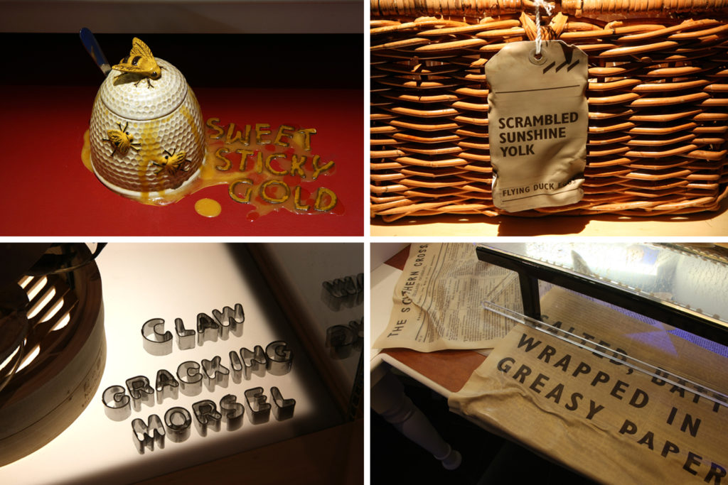
Our key solution was to use the typeface History by Typotheque. Its kit of parts can be combined to produce endless variations of letter forms that are clearly related to the same visual family. The bones of the typeface supported the minimal, elegant style of the 3D design (1.) while allowing additional flourishes to complement and distinguish the exhibition’s five thematic sections and sub-sections. It was essential that the graphic approach extend and reflect on the playful use language in the exhibition’s participatory areas. To connect objects and text with other senses, including smell, taste and texture, we used a combination of relevant props and found lettering. These directly responded to the onomatopoeia of the words and reinforced the object’s story—thereby allowing graphics to carry part of the message.
The needs of a diverse range of visitors, in terms of experience (legibility, coherence, accessibility), was a major consideration. To achieve this, all levels of information within the text hierarchy, from exhibition introduction through to object labels, were presented in a consistent typeface, Museo Sans, within a systematic layout. Text was a considered element requiring integration into a space in order to reduce visual noise. For example, text was cut vinyl applied directly to the walls rather than being produced as large panels. Another example is the ‘eating outdoors’ sub-section, where image labels tacked onto light boxes threatened to be a discordant distraction and so text was framed within silhouettes of swooping seagulls. This provided an immediate interpretive meaning to the space and draw visitors closer to both the images on display and their associated text.

AQUA the exhibition, created by ONE DROP in collaboration with Cirque du Soleil (Canada), took museum visitors on a journey into one of our planet’s most fragile resources–fresh water. In addition to the exhibition, Auckland Museum developed a programme that brought local water-related material and issues into focus. The AQUA Trail encouraged visitors to uncover water stories behind 22 objects in the museum galleries. These objects were extremely diverse in terms of size, presentation and display. The design challenge was to create a graphic identity that was distinctive yet clearly connected to AQUA and related programmes.

My solution was to frame each object on the trail in a simple outline that drew attention to the relevant object in the busy display cases and galleries. The trail was visually connected to the AQUA exhibition through its consistent use of colour (cyan blue), and the typeface Blur. This approach allowed for a flexible system of ever-changing graphic marks that worked with the diversity of objects, sizes and display presentations. Outlines were created using cut vinyl applied directly to cases, walls, floors or plinths as appropriate. Additionally, I used the droplet form and reshaped it into a multi-purpose shape that was both a pointing device and a ‘speech bubble’ in which to house the water story. To further draw attention to the objects on the trail, these were illuminated with pools of soft blue light. The AQUA exhibition dealt with issues of sustainability and water conservation, and to emphasise the Museum’s commitment to these issues, we used sustainable products including recycled PVC, biodegradable vinyl and water-based non-toxic inks for the water trail graphics throughout the galleries.

In February 2015 I left my job at Auckland Museum to focus full-time on running my own design studio called Narrow Gauge–part of a wider project called “split/fountain” which I founded in 2009, around the same time as I started working at Auckland Museum. As the name’s reference to blended ink technology suggests, split/fountain merges at least three forms of production and dissemination—art, design and print—through its operation as project space, exhibition venue, niche publishing house, design studio, reading room, and pocket-scaled laboratory for urban aesthetics and collaborative thinking. The project’s title also alludes to Duchamp’s infamous fountain—split/fountain sees its gradations between commerce, art, ideas and printed matter as speculative, experimental, and adaptable. Narrow Gauge specialises in work for art, architecture, education, and culture. The studio’s practice includes the design of identity systems, exhibition design, publications, posters, signage, publishing, and content strategy. Recent clients include: Auckland Art Gallery Toi o Tāmaki, Elam School of Fine Arts, The University of Auckland, AUT University, Auckland Zoo, Te Tuhi Centre For the Arts. Artist collaborations include: Wystan Curnow, Xin Cheng, Michael Parekowhai, Fiona Amundsen, The Estate of L. Budd, Gregory Maass and Nayoungim. Being Creative director at Narrow Gauge allows me to combine my interest in exhibition and print design, as well as publishing and curatorial work.
Discussion in this text of the exhibitions Kai to Pie: Auckland On Your Plate, and Outrageous Fortune: The Exhibition, were written in collaboration with Karen Tribbe.
Images by Krzysztof Pfeiffer, courtesy of Auckland War Memorial Museum Tāmaki Paenga Hira.
1: By Andrew Thomas at Workshop