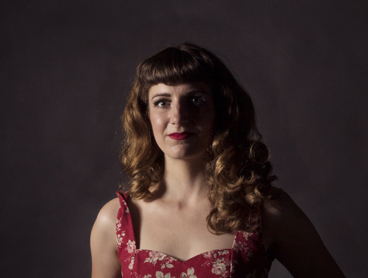
5 Minutes with… Kalee Jackson
Kalee Jackson is an Auckland-based independent designer. Her work focusses on typography, exhibition branding, publication design, and printed ephemera. She has worked for some of our top New Zealand galleries creating exhibition and promotional material. In 2014 Kalee won the PANZ Book Design Awards Young Designer of the Year Award, and was also a finalist for the HarperCollins Publishers Award for Best Cover 2014. She has also received the Hachette New Zealand Award for Best Non-Illustrated Book 2013 and was shortlisted for the Awa Press Young Designer of the Year 2010. We recently caught up with Kalee to find out more:
Hi Kalee, can you tell us a little bit about the type of work that you do and your working processes?
I work mostly in the fine art and publishing sectors. I design for art galleries and museums – exhibition branding and signage, print ephemera, exhibition catalogues and artist monographs. I also design book covers for publishers across a diverse range of titles. I work with a motley bunch of fabulous curators, artists, creative entrepreneurs and publishers.
The flexibility of working for myself and having autonomy of choice regarding the kinds of projects I work on are the perks of self-employment. It’s important to me to work for clients whose businesses or endeavors I genuinely believe in helping promote. This is what helps me sustain a work ethic. All my client work has appeared through word of mouth and from working with a bunch of different people in the industries across different years and institutions.

Can you tell us a bit about your background and how your first got started in the industry?
After graduating from design school I worked in magazine publishing for a couple of years in Wellington and London. I came back to NZ to work in the provinces at the Govett-Brewster Art Gallery as their in-house designer. This was when I first began working on the kinds of projects that I predominately I do now.
What impact did winning the PANZ Design Awards Young Designer of the Year in 2014 have for you?
I think it increased awareness of my work in the publishing world. It also helped me upgrade some gear for my business, which was definitely needed at the time.
What are your thoughts on the future of publication design and the relevance of print these days?
Well, obviously changing technology has an influence on the kinds of publications we produce. Kate Pullinger at the National Writers Forum a couple of weeks ago spoke on how people tend not to read fiction and certain other genres online or in digital publications, though are comfortable reading non-fiction and articles. So it will be interesting to see how this might change as technology and approaches to publishing evolve. The quality of digital print has evolved so much in the last decade. I think this makes small run and self-published publications more feasible, which suits small markets like New Zealand, and opens up a lot of opportunity. People are interested in books as much for their beauty as objects and the experience of handling and reading them as for the content. People like how books feel and smell, and the sensation of turning pages. That’s not something that is easily replicated digitally. As a result of this I think we are seeing a move towards more beautifully designed and produced books. This could be compared to how vinyl as a format for music and cover art has made a comeback in recent years.

Can you name a project that you’re most proud of, and tell us why.
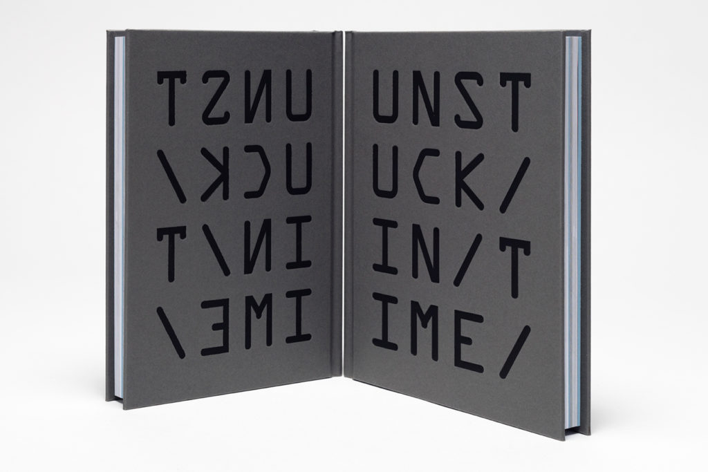
Crikey, it’s probably a toss-up between two books – Unstuck in Time and Matthew Cowan: Wudewasa. I’m proud of Unstuck in Time because it is a bit of a tome, untold hours went into it, and I’m rather fond of the cover. It consists of three small digital publications rolled into one print monolith. The exhibition, curated by Bruce E. Phillips at Te Tuhi, drew influence from Kurt Vonnegut’s Slaughterhouse 5. So there are all kinds of nerdy sci-fi references in the design.
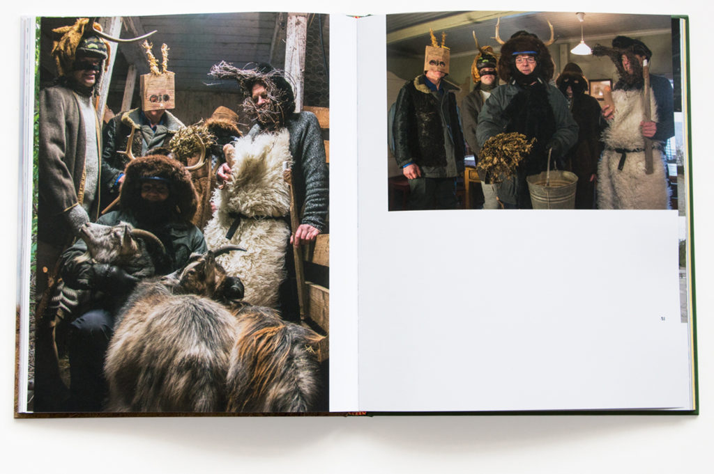
Matthew Cowan: Wudewasa is the latest book I’ve worked on to come back from the printers. I’m mostly proud of the intrepid font hunting that went into sourcing typefaces for this book. Right from the start I knew a version of of Hermann Ihlenburg‘s 1892 typeface Columbus was the perfect display typeface to sit alongside Matthew Cowan’s work. Cowan’s work is based on folk ritual, and I’d been looking at imagery of green men and graphics to do with Morris dancing groups etc, and Columbus had the perfect level of olde-worlde strange curliness to it. Deeply unsatisfied with the recuts of Columbus currently available commercially, I hit up a bunch of type forums. Eventually I managed to contact Thomas Phinney and get my hands on a pre-release of his lovely cut of Columbus – Cristoforo.
I’m talking about typefaces because realistically this is potentially the only audience that might be interested. But there are lots of things about this cheerfully odd book that I like. The images are glorious, and it has a nice pace to it. Also it’s very satisfying to match the binding tape of a book to one of the artist’s works.


Changing the subject completely, can you tell us what the Fan Art Swap is? What does it involve?
Fan art swap is a social art project where people participate by sending an image and biographical information about themselves. I match them with another person and then they make a piece of art about and for the other person. It can be in any format or medium – visual art, objects, interpretive dance… Whatever! You can see work produced as part of previous swaps here: loveyourwork.org (work from the current swap will be up in the next couple of weeks).
What prompted you to set up the Fan Art Swap?
I started Fan Art Swap in 2006. I was really taken with the awkward friend fan art in the movie Napoleon Dynamite and that triggered the idea for the swap. I had the idea and sent out an email to seek participants the same day. I had no idea the project would still be running ten years later. When I started the swap not many people knew what fan art was, so it took more explaining. Thanks to the internet, and more visibility regarding the culture of fandoms, this has changed significantly in the last few years.
And what do you see as some of the benefits from having set this up?
I try to match people who don’t know each other previously. What is interesting is that people come to know the other person and, in a way, become their fan through the process of making fan art of them. It’s a weird mix of pop, outsider art, mail art, and relational aesthetics. It has a feel-good vibe about it as it’s about generosity of time, gifting and exchange.
Some of our DA readers could be interested in participating. How can people get involved?
I run the swap once a year. You can register for the next swap at any time. It usually runs for a month over winter. My next major project for 2017 is putting together a publication of all the work made so far in the swap (over 180 pieces of fan art to date). Keep an eye out for the crowd funding campaign, and, if you’re feeling generous, DA readers can support the project by kicking in a couple of bucks towards the printing.
And, where to next for Kalee Jackson? What’s in the pipeline?
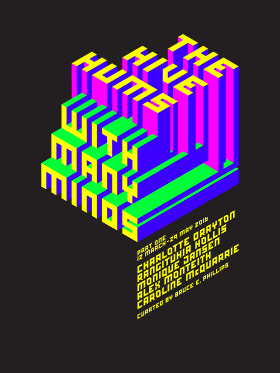
I’m working on a publication about the exhibition THE HIVE HUMS WITH MANY MINDS for Te Tuhi. The design for this publication is extrapolated from the masthead and exhibition graphics that I designed for the show. The masthead was based on an isometric grid, so I developed a modular lettering system based on this grid. When I began the publication I realised that it would take forever to hand set, so I’ve been developing the lettering into a font using FontForge. It’s designed to be set at a 30-degree angle. Though it’s a fairly simple font structurally, it’s the first time I’ve gone through the mechanics of translating lettering into a functioning font and I’ve really enjoyed the process. Maybe next time I’ll try making a font with curves…
An e-version of the publication can be downloaded once available at: http://www.tetuhi.org.nz/whats-on/publications.php
Thanks for your time Kalee. If you’d like to see more, visit:
http://kaleejackson.com/
Twitter/kalee_jackson
Instagram/kalee.jackson


