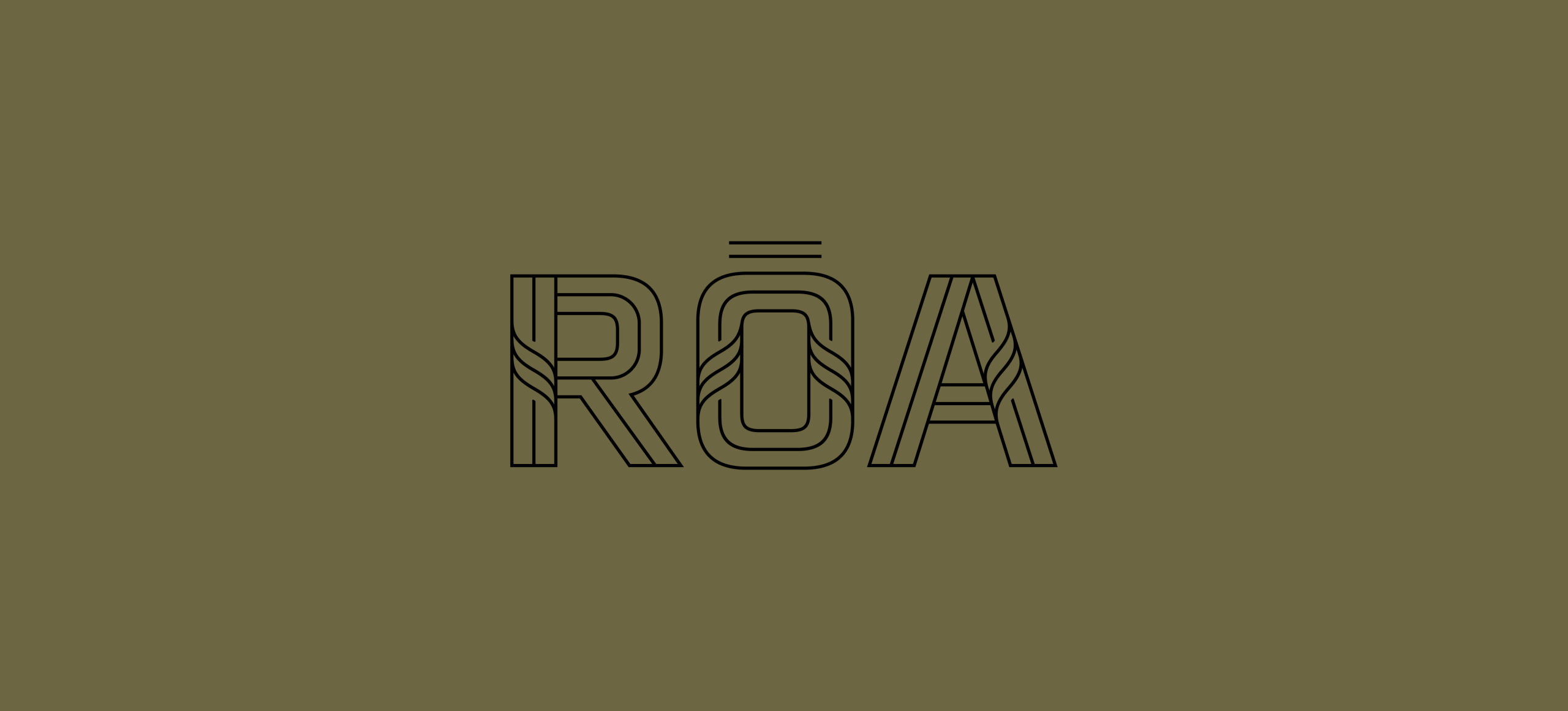
Fresh from the Field: RŌA Consulting Brand Identity
Ahead of their upcoming workshop Redesigning Aotearoa, coming to Pōneke and Tāmaki Makaurau this July, our friends at Ira share how they created a bold new brand identity for RŌA Consulting that weaves together the strength of the collective while speaking to the warmth of relational expertise and the clarity of strategic leadership.
Fresh from the Field is a weekly article series sharing fresh and inspiring work from the Design Assembly community. Want to submit your work to Fresh From The Field? Fill out the form here.
The brief
Teahooterangi Pihama and Awhina Rangitutia-Pihama approached Ira to develop their brand identity for RŌA Consulting, who specialise in weaving strategy, culture and economic outcomes to achieve sustainable solutions. Our brief was to disrupt the financial services sector with a brave new brand, defining a brave new offering. A disruptive new start up, RŌA wanted to ensure it did not look like the old corporate entities. Instead, the brand needed to speak with the warmth of relational expertise and the clarity of strategic leadership. The strength to take a brave stand to uphold cultural values and effectiveness to take all on the journey to achieve collective progress.
The Design Response
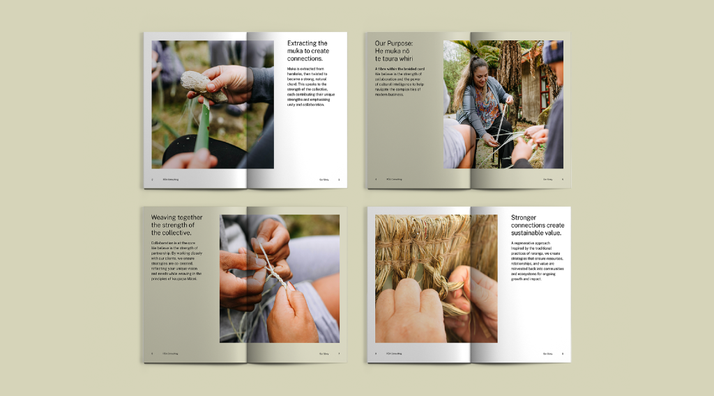
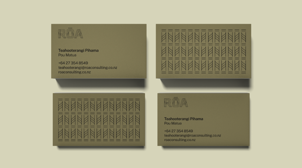
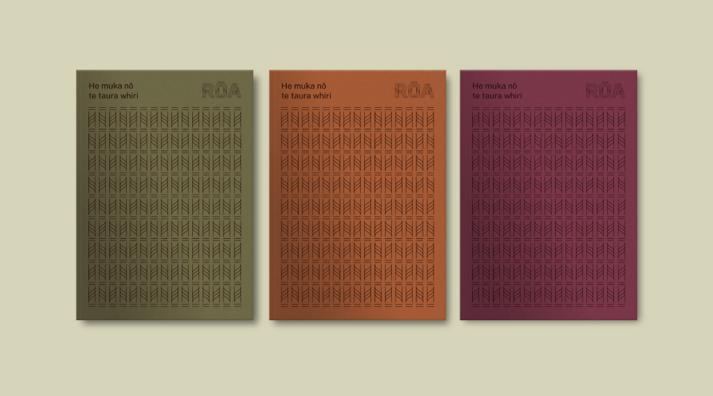
Weaving together the strength of the collective: Muka is extracted from harakeke, then twisted to become a strong, natural chord. This speaks to the strength of the collective, each contributing their unique strengths and emphasising unity and collaboration. It also speaks to the coming together of three dimensions to create a holistic solution for clients. Rautaki (strategy), Ōhanga (economic development) and Ahurea (organisational culture) are intertwining expertise that enable RŌA Consulting to deliver unique and powerful solutions. Each of these areas create strands that can bring forward fibers, be prepared, refined and twisted to become strong, then woven together to create value.
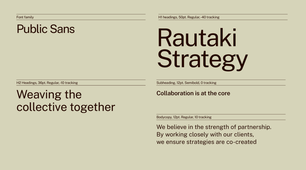
Through the use of relatable typeface and warm, inviting colour we bring to life the brand narrative with simplicity and clarity. This enables expertise to speak forth clearly and simply. The tones of the brand speak to the harakeke from which the braided chord is woven, while also feeling warm, connective and uniquely of Aotearoa.
“We both believe in the strength of the collective and collaborated in a process that brought our strengths together. There is a genuine curiosity at Ira that made insightful connections between our purpose and values and great storytelling and design. This ensures our pakihi (business) stands out, rather than fitting in, helping us demonstrate our intention to be a market disruptor.” – Teahooterangi Pihama, Pou Matua, RŌA Consulting
The Design Team
Johnson McKay – Creative Director
Tim Hansen – Design Director
Jason Fantonial – Designer
Storm Smith – Designer
Malachi Mckay – Motion
Levi Singsam – Motion
ira.nz | https://www.instagram.com/ira_aotearoa
The Client Team
RŌA
Fresh from the Field is a weekly article series sharing fresh and inspiring work from the Design Assembly community. Want to submit your work to Fresh From The Field? Fill out the form here.