Fresh From The Field — The Kind Project by Studio 7
DA loves seeing projects where design has ambitions to inspire social good. This Fresh From The Field by Studio7 features a brand with a big heart and generous intentions.
If you have new or recent work that you would like to share in Fresh from the Field email nicole@designassembly.org.nz for details.
![]()
The Brief:
The Kind Project are on a mission to make the world a little kinder. Based in Parnell, Auckland, The Kind Project opened in September 2019 intent on serving ethically sourced coffee and wholesome food to the local community, while donating a percentage of all proceeds to charity. With this ambition in mind, they approached Studio7 to help them create a brand identity with kindness at heart.

The Response:
With a relatively low budget, Studio7 set to work creating the brand logo, iconography and colour palette to be used in the design of the physical café and the supporting collateral.
As a supportive force for good in the community, the idea of a helping hand became a recurring theme. To lend a hand is to be kind. A symbol of compassion and altruism, the hand became a central piece of the logo, holding it in place. This represented the café both supporting and being supported by people: the community, staff and customers. The curvature of the hand also provided balance to the heavy sans-serif font to create a feeling of harmony.

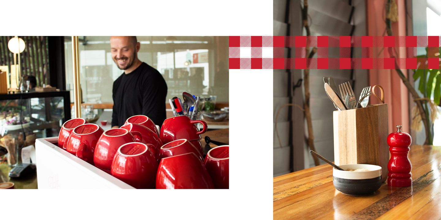
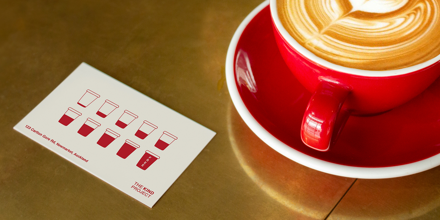
A bold and deep red became the dominant colour used, communicating the passion and warmth that emanated from the café’s charitable roots and intention, through its staff, service and into the wider community. This red translated to a tartan, chequered pattern used across various iterations, resembling a picnic blanket and bringing with it the ideas of sharing, leisure and different threads of the community weaving together into a vibrant, cohesive tapestry.
This design culminated in an eye-catching centrepiece display – an embedded screen displaying donations in real-time, propped up by a three-dimensional hand – a great symbol of the altruism each coffee holds, and an engaging reminder of the community spirit and collective goodwill of all involved.
Through these elements, Studio7 told a story. One of ambition for a better, kinder world. From a smile to a shared cup of coffee, The Kind Project became an incubator for positivity, with every happy customer, interaction and donation to a good cause helping this kindness move outward, into the wider world. With their revised brand direction, The Kind Project became a symbol of inspiring goodness – a reminder that while Kindness may cost little, it means a lot.

CREDITS:
Studio: Studio7
Website: studiosevencreative.co
Creative Director: Gianni Russo
Design Director: Amy Cole
Design Team: Amy Cole, Luca Russo, Blake Holmes, Louise Delaveau
Client: thekindproject.co / @thekindproject