Fresh From The Field — wadeandleta.com by Sons and Co.
This Fresh From The Field features an out of the box website by web design maestros Sons and Co. for an iconic New York-based design duo which is sure to delight. Lyttleton based Sons and Co. elevate the global industry standards of design on the web notch by notch with each and every project they undertake, for this article we caught up with Wade & Leta to learn more about the commissioning process, project scope and industry response for their site.
If you have new or recent work that you would like to share in Fresh from the Field email Louise for details.

The Brief:
Wade Jeffree and Leta Sobierajski are creative partners in life and work. Their design practice ranges from conventional identities to bizarre compositions, spanning the spectrum of disciplines and tastes. They combine traditional graphic design with photography, art, fashion, events and technology to create visuals that demand an emotional response.
Wade and Leta frequently inject themselves into their work – their personalities and physical presence is a feature of their design – it’s a direct and deliberate contrast to the idea that the designer should be invisible. They promote the notions of ‘Design as Performance’ and ‘Purposeful Ecclectisism’ in in their work and wanted to carry those ideas through the site!

The Response:
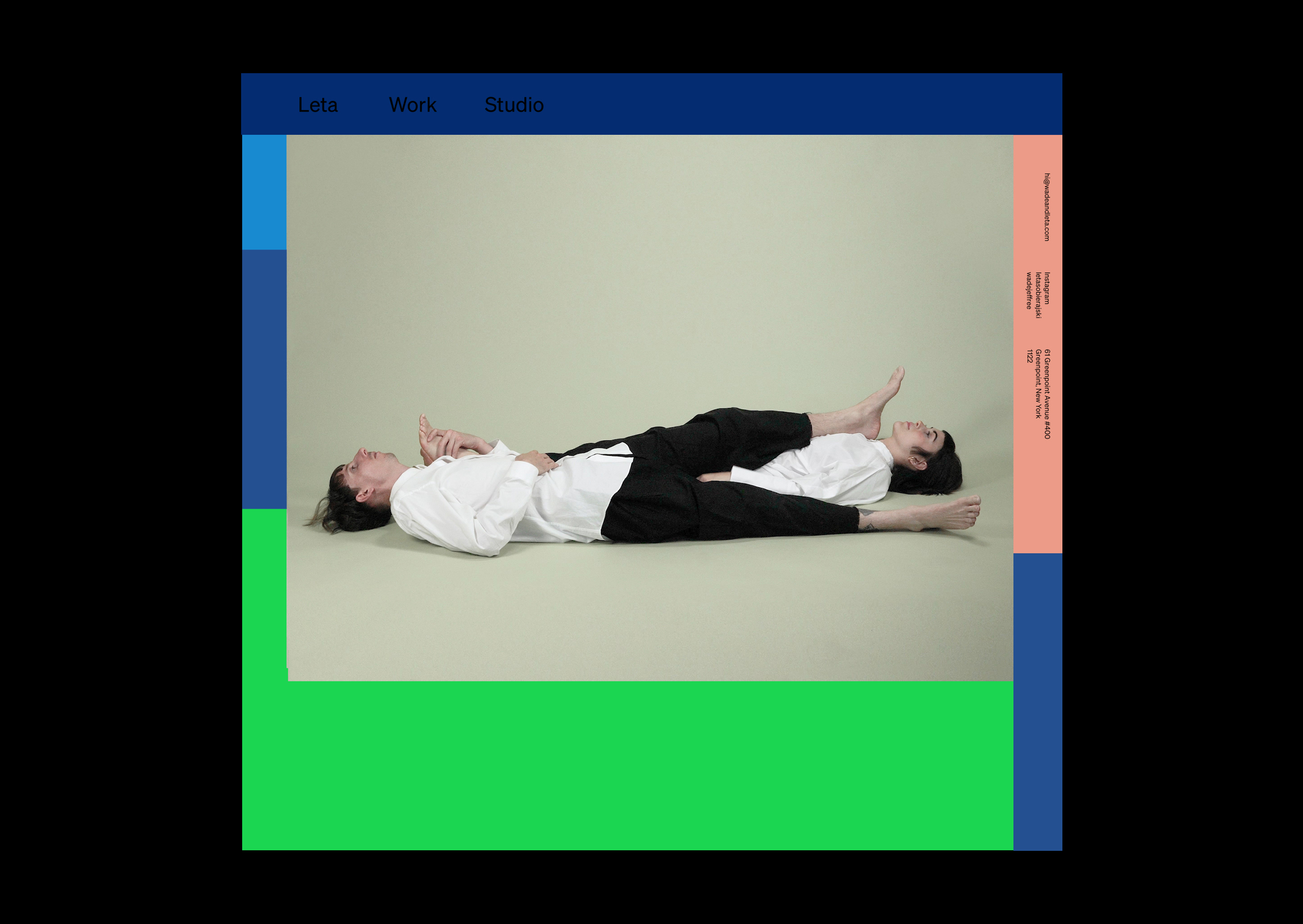
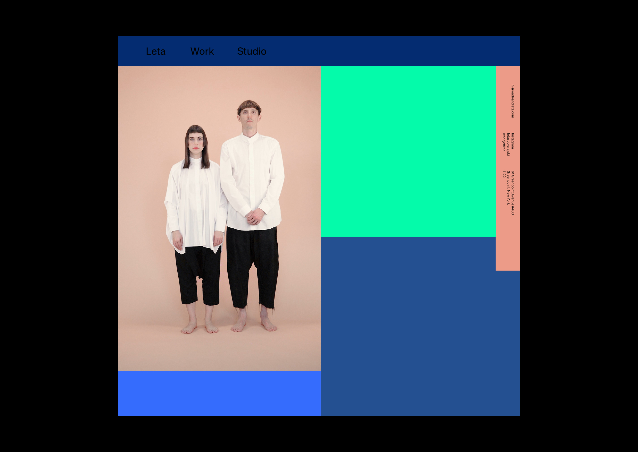
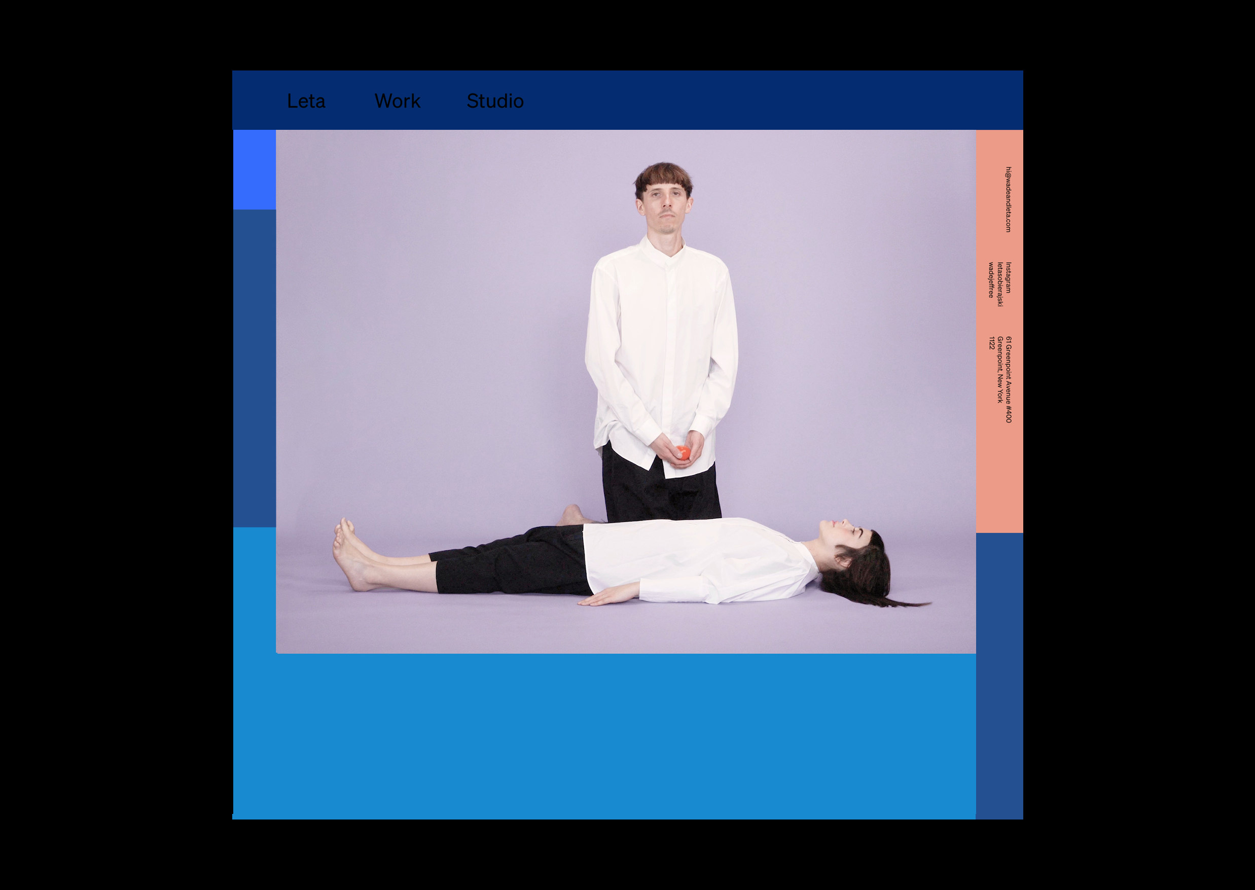
Design can’t save the world, but it can raise the human spirt, even if just for a brief moment, and that’s the purpose of Wade and Leta’s website. It’s a much-needed antidote to the conventional graphic design portfolio – typically all grids and gloss – that makes us glad that some designers still march to their own beat. This website is a culmination of the time Wade & Leta have spent together intimately and professionally and showcases a small selection of the work they have done during that time.

The Dialogue (diving deeper):
We love your positioning statement of making music for your eyes – did this idea scaffold the brief you set for the website?
That was a brilliant piece of charm Sons added to the design. One thing we were drawn to with their work is the copywriting; they both have amazing senses of humor and it shows in little touches like that.
Given you are designers engaging designers – was the design process more collaborative (rather than the traditional transactional model) if so how did you scope the roles and responsibilities for this design/build?
Everyone we respect is a nice person first and foremost and that showed in working with Sons & Co.
We were open with everything. The brief was pretty simple really: inject as much fun and colour as we can. We knew that we would create videos for the site and that we were aiming to showcase the work and life as separate entities on the site e.g. “projects” = Work and the homepage = life.
Although not restraints we did spend time talking about how we define ourselves as a studio and as individuals. We believe that life and work are intertwined and we wanted to show that. We are two individuals running a studio that we put our heart and soul into and if we are happy with what we are creating we will be happy with everything else. We are also very positive and happy individuals who are not afraid to be the brunt of a joke. In many ways, a project we completed years ago called Complements shows that; there needed to be an optimism within the design and in the content.
This moved into the notions we use to define the studio 1. Purposeful Eclecticism and 2. Design as Performance. We attempt to bring these notions into every aspect of our work.
We also understand the ins and outs of the design process so at every intersection we were open and optimistic about their suggestions. This trust is shown through Sons and Co. making many tweaks and changes without us even knowing. As soon as we would notice them we would both look at each other and remark how smart it was. To be completely honest, we were gushing a lot to our friends and peers throughout the entire process.

The website is refreshingly different (one of the things we love about Sons&Co’s work) were there any challenges?
We kept joking with Sons that we were their worst client. The site was designed and ready to go for quite sometime (nearly 2 years!) but we had trouble getting time to shoot the videos and project imagery. This of course was our catalyst for engaging Sons&Co to begin with: besides us respecting their work we knew that we would not enjoy the process of designing our site so we wanted to entrust it to someone who could give it the love and care it needed, but most of all we wanted to work with people who were down to clown like us.
Leta your bio says you Inject colour into everything you touch, how did you go about selecting the palate for this website?
The way that Sons incorporated colour into the homepage was so smart! They set the system up so we could choose the background colours for the site and that would become the color blocking system on the homepage. It can then constantly shift as we upload new projects and can evolve with the work.
There are lots of well considered and innovative flourishes throughout the site. (I love the double glyphs in Wade’s bio – acting as a delightful abstraction of a “confusing” Australian accent!) what are your favourite details?
Using imagery as menu hover states is something we have loved from the beginning. Through iterations we have clarified how it works to make it more effective. Hovering over the Studio menu makes the lips say “Wade and Leta” and “Projects” is a blinking eye that is in a sense readying you for the heavy visual component of the site or…the music to your eyes.
One thing Wade really loves is the mobile version of the site, to him it feels like a poster.
Have there been any measurable results from the site?
It’s been really helpful for us establishing the studio, really. For quite some time people had not known that we work together on every project. With the design having all the aspects we wanted to hit, it’s been really amazing to have the site as a tool in engaging clients to understand our practise, process and previous work in one place in order to present the world we want to build with them. In many ways it has reinvigorated past clients and brought in many new ones which we are of course happy with!


