Where Creative Opportunities Lie: Arch MacDonnell on Tatau: A History of Sāmoan Tattooing
Written by Lana Lopesi
Graphic Matters is a monthly column on issues and ideas related to New Zealand Design Culture
Last month Te Papa released yet another amazing book called Tatau: A History of Sāmoan Tattooing. The book co-written by Sean Mallon and Sébastien Galliot is the first publication to examine 3000 years of Sāmoan tatau. The publication presents a rich history which in the end argues that “Sāmoan tatau has a long history of relevance both within and beyond Sāmoa, and a more complicated history than is currently presented in the literature.” The texts written by Mallon and Galliot are complemented by texts from other contributors it is also “richly illustrated with historical images of nineteenth and twentieth century Sāmoan tattooing, contemporary tattooing, diagrams of tattoo designs and motifs, and with supplementary photographs such as posters, ephemera, film stills and artefacts.”
While from a cultural history perspective the text is significant, it is also a significant piece of design. Tatau: A History of Sāmoan Tattooing was designed by the Auckland based consultancy Inhouse. On the occasion of the book being released, I had a short interview with Arch MacDonnell, Inhouse Creative Director.


Lana Lopesi: Let’s start with the outside and work in. I was really struck by the ‘tatau’ repeated on the hardcover, where did the inspiration for that come from?
Arch MacDonnell: We wanted to give the book a strong sense of identity so we explored the idea that lettering somehow based on tatau could be developed to create a unique wordmark. The result is a wordmark and numeral set that draws on the shark tooth motif prevalent in Samoan tatau. We love how the stencil nature of the forms means it can be read as both pattern and letters at the same time.
The slip jacket – and the entire publication for that matter – incorporates a number of iconic images, how do you retain the integrity of that kind of imagery as a designer?
We have designed many publications that deal with artworks as the primary image source. We are always cognisant of the fact that we are creating a frame for these images. It’s about allowing the ‘graphic design’ to sit back and allowing the content to come to the fore.
LL: I really enjoyed the differentiation of sections and between the text through styles and stocks. What was your thinking there?
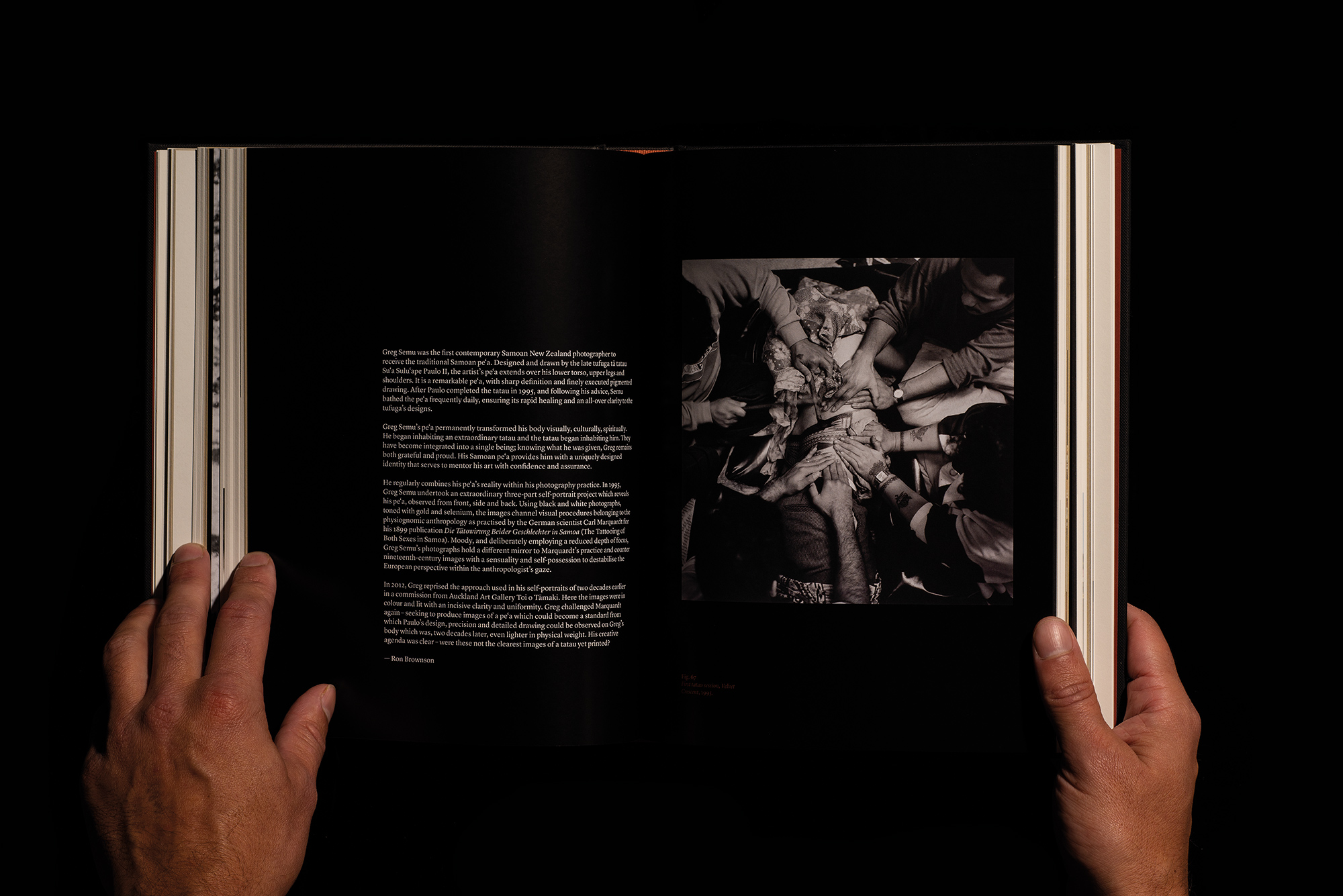
AMD: We also enjoy changing stock and type palette within a title. It allows us to signal a change in content to the reader. The artist portfolios in this book are printed on a satin stock with rich black backgrounds that allow these chapters to elevate from the more museological body of the book printed on matt uncoated paper.


LL: How do you approach a publication like this one – which is dealing with very specific ideas and histories for a general public?
AMD: We always like to become familiar with the books content before embarking on the design process. This allows us to develop an appropriate approach and to know where the creative opportunities lie. Creating a solid structure and grid with clear differentiation between the various content types is critical to make dense information palatable for the reader.
LL: What is the Inhouse style?
AMD: I’m not sure we have one, if we do it may be by accident rather than design. We always like to take a reductive approach to our projects, trying to distil them to essential elements. Taking complex information and trying to present it as efficiently and effectively as possible.


