
Fresh From The Field – The Art of Letters by Kris Sowersby
Be in to win a free copy of The Art of Letters! Simply tell us what custom typeface was used to typeset the book, then email janelle@designassembly.org.nz with the subject […]
3 years ago by Louise Kellerman

Postgraduate Design Research — Jaime Kapa, Unitec
Welcome to Postgraduate Design Research – an opportunity to profile a selection of current design postgraduate students and their projects across our tertiary institutions. Today, we speak with Jaime Kapa […]
3 years ago by Louise Kellerman
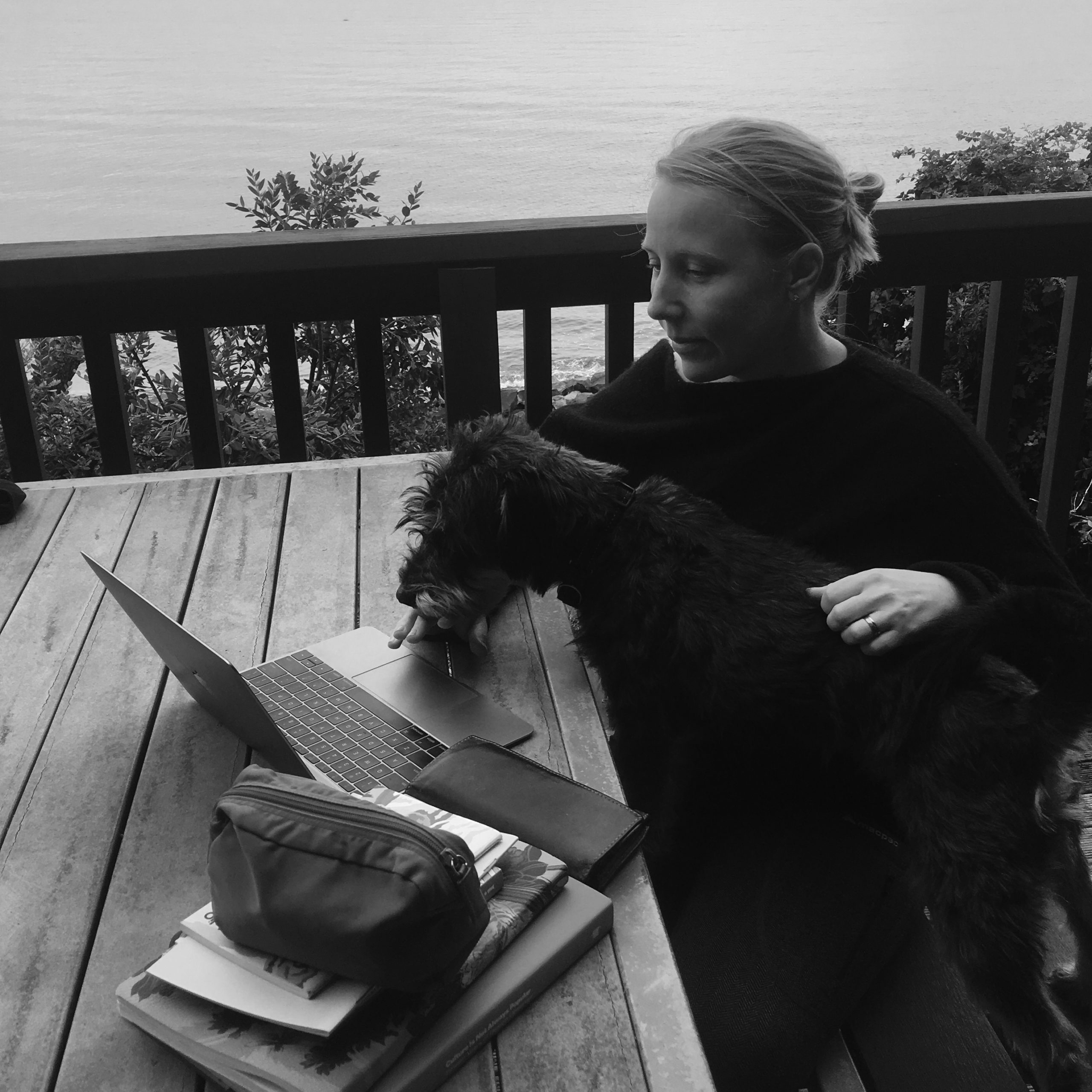
Take 10 with… Nicole Arnett Phillips
The DA team want to support our community through these unprecedented times – something we kept coming back to is a focus on connection and community. So we want to […]
4 years ago by Louise Kellerman
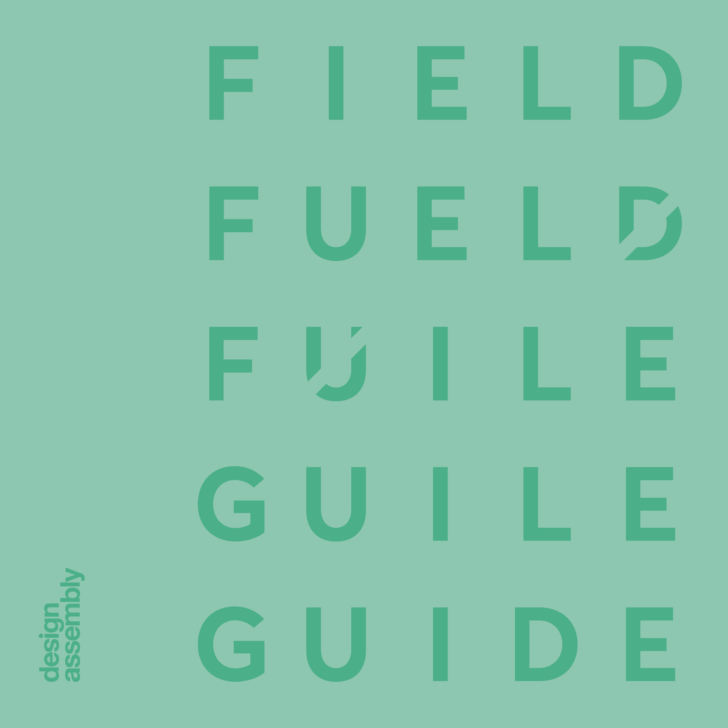
Field Guide — Typographic Anatomy
There is plenty of Jargon (and way too many rules!) in typography which can be overwhelming when just starting out in design. You don’t need to be a specialist to […]
5 years ago by Louise Kellerman

Fresh from the Field — Skinnies Kids Sungel by 2di4 Design
This week’s Fresh From The Field features the typography, packaging and campaign for Skinnies Kids Sungel by 2di4 Design. If you have new or recent work that you would like […]
6 years ago by Louise Kellerman
DA Workshop Wellington: ‘Wine & Type’ with Nicole Arnett Phillips and Sarah Maxey — Thursday 20th September

O’Wine & Type’
with Nicole Arnett Phillips and Sarah Maxey
20th September
6—9pm
Victoria University of Wellington,
Faculty of Architecture and Design
139 Vivian Street
Te Aro, Wellington, 6011
Early bird (ends 14th September) $69 Professional / $49 Design Assembly Friend (+ GST)
$89 Professional / $69 Design Assembly Friend (+ GST)
(Not a DA Friend? Details on how to sign up can be found here).
Typography (like language) is expressive as well as functional. We most often think of the expressive qualities regarding volume, tone and voice. But type can equally convey a mood, an event, a sense of place, time and culture. Type also expresses sensory characteristics like taste and smell.*
So, what lettering style comes to mind when indulging in your favourite wines? Think about the robust boldness of Shiraz, the crisp refreshment of a Sauvignon blanc, the light spice of a Pinot Noir, the smoothness of a Merlot, or the delicacy of sparkling Pinot? All of these sensory characteristics have their own aesthetic.
After a brief introduction of themselves and their work, Nicole and Sarah will guide participants through a wine tasting, drawing based workshop where they will use visual language to convey the characteristics of New Zealand’s wine culture in a series of guided briefs (to design a sequence of wine labels). It is a social and interactive evening, sure to delight the senses!
You’ll learn lettering techniques, some of the science behind typographic allusion, play with identity ideas, and get insight into a leading agencies approach to beverage branding. You’ll swill, sniff (and probably slug!) a few wines over nibbles, meet other designers, have the ability to ask questions and visually explore the qualities of four wines we will sample through the event.
—
About the facilitators: Nicole Arnett Phillips (TypographHer) introduces herself as loving letters, layout and ink, but the accomplished document designer and printmaker confesses she enjoys wine *almost* as much as type & print! After collaborating with Sarah Hyndman on gathering data for her type tasting research in 2015. Nicole hosted three food, wine and type matching dinners in Australia, and two wine & design drawing workshops before she moved home to New Zealand in December 2017 (where she has spent the summer reacquainting herself with her favourite NZ wines)!
Graphic designer Sarah Maxey’s distinctive work has graced publications worldwide, including the New York Times and many literary books. She was Design Manager for Bloomsbury Publishing in London in the mid-90s, and has run her own studio since. She has won numerous awards, including the 2011 BEST Awards Purple Pin and a Certificate of Excellence from the International Society of Typographers.
*Based on the groundbreaking research by Sarah Hyndman (Type Tasting), in collaboration with Charles Spence’s (Professor of Experimental Psychology & University Lecturer, Somerville College, UK).
Terms and Conditions: If you cancel your ticket more than 8 days ahead of the workshop, 100% of your ticket will be refunded. Within 7 days of the workshop, 50% of the ticket price will be refunded or you can transfer your ticket to another Design Assembly workshop within a year.
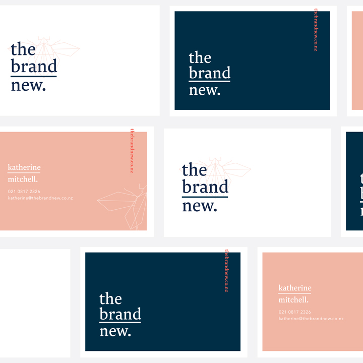
Fresh from the Field — The Brand New by Folk Creative
This week’s Fresh From The Field features a new identity, The Brand New by Folk Creative If you have new or recent work that you would like to share in […]
6 years ago by Louise Kellerman

Wine Literacy with Nicole Arnett Phillips – Co-presenter of DA Workshop Wine & Type, 17th May, Auckland
In this episode I spoke to Nicole Arnette Phillips. Nicole is a designer, typographer, publisher and print-maker. Orginally from NZ, she currently lives in Brisbine. She divides her working week between client work and her own practice of publishing, typographic and printmaking pursuits AKA Typograp.HER
6 years ago by Louise Kellerman
DA Workshop Auckland: ‘Wine & Type’ with Nicole Arnett Phillips and Craig Black — Thursday 17th May

‘Wine & Type’
with Nicole Arnett Phillips and Craig Black
17th May
6—9pm
Thievery Studio
203 Karangahape Road, Newton
Auckland
Early bird (ends 3rd May) $85 Professional / $65 Design Assembly Friend (+ GST)
$99 Professional / $79 Design Assembly Friend (+ GST)
(Not a DA Friend? Details on how to sign up can be found here).
With thanks to Crafters Union for being our refreshment partner
![]()
Typography (like language) is expressive as well as functional. We most often think of the expressive qualities regarding volume, tone and voice. But type can equally convey a mood, an event, a sense of place, time and culture. Type also expresses sensory characteristics like taste and smell.*
So, what lettering style comes to mind when indulging in your favourite wines? Think about the robust boldness of Shiraz, the crisp refreshment of a Sauvignon blanc, the light spice of a Pinot Noir, the smoothness of a Merlot, or the delicacy of sparkling Pinot? All of these sensory characteristics have their own aesthetic.
After a brief introduction of themselves and their work, Nicole and Craig will guide participants through a wine tasting, drawing based workshop where they will use visual language to convey the characteristics of New Zealand’s wine culture in a series of guided briefs (to design a sequence of wine labels). It is a social and interactive evening, sure to delight the senses!
You’ll learn lettering techniques, some of the science behind typographic allusion, play with identity ideas, and get insight into a leading agencies approach to beverage branding. You’ll swill, sniff (and probably slug!) a few wines over nibbles, meet other designers, have the ability to ask questions and visually explore the qualities of four Crafters Union wines we will sample through the event.
—
About the facilitators: Nicole Arnett Phillips (TypographHer) introduces herself as loving letters, layout and ink, but the accomplished document designer and printmaker confesses she enjoys wine *almost* as much as type & print! After collaborating with Sarah Hyndman on gathering data for her type tasting research in 2015. Nicole hosted three food, wine and type matching dinners in Australia, and two wine & design drawing workshops before she moved home to New Zealand in December 2017 (where she has spent the summer reacquainting herself with her favourite NZ wines)!
Craig Black is a talented illustrator, passionate letterer and energetic design advocate based in Glasgow. As well as running Craig Black Design, he is also the Lead Designer at Thirst Craft — a specialist drinks packaging design agency that builds creatively rare, commercially sound, brands for the beverage industry. Over the last two years, Craig has created some of the most memorable and celebrated wine and beer labels in the design industry. Craig will be speaking at The Design Conference 2018 in Brisbane.
Despite being on opposite sides of the globe, Nicole and Craig have been collaborating on Artwork since 2016, including their acclaimed lettering meets letterpress series.


*Based on the groundbreaking research by Sarah Hyndman (Type Tasting), in collaboration with Charles Spence’s (Professor of Experimental Psychology & University Lecturer, Somerville College, UK).
Terms and Conditions: If you cancel your ticket more than 8 days ahead of the workshop, 100% of your ticket will be refunded. Within 7 days of the workshop, 50% of the ticket price will be refunded or you can transfer your ticket to another Design Assembly workshop within a year.

Scribble Me This, New Boutique with a Point of Difference
Introducing Scribble Me This, a new boutique Auckland design studio established in 2017 by graphic designer and lettering artist Kate Hursthouse. Custom hand lettering is their specialty and point of difference, and […]
6 years ago by Lana Lopesi

By Day/By Night: Caroline Powley, Whitecliffe
Welcome again to our 2017 By Day/By Night series. Here we profile a range of design teachers from our tertiary institutions to find out what projects they’re involved in outside […]
7 years ago by Louise Kellerman

Untitled: Klim Type Foundry and Alt Group, Objectspace
Untitled: Klim Type Foundry and Alt Group shows at Objectspace from 28 Jul–17 Sep 2017. We are all consumers of type but often we are not conscious of the qualities of […]
7 years ago by Louise Kellerman

DA Film: Helvetica, 10th Anniversary Screening in Auckland
It’s been 10 years since Helvetica the film was released. Join us in this special 10th Anniversary film event showing on the big screen, to celebrate and debate the influence […]
7 years ago by Louise Kellerman
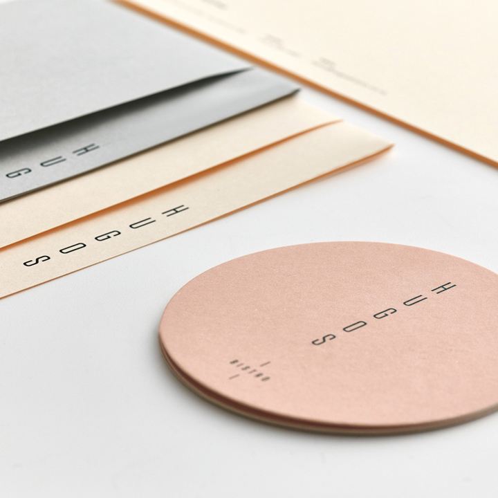
Smells Like Fresh Print — Hugo’s Bistro
Brought to you by B&F Papers, the Smells Like Fresh Print series celebrates the beauty and tactile qualities of recently created, selected print projects. This week we share work created for Hugo’s Bistro […]
7 years ago by Louise Kellerman

Nicole Arnett Phillips: Christchurch and Auckland
Brisbane based designer Nicole Arnett Phillips recently visited Christchurch to run a type workshop, hosted by the Ara Institute of Canterbury. Before we got stuck into the hands on work, Nicole […]
7 years ago by Louise Kellerman
Celebrating Matariki 2017
25 June marks the beginning of Matariki for 2017. This year HP and Design Assembly have collaborated with Wellington designer Tim Walter Hansen to create a typographic illustration that you can download […]
7 years ago by Louise Kellerman

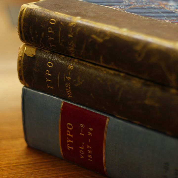
A man you need to know: Robert Coupland Harding, Part IV
Written by Kelly Gilchrist Earlier articles in this series are available here: Part I, Part II, Part III To undertake a project the size of Typo is an outstanding feat by today’s standard; […]
7 years ago by Louise Kellerman

Fresh from the Field — Disobedient Teaching, Welby Ings
Written by Nicole Arnett Phillips When I was at AUT, I was distracted. I enjoyed design, I enjoyed learning… but I was also working 18+ (often 24-30) hours per week, […]
7 years ago by Louise Kellerman

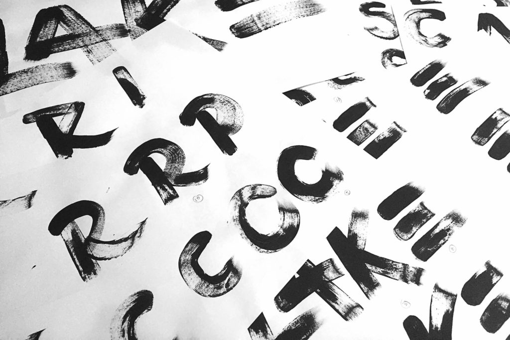
DA Workshop, Hand Lettering with Kelly Spencer, April 8th, Wellington
Join Kelly Spencer, hand-letterer, designer and illustrator, for this full-day, Wellington-based typography workshop. Hand Lettering with Kelly Spencer Saturday 8th April, 10am–4pm Toi Pōneke Arts Centre Upper Chamber 61 – 69 Abel Smith […]
7 years ago by Louise Kellerman
DA Workshop, Hand Lettering with Kelly Spencer, 08 April Wgtn
Join Kelly Spencer, hand-letterer, designer and illustrator, for this full-day, Wellington-based typography workshop.
Workshop Summary
Take a well earned break from points and pixels in a 1 day intensive workshop studying the craft of hand lettering, with Wellington lettering artist Kelly Spencer.
Learning Outcomes
Workshop attendees will learn a range of practical hand lettering skills, building confidence in the creation of structured letterforms and design layout. Kelly will share her process through live demonstrations and explanations. A small class size allows the benefit of one on one time with Kelly, and students are encouraged to allow their individual style to flow, crafting their own custom design whilst being guided through tips and techniques for refinement.
The class will cover selection of materials, instruction on the execution of different alphabet styles, and the practical application of hand lettering to a custom illustration, exploring weight, shape and space.
Materials needed
Mechanical pencil, ink pen, eraser, ruler, tracing paper, paper stock.
20 people maximum.
About Kelly
Operating from Honey Badgers Studios in central Wellington, Kelly is a full time freelance illustrator best known for her beautifully crafted hand lettering. Whilst being primarily based in Wellington, Kelly loves to travel, and aims to head overseas at least once a year, painting walls across the world. She’ll also jump at any opportunity to explore and decorate homeland NZ.
Kelly’s creative style is characterised by a bold use of colour, curvaceous forms, clean lines, and hints of old-school. This broad approach allows her the freedom to design across a wide variety of media, and she enjoys creating both in-studio or out on the streets, adorning surfaces large and small with her colourful forms. Adventures to date include murals/street art, sign painting, book illustration, web design, apparel graphics, festival — gig branding, identity design and set design.
The fluidity of freelance life often leads to projects which allow collaboration with other artists across a variety of mediums. In addition to her contract work, Kelly is one of 5 directing members of The League of Live Illustrators — a lively and glittery team of graphic facilitators for hire.
Kelly does not engage in conversation before consuming coffee in the mornings, but is henceforth a social creature, taking great delight in the company of the 8 other talented creatives she shares her studio with. On the rare occasions where she’s not drawing, Kelly will be found sharing chardonnay with friends, practicing yoga, and patting other people’s dogs.

DA Workshop: The Essentials of Typography with Nicole Arnett Phillips, 27 May 2017, Auckland
Join Brisbane-based type designer Nicole Arnett Phillips aka TypographHer, for this full-day, hands-on typography workshop in Auckland: The Essentials of Typography – Everything about type that you didn’t learn at school! Saturday […]
7 years ago by Louise Kellerman
DA Workshop: The Essentials of Typography with Nicole Arnett Phillips, 27 May, Auckland
Join Brisbane-based type designer Nicole Arnett Phillips aka TypographHer, for this full-day, hands-on typography workshop in Auckland:
The Essentials of Typography – Everything about type that you didn’t learn at school!
Saturday 27th May
10am–4.00pm
Yoobee, Level 4 workspace
3 City Road
Auckland CBD
$350 Professional / $250 Design Assembly Friend (Not a DA Friend? Click here for details on how to sign up).
$150 DA Student Friend (Not a DA Student Friend? Click here for details on how to sign up).
Refreshments from Atomic Coffee and Serious Popcorn. Thanks Guys!

I attended Auckland University of Technology, and our curriculum was broad. We had an introduction to typography, its historical context, pairing typefaces and the fundamental geometry of the major type classifications — barely scratching the surface of type as a discipline.
At the time (15+ years ago) design schools were moving away from drawing (and making) toward more fast-paced, digital production practices, so I soon realised that I needed to create a personal investigative practice that trained my eye, developed my hand, and nurtured my curiosity for the mechanics of typography. I began interrogating letters (and typefaces) hoping to unlock their dirty little secrets. My method of visual research was tactile and analogue. I would draw, trace, and scale characters, rotate and reverse them, crop them and recreate them.
This craft based learning (after graduation) was where my type education began. Analogue craftsmanship demands you to be resourceful and clever, I value the freedom that comes from working slow, with my hands, and without the safety net of {cmd+Z} to undo. Crafting and interrogating letterforms in this way is the best medium to learn the finer details of typography, lettering and type design.
In this one day workshop I will share some of what I have learned as well as my techniques for interrogating, drawing (and learning) about type. We will explore all the things you didn’t learn about type design and typography at school, using craft to unlock type’s dirty little secrets.
Learning Outcomes:
- Exploring the origins, anatomy, and vernacular of typography.
- Understanding recognition, legibility, archetypal forms, and the visual logic of typography.
- Using varied techniques for creating typography by hand.
- Gaining insight into the maths (geometry) and magic (common optical illusions/adjustments) used in typography.
- Participants will also deepen their understanding of typographic tone, what sounds look like, and the relationship between visual and verbal language.
Fresh from the field – Function memento by TDF
Our Fresh from the Field this week showcases the recent release of Function by Anthony Burrill, as well as the limited Collector’s Edition Woodblock Memento by TDF. The woodblocks are being sold individually […]
8 years ago by Louise Kellerman
Robert Coupland Harding — a man you should know, Part I
Written by Kelly Gilchrist A few words to set forth the objects and scope of our publication will not be out of place in our first number. It is our […]
8 years ago by Louise Kellerman