Three Takeaways from Webstock 2017
Written by Shane O’Connell, Pixel Fusion
What is Webstock? It’s much more than a conference, it’s a community of people that welcome you with open arms. The team behind Webstock; Natasha Lampard, Mike Brown, Deb Sidelinger, Ben Lampard, and Charles Bird pour their hearts, feelings and passion into making sure the event is successful, entertaining, and high quality every year since 2006. 2017 was no different — it was incredible, this year it had it all:
- Beauty
- Politics
- Artificial Intelligence
- Controversy and public apologies
- Design
- The after party!
- Highly sought after Swag
- Technical insight
- Stories
I believe that anyone who goes will gain an unprecedented amount of value from attending Webstock in Wellington each February, they even make it easy to ask your boss. It wouldn’t be possible to do the event justice by trying to cover all the value I indulged in this year, so I would like to share just three key takeaways.
1 . “You’re only as strong as your weakest link”
The first takeaway is inspired by Jared Spool’s talk Beyond The UX Tipping Point.
Jared Spool shared insight around how organisations all over the globe have teams from the executive level down, seemingly all with different understandings as to what user experience (UX) actually is. Conversely, if an organisation has not invested in UX at all, then there is a high chance they are, as Jared would say “stuck in the dark ages”, unconsciously producing highly technical products that are essentially solutions looking for a problem. Both of these issues are not ideal because they result in terrible user experiences.
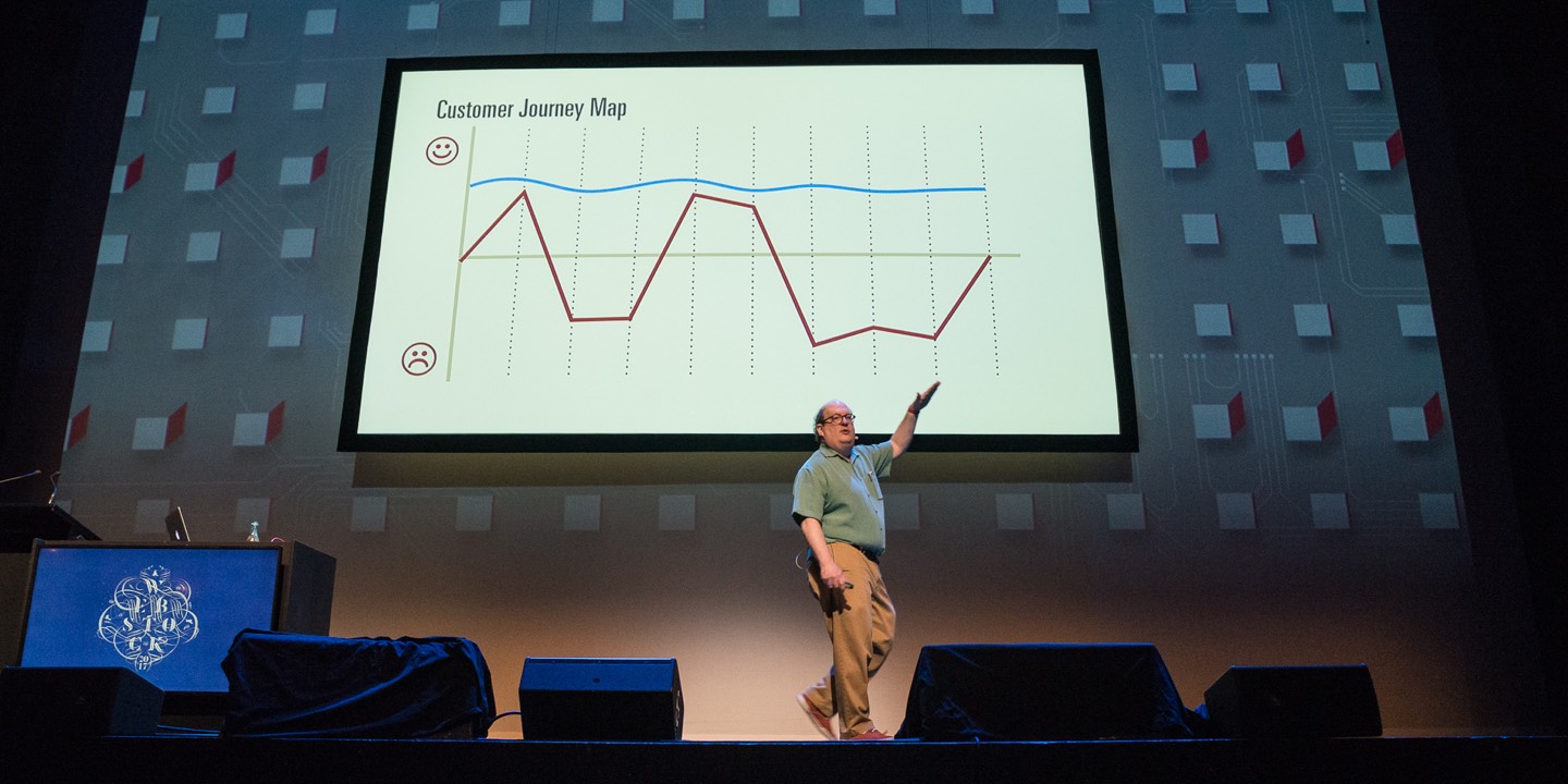
Jared refers to three different levels of understanding an individual goes through on their user experience skill set development:
- Literacy
- Fluency
- Mastery
These days it’s extremely important that we work toward a point where every project team member has fluent design skills. Jared says that it is a “UX Leader’s primary job to level up of the rest of the team”. We are certainly seeing the benefits of this at Pixel Fusion.
The best way I can see to mitigate having a lack of global understanding in your organisation, is to make sure you embrace all three levels (literacy, fluency, and mastery) in your internal processes, to allow a culture where your UX lead(s) are able to up-skill your wider team (not just the other designers).

Don’t take my word for it, head over and check out some of Jared Spool’s talks and follow him on Twitter.
2. Silo based thinking is painfully common
The second takeaway I’d like to share is inspired by Kim Goodwin’s talk Scenarios & Storyboards — Getting to structure and flow.
Kim Goodwin’s talk changed my perspective on how to think and work with organisations structured in silos. By silos I mean departments filled with people that are seemingly not willing to share information with others in the same company. Kim spoke about how painfully common silo based thinking is, which is when people only think within their silos, this leads to narrow constrained views.
Kim also mentioned the best way to get people talking about a product is by going further than “usable”, always looking to add something unexpectedly good. Silo based thinking makes it difficult to create these experiences, as you are not always in control of the entire process.
Therefore, considering your part as a designer, you need to continuously think about where people have come from and where they might be going before or after interacting with your part of the process. Good experiences come from connecting silos.

Remember, in each of these silos you may be thinking of “users” or “roles”. Don’t forget these terms refer to “people”.

At the beginning of your user experience activities don’t be specific, as doing so makes assumptions that you are most likely not ready to make. Kim challenged us to “Think big”, to consider what would happen if we ran the world — think outside your silo.

Follow Kim Goodwin on Twitter or on LinkedIn
3 . The web is for everyone, regardless of location, beliefs, and circumstance.
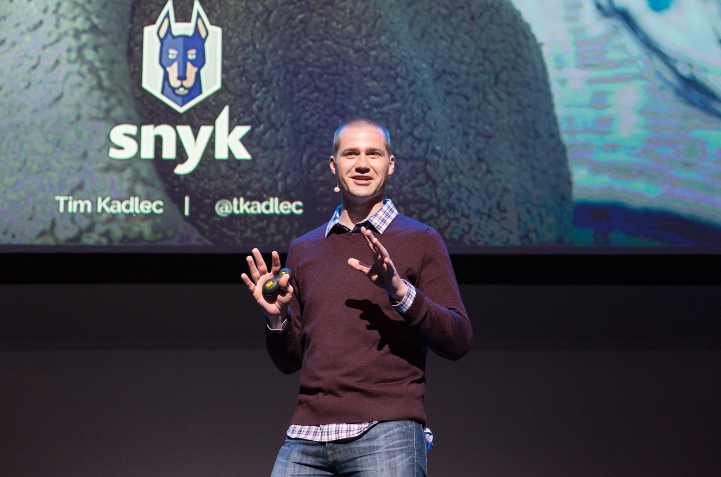
My last takeaway is inspired by Tim Kadlec’s talk Unseen
There are four basic elements of a person that uses the internet:
- Consumer readiness — society accepting everyone can have access
- Content — what one has access to
- Affordability — cost to access
- Infrastructure — broadband, 3G, 4G, and electricity
Have a think about the device you are reading this on… You are most likely on a mobile device that is branded with a piece of fruit or a funny looking robot… Regardless, there is a high chance it has a significant amount of computing power and is connected to high speed internet connection.
Now take a moment to consider how this experience might differ on a device that had significantly less computing power and you were on a dial up connection (do you know what dial up is? google it). What if this page took more than five seconds to load, would you even be reading this?
In July 2016, 3.4 billion people were connected to the internet, which was 46.1% of the global population (7.4 billion) at the time, this leaves 4 billion people essentially “internetless”. Of that 3.4 billion that are connected not everyone is on fibre, infrastructure varies from country to country. Users have a completely different experience when accessing the internet on outdated devices with connections worse than dial up.
As creators of the web everyone is responsible for ensuring we build beautiful experiences that everyone can securely access. Simple security, accessibility, and performance mistakes may be invisible to people in privileged countries and situations. However, these mistakes can cause major issues for people around the globe if overlooked.
Let’s not predefine, unintentionally or intentionally, who can access our websites. Put emphasis on the following components, consider them as part of your design process (hopefully you already are and this is just a reminder).
- Security
- Accessibility
- Performance
Let’s not have another healthcare.gov (don’t know what that is? google it)
Tim recommends using a chrome browser extension called aXe, which is an automated tool to find accessibility defects on your website.
Tim built an awesome tool that allows you to check out what any website costs to access around the globe called whatdoesmysitecost.com. Below outlines what pixelfusion.co.nz costs around the globe (in USD).
http://pixelfusion.co.nz weighs 1.24MB.
![]()
Learn about Tim’s background here and follow him on twitter
Thanks for reading. See you at Webstock next year – http://www.webstock.org.nz
Feel free to comment or reach out to me on Twitter
Read Gerbrand van Melle’s thoughts on this year’s Webstock here.


