Robert Coupland Harding: A man you need to know, Part II
Written by Kelly Gilchrist
Under the heading of « Design in Typography, » we purpose publishing from month to month a series of original articles of a practical character on the general principles of display work and ornamental composition. In some trade serials may be found a multiplicity of rules on this subject—in most cases excellent—sometimes otherwise.
Robert Coupland Harding’s reoccurring article, Design in Typography, has the power to release the design nerd in all of us. Over the years of Typo, Harding used the article, Design in Typography to explain the art of printing in a systematic manner. He begins with what he refers to as the ‘broad principles of display,’ which he then continues to discuss the large and opinionated ‘subject of decoration’. Curiously, he intends to discuss the ‘use and abuse of rules (strips of metal used as a measure), corners, and ornaments,’ which creates an interesting debate.
During 1887, the first Design in Typography articles, provided detailed information about the underlying principles in the construction of the design – unfortunately, like any good magazine you had to wait an entire month for the next instalment. This would have dramatically staggered any compositors’ education – that is of course, if he were reliant on Harding’s teachings. This period saw both the obsession and the insignificance of decoration, although, there was a slow shift of thought from the former to the latter. Harding, through Typo, systematically describes the process of ornamental printing. There were – if the subject was vast – generally multiple issues dedicated to the subject. Each Design in Typography article had enough information, squeezed into a simple but effective two column grid, for an entire book.
Harding primarily focuses on display, where he discusses the use of contrast and harmony (a large and complex subject):
Contrast and harmony are the two great regulating principles of display, and under these heads all effects of form, color, and light-and-shade may be classified. Without contrast there can be no display; without harmony there can be no artistic effect. [Typo, Volume 1, Issue 3, 1887, p.15 ]
These are the first sentences of issue three, from the outset, Harding leaves nothing to the imagination. To achieve harmony in a display, was to achieve a successful piece of work. No matter the intricacy of the typeface chosen, the principle of contrast was always necessary. Harding continues to discuss the true importance of harmony in a work:
Where harmony is the leading principle of display, either in form or color, or both combined, there is room for more subtle and beautiful effects than where contrast is sought. Harmony produces quiet, graceful, and dignified effects. Contrast gives us quaint, striking, and bold results, and is much more liable to abuse. [Typo, Volume 1, Issue 3, 1887, p.15]
Generally, if he could, Harding would provide visual examples of what he was discussing in the article, Harmony in Contrast is no exception. The following images show the examples of ‘jobs’ that had varying degrees of harmony. The first as Harding states, eliminates the use of contrast.
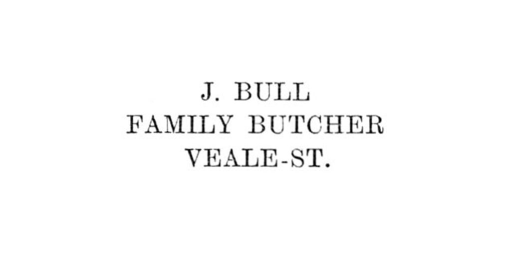
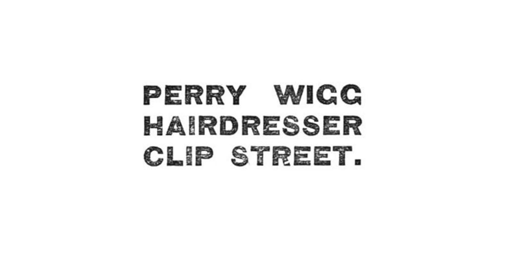 The next example shows a simplistic use of harmony, where only one typeface is available to the compositor.
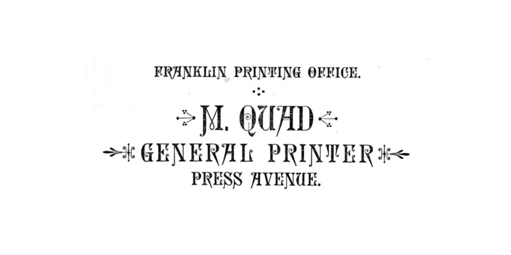
 This example introduces ornamental lettering as an example of harmony.
 He continued to show examples of displays with the use of lower case letters, various sized type and multiple lined titles.
 He applied the work to different ‘jobs’, meaning the different formats of printed work, including, menu cards, programmes, tickets, memorial cards. He ended the detailed introduction to display with, ‘borders, ornaments, and decorations in general should always be in harmony with the types employed’ – a statement that should be posted on billboards now, though preferably without borders and decoration.
The amount of preparation and work that went into each issue of the journal, was adequate for a team, and perhaps outrageous for a single man. Harding’s passion for typography shines throughout the journal, his expressive style of writing will never bore. The blunt comments, during a period largely believed to be quite conservative; will shock you enough to make you gasp and strangely giggle. ‘We,’ Harding wrote, ‘lately read in a trade paper that condensed romans should always be avoided in titles. That is simply nonsense’ [Typo, Volume 1, Issue 3, 1887, p.16]. Or my personal favourite: ‘a New York brewer sends Typo his circular and pricelist. A four cent stamp wasted’ [Typo, Volume 2, Issue 14, 1888, p. 14]. These comments refer to works or statements that disagree with Harding’s beliefs. The main intention of the journal was to educate, so as much as he needed to provide information on what to do, there was also need for what not to do.
As the years went on, Harding meticulously broke down details surrounding each principle of printing. Remarkably, Harding hides magic even in the initials (the often decorative large letter to begin a paragraph or book), he sequentially used the following letter in the alphabet for each new issue. Only ignoring the difficult letters: X, Y, J.
 His marvellous type collection gleams from the ink pressed upon the pages, an international collection, any printer would be envious of. These collections are also highlighted in the dedicated articles; Type Standards, Type Specimens and Recent Specimens. But like the next issue of Typo, you will have to wait.
This is the end of the second part of Harding’s story. I intend to continue the story of Harding and Typo in two additional articles. You can find the digitalised pages of Typo on Victoria University NZETC by clicking here. And original copies of Typo in the National Library of New Zealand, Wellington.
Kelly is a graphic designer (recently turned writer) with a fondness for the ‘old’. This drives her personal interest in history, typography, and books. Better with the handmade, Kelly’s expensive pastimes include book binding, letterpress printing, analogue photography and paper engineering. She is currently studying an Honours degree at AUT University and is also part of the Photography Collections team at the Auckland War Memorial Museum, in order to digitalise the entire museum collection.


